
Responsive Web Design Tutorial
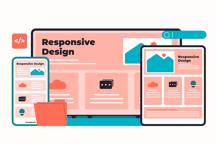
In today’s digital age, having a responsive website is crucial for reaching and engaging with your audience across various devices. A responsive web design ensures that your site looks great and functions well on desktops, laptops, tablets, and smartphones. In this tutorial, we will guide you through the fundamentals of creating a responsive website using HTML and CSS.
Step 1: Setting Up Your HTML Structure
Start by creating a basic HTML structure for your webpage. Use the following tags to set up the skeleton of your site:
Welcome to Our Responsive Website
Your content goes here…
Step 2: Adding CSS Styling
Next, style your webpage using CSS to make it responsive. Create a separate CSS file or include the styles within the