
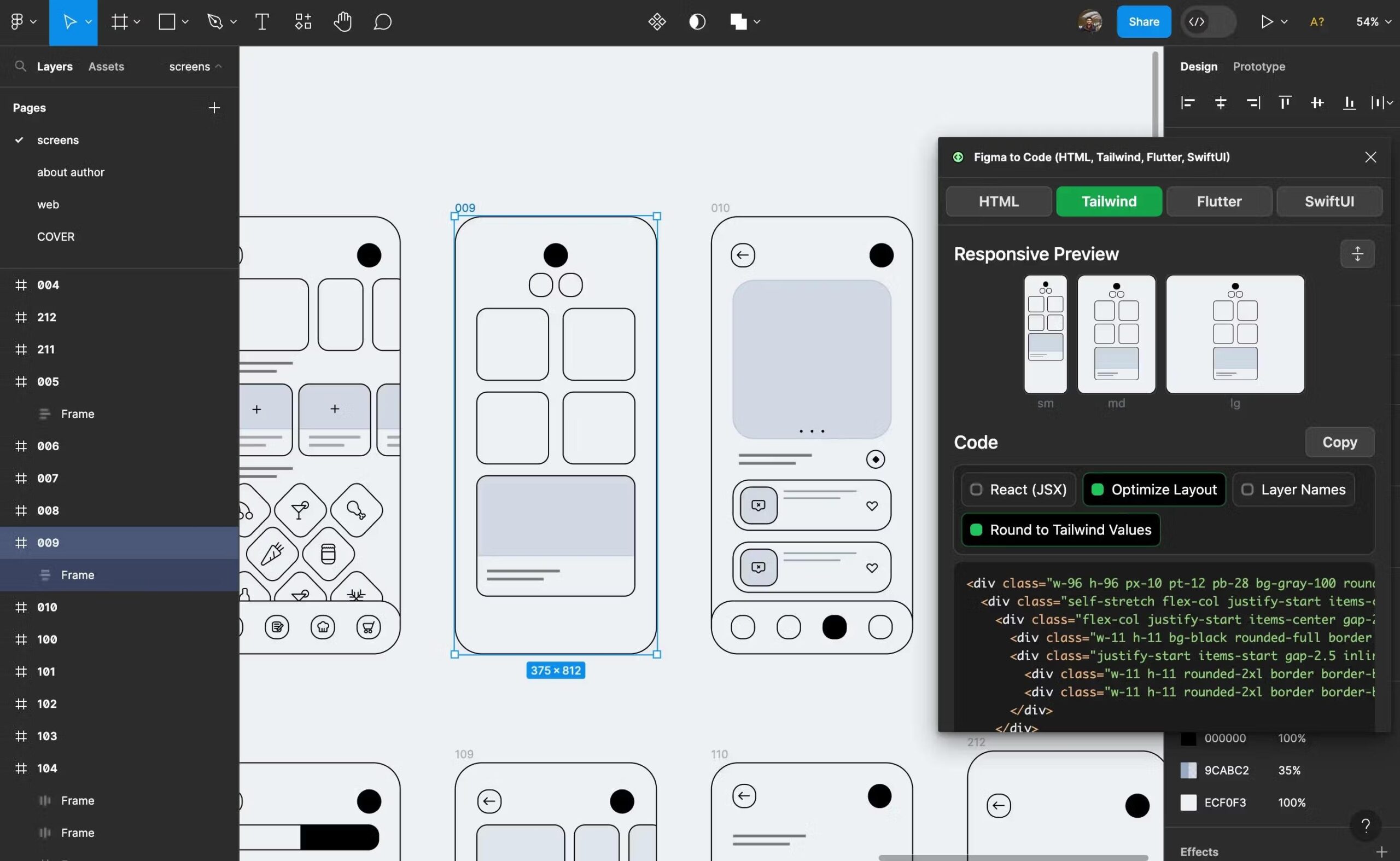
Responsive Web Design in Figma: A Practical Guide
Responsive web design helps a website adapt to different screen sizes, from wide desktop monitors to small mobile phones. Figma makes it easier to plan and test these layouts in one workspace. With thoughtful use of frames, Auto Layout, constraints, components, and prototypes, designers can build interfaces that flex with their content rather than simply shrink to fit.
What Responsive Design Means
A responsive interface adjusts its layout and presentation to suit the available space. A desktop page might display a full navigation bar, a multi-column grid, and a sidebar. On a phone, the same content might use a compact menu, a single column, and larger touch-friendly controls.
Responsive design is not just about creating a desktop mockup and a mobile mockup. It also means considering what happens between those sizes: how text wraps, when columns stack, how images scale, and whether controls remain easy to use.
Start with Frames and Breakpoints
In Figma, frames provide a useful foundation for designing and testing layouts. Create frames for the screen sizes that matter to your project, such as mobile, tablet, and desktop. These are design references, not rigid rules: real websites can appear at countless widths.
Choose breakpoints based on the content and layout, rather than relying only on popular device dimensions. For example, if a navigation bar becomes crowded at a certain width, that may be a better point to rethink the layout than an arbitrary device category.
- Mobile: Focus on a clear reading order, concise navigation, and comfortable touch targets.
- Tablet: Check how components behave in the middle ground between narrow and wide layouts.
- Desktop: Use the available space thoughtfully, without letting text lines or content areas become excessively wide.
Use Auto Layout for Flexible Components
Auto Layout is one of Figma’s most useful tools for responsive interface design. It arranges elements inside a frame and can adjust spacing as content changes. It is especially helpful for buttons, navigation groups, cards, form fields, and repeated lists.
For example, a button built with Auto Layout can grow to fit a longer label while keeping consistent padding. A card can expand as its description becomes longer. A navigation group can maintain even spacing between links.
When setting up Auto Layout, consider whether elements should:
- Hug their contents, such as a button that should fit its label.
- Fill the available space, such as a search field in a flexible toolbar.
- Use a fixed size, where a specific dimension is required.
Choose these settings intentionally. A layout can look correct in one frame but break at another if its elements are forced to fixed widths when they should expand or wrap.
Apply Constraints and Resizing Rules
Constraints help control how a layer behaves when its parent frame changes size. A layer can stay attached to an edge, remain centered, or stretch with the frame. These settings are useful for elements such as logos, icons, background shapes, and image areas.
For example, a logo may stay aligned to the left edge of a header while a call-to-action button stays aligned to the right. A background panel may stretch to fill its parent. Test these behaviors by resizing frames in Figma; the goal is to see whether the design responds as expected, not just whether the initial mockup looks polished.
Build Reusable Components
Components make it easier to keep an interface consistent across layouts. Create components for repeated elements such as buttons, navigation bars, cards, and form controls. Variants can represent different states or styles, such as a primary button, a secondary button, or a disabled state.
Responsive components should account for changes in both screen width and content. A navigation component, for instance, may need a compact mobile version, while a card may shift from a horizontal arrangement to a vertical one. Reusable components make these adjustments easier to manage across multiple screens.
Design for Content, Not Just the Frame
Real content rarely fits a mockup perfectly. Headlines may be longer, names may vary in length, and images may have different proportions. Test designs with realistic text and varied image sizes. Pay attention to line breaks, card heights, button labels, and the amount of space between elements.
Also consider how images should behave. Decide whether an image should crop to fill a set area, maintain its original proportions, or change placement on smaller screens. In Figma, use image fills and frame settings to explore these options visually.
Test the Layout at Intermediate Sizes
It is easy to focus on a few preset frames and miss problems in between. Resize frames or create additional test widths to check for awkward transitions. Look for:
- Text that becomes too small or wraps in an unexpected way.
- Navigation items that collide or become difficult to tap.
- Columns that feel cramped before they stack.
- Images that crop important details.
- Excessive empty space or content that stretches too far.
Prototypes can help demonstrate navigation and interaction states, but a Figma prototype is not a substitute for testing the finished website in a browser. Browser rendering, real content, and implementation details can all affect the final result.
Prepare Designs for Handoff
A responsive design is most useful when its behavior is clear to the people building it. Organize frames and components, use descriptive layer names, and document important layout decisions. Note which elements stack, hide, resize, or change order at different widths.
Include states that developers may need, such as expanded mobile navigation, hover and focus treatments, validation messages, and loading or empty states. Clear annotations reduce guesswork and help the implemented site match the intent of the design.
A Better Workflow for Responsive Design in Figma
- Identify the content, user needs, and key page sections.
- Sketch the main layout at a few representative widths.
- Build flexible elements with Auto Layout and appropriate resizing rules.
- Create reusable components for repeated interface patterns.
- Test realistic content at both preset and intermediate widths.
- Document responsive behavior and prepare the file for handoff.
Conclusion
Figma supports responsive web design by making it easier to explore layouts, create flexible components, and communicate how an interface should adapt. The strongest results come from designing for content and behavior—not just for a collection of device-sized frames. By testing how a layout responds across a range of widths, designers can create clearer, more consistent experiences for users on any screen.
6 Key Benefits of Using Figma for Responsive Web Design
- Preview layouts across screen sizes.
- Build flexible components with Auto Layout.
- Reuse consistent styles and components.
- Spot layout issues early.
- Prototype responsive interactions.
- Simplify developer handoff.
Challenges of Responsive Web Design in Figma: Key Considerations and Limitations
- Figma can’t fully replicate real browser behavior.
- Responsive layouts require extra testing at varied widths.
- Auto Layout can be tricky to configure.
- Prototypes may not show every responsive state.
- Design files can become complex to maintain.
- Developer handoff may leave implementation details unclear.
Preview layouts across screen sizes.
Figma makes it easy to preview a design across different screen sizes by placing layouts in frames for mobile, tablet, and desktop—and resizing them to check what happens in between. This helps designers spot issues early, such as crowded navigation, awkward text wrapping, or images that don’t scale as intended. Reviewing layouts side by side also makes it easier to refine responsive behavior and create a more consistent experience across devices.
Build flexible components with Auto Layout.
Building flexible components with Auto Layout in Figma makes responsive design easier to manage. Components such as buttons, cards, and navigation bars can adjust to different text lengths and available space while maintaining consistent padding, spacing, and alignment. Instead of manually resizing every element for each screen size, designers can define how components should grow, shrink, or fit their content—helping layouts stay consistent across devices and making updates faster.
Reuse consistent styles and components.
Figma makes it easy to reuse consistent styles and components throughout a responsive design. Shared color, typography, and effect styles help keep the interface cohesive, while reusable components—such as buttons, navigation bars, and cards—can be updated once and applied across multiple screens. This saves time, reduces inconsistencies, and makes it simpler to adapt the design for mobile, tablet, and desktop layouts.
Spot layout issues early.
Responsive web design in Figma helps teams spot layout issues early, before development begins. By previewing a design at different screen widths, designers can catch problems such as crowded navigation, awkward text wrapping, uneven spacing, or images cropping incorrectly. Fixing these issues in the design file is often faster and less costly than discovering them after the site has been built.
Prototype responsive interactions.
Figma lets you prototype responsive interactions so you can show how an interface changes across screen sizes and user actions. Preview behaviors such as a navigation menu opening on mobile, content shifting into a single column, or buttons revealing different states. These interactive prototypes help teams evaluate the experience early, gather feedback, and communicate design decisions before development begins.
Simplify developer handoff.
Figma can simplify developer handoff by keeping responsive layouts, reusable components, and design specifications organized in one place. Designers can show how elements should resize, wrap, stack, or change across screen widths, while developers can inspect measurements, spacing, colors, and assets. Clear annotations and examples of key breakpoints reduce guesswork, helping teams build an experience that more closely matches the intended design.
Figma can’t fully replicate real browser behavior.
One limitation of responsive web design in Figma is that it can’t fully replicate how a real browser behaves. A design may look and resize as expected in Figma, but browsers can render fonts, images, spacing, and interactive elements differently depending on the device, browser, and implementation. Figma prototypes also can’t reproduce every detail of scrolling, dynamic content, or touch interactions. That’s why designs should be tested in a working website across real browsers and screen sizes before launch.
Responsive layouts require extra testing at varied widths.
One downside of responsive web design in Figma is the extra testing required across varied screen widths. A layout that looks polished on desktop and mobile can still feel cramped, uneven, or awkward at intermediate sizes. Designers need to resize frames and check how text wraps, columns shift, images crop, and controls behave, which adds time to the design process.
Auto Layout can be tricky to configure.
Auto Layout can be tricky to configure in Figma, especially when a design includes nested components, mixed fixed and flexible sizing, or content that changes across screen sizes. Small mistakes in padding, spacing, or resizing settings can cause elements to stretch, shift, or wrap in unexpected ways. Designers may need to experiment with different settings and test multiple frame widths before the layout behaves as intended, which can add time to the design process.
Prototypes may not show every responsive state.
Figma prototypes are useful for demonstrating how a design works, but they may not show every responsive state a website can encounter. A prototype often focuses on a few selected screen sizes and interactions, so layout issues between breakpoints, unusual content lengths, or changes in browser behavior can go unnoticed. Test designs at a range of widths and document how elements should resize, wrap, stack, or hide to give developers a clearer picture of the intended experience.
Design files can become complex to maintain.
One drawback of responsive web design in Figma is that design files can become complex to maintain as a project grows. Multiple screen sizes, component variants, interaction states, and repeated layouts can lead to a crowded file with duplicated or outdated elements. Without consistent naming, organization, and component management, it can be difficult for designers and developers to find the right version or understand how a design should adapt across screens.
Developer handoff may leave implementation details unclear.
Developer handoff in Figma can leave implementation details unclear if responsive behavior isn’t documented. A design may show how a page looks at a few screen sizes without explaining what should happen between them—for example, when columns stack, elements resize or disappear, or navigation changes. Without clear notes on breakpoints, spacing, typography, and component behavior, developers may have to guess, leading to inconsistencies between the design and the finished website.