
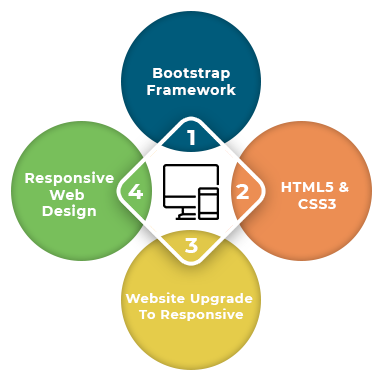
HTML5 Responsive Web Design
In today’s digital age, having a responsive website is crucial for reaching a wider audience and providing a seamless user experience across different devices. HTML5 has revolutionized the way websites are designed and developed, making it easier to create responsive designs that adapt to various screen sizes and resolutions.
One of the key features of HTML5 is its support for media queries, which allow developers to apply different styles based on the device’s screen size. This means that a website can look great on a desktop computer, tablet, or smartphone without the need for separate designs for each device.
By using flexible grid layouts and fluid images, developers can ensure that content is displayed optimally on any screen size. This approach allows for a more consistent user experience and eliminates the need for users to pinch and zoom to view content on smaller screens.
Another important aspect of HTML5 responsive web design is its support for touch events, making websites more interactive and user-friendly on touchscreen devices. By incorporating touch-friendly features such as larger buttons and swipe gestures, developers can enhance the overall usability of their websites on mobile devices.
In addition to improving user experience, responsive web design has SEO benefits as well. Search engines like Google prioritize mobile-friendly websites in search results, so having a responsive design can help improve your site’s visibility and rankings.
In conclusion, HTML5 responsive web design offers numerous advantages for both developers and users. By creating flexible layouts that adapt to different devices and screen sizes, developers can provide a better user experience while also improving their site’s SEO performance. Embracing responsive design principles is essential in today’s mobile-first world to ensure your website remains accessible and engaging across all devices.
8 Essential Tips for Mastering HTML5 Responsive Web Design
- Use a responsive meta tag in the head section of your HTML document.
- Design with a mobile-first approach to ensure compatibility with smaller screens.
- Utilize CSS media queries to adjust styles based on screen size.
- Optimize images for various screen resolutions to improve loading times.
- Consider using flexible grids and layouts such as Bootstrap or Flexbox.
- Test your design on different devices and browsers to ensure consistency.
- Prioritize content and features based on importance for smaller screens.
- Keep code clean and organized to facilitate maintenance and updates.
Use a responsive meta tag in the head section of your HTML document.
To ensure that your website is properly optimized for various screen sizes and devices, it is essential to include a responsive meta tag in the head section of your HTML document. By adding the meta tag with the viewport attribute set to “width=device-width, initial-scale=1.0,” you can instruct the browser to render the web page according to the device’s screen width, ensuring a consistent and user-friendly experience across different platforms. This simple yet powerful technique is a fundamental step in implementing HTML5 responsive web design and plays a crucial role in creating websites that are accessible and visually appealing on all devices.
Design with a mobile-first approach to ensure compatibility with smaller screens.
When implementing HTML5 responsive web design, it is essential to adopt a mobile-first approach to guarantee compatibility with smaller screens. By prioritizing the design and functionality for mobile devices, developers can create a user-friendly experience that seamlessly scales up to larger screens. Designing with a mobile-first mindset encourages simplicity, efficiency, and prioritization of essential content, resulting in a responsive layout that adapts fluidly across various devices. This approach not only enhances user experience on smartphones and tablets but also ensures that the website performs optimally on all screen sizes, ultimately improving accessibility and engagement for all users.
Utilize CSS media queries to adjust styles based on screen size.
In HTML5 responsive web design, a valuable tip is to utilize CSS media queries to adjust styles based on screen size. By incorporating media queries into your CSS code, you can create rules that target specific screen sizes and apply different styles accordingly. This allows you to optimize the layout and appearance of your website for various devices, ensuring a consistent and user-friendly experience across desktops, tablets, and smartphones. Media queries empower developers to create flexible and adaptive designs that adapt seamlessly to different screen resolutions, enhancing the overall responsiveness of the website.
Optimize images for various screen resolutions to improve loading times.
Optimizing images for various screen resolutions is a crucial tip in HTML5 responsive web design to enhance loading times and overall user experience. By serving appropriately sized images based on the user’s device resolution, developers can prevent unnecessary data transfer and reduce load times, especially on mobile devices with limited bandwidth. Implementing responsive image techniques such as using srcset and sizes attributes or employing CSS media queries can help ensure that images are displayed crisply and efficiently across different screen sizes, leading to faster page load times and improved performance for all users.
Consider using flexible grids and layouts such as Bootstrap or Flexbox.
When implementing HTML5 responsive web design, it is highly recommended to consider using flexible grids and layouts like Bootstrap or Flexbox. These tools provide developers with pre-built components and grid systems that make it easier to create responsive designs that adapt smoothly to different screen sizes. Bootstrap, for example, offers a responsive grid system that automatically adjusts the layout based on the device’s screen size, while Flexbox provides a more flexible way to design complex layouts with ease. By leveraging these frameworks, developers can save time and effort in building responsive websites while ensuring a consistent user experience across various devices.
Test your design on different devices and browsers to ensure consistency.
It is essential to test your HTML5 responsive web design on various devices and browsers to guarantee consistency in how your website appears and functions across different platforms. By conducting thorough testing, you can identify any potential issues or discrepancies in the design layout, responsiveness, or functionality and make necessary adjustments to ensure a seamless user experience for all visitors. Testing on a range of devices and browsers helps you catch any compatibility issues early on and ensures that your website looks and performs optimally regardless of how visitors access it, ultimately enhancing usability and user satisfaction.
Prioritize content and features based on importance for smaller screens.
When implementing HTML5 responsive web design, it is crucial to prioritize content and features based on importance for smaller screens. With limited screen real estate on mobile devices, it is essential to focus on displaying the most critical information and functionalities prominently. By identifying key content and features that are essential for users on smaller screens, developers can ensure a streamlined and user-friendly experience that prioritizes what matters most, ultimately enhancing usability and engagement on mobile devices.
Keep code clean and organized to facilitate maintenance and updates.
In HTML5 responsive web design, it is crucial to keep the code clean and organized to facilitate maintenance and updates. By structuring the code in a logical and consistent manner, developers can easily identify and modify specific elements when needed. This not only streamlines the maintenance process but also ensures that updates can be implemented efficiently without causing unintended issues. Clean and organized code promotes better collaboration among team members, enhances readability, and ultimately contributes to the overall success of the project by making it easier to manage and scale as needed.