
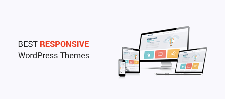
The Importance of Responsive Web Design in WordPress
Responsive web design has become a crucial aspect of creating websites in today’s digital landscape. With the increasing use of mobile devices to access the internet, having a responsive website is essential to provide users with a seamless and optimized browsing experience.
When it comes to building a website on WordPress, ensuring that it is responsive should be a top priority. WordPress offers a variety of themes and plugins that are specifically designed to help create responsive websites that adapt to different screen sizes and devices.
One of the main benefits of responsive web design in WordPress is improved user experience. A responsive website will adjust its layout and content based on the device being used, making it easier for visitors to navigate and interact with the site.
In addition, having a responsive website can also improve your site’s search engine rankings. Search engines like Google prioritize mobile-friendly websites in their search results, so having a responsive design can help boost your site’s visibility and reach a wider audience.
Overall, incorporating responsive web design into your WordPress site is essential for staying competitive in today’s online market. By providing users with a consistent and user-friendly experience across all devices, you can attract more visitors, improve engagement, and ultimately achieve your online goals.
Make sure to choose a responsive WordPress theme and optimize your site for mobile devices to ensure that your website looks great and functions properly on any screen size. With the right approach to responsive web design, you can create a successful and impactful online presence for your business or brand.
Top 8 FAQs About Implementing Responsive Web Design in WordPress
- What is responsive web design?
- Why is responsive web design important for WordPress websites?
- How can I make my WordPress website responsive?
- What are the benefits of using a responsive WordPress theme?
- Does responsive web design affect SEO for WordPress sites?
- Are there specific plugins that can help with responsive web design in WordPress?
- How can I test if my WordPress site is truly responsive?
- What are some common mistakes to avoid when implementing responsive web design in WordPress?
What is responsive web design?
Responsive web design refers to the practice of creating websites that can adapt and optimize their layout and content based on the screen size and device being used to view them. In the context of WordPress, responsive web design ensures that websites built on the platform will provide a seamless and user-friendly experience across desktops, laptops, tablets, and mobile phones. By incorporating responsive design principles into a WordPress site, web developers can ensure that visitors have access to the same content and functionality regardless of the device they are using, ultimately enhancing user experience and accessibility.
Why is responsive web design important for WordPress websites?
Responsive web design is crucial for WordPress websites because it ensures that the site can adapt and provide an optimal viewing experience across various devices and screen sizes. With the increasing use of smartphones and tablets to access the internet, having a responsive WordPress website is essential to cater to users on different platforms. By implementing responsive design, WordPress websites can maintain consistency in design, functionality, and user experience, ultimately improving usability, engagement, and search engine rankings. Embracing responsive web design for WordPress sites is key to staying relevant in today’s digital landscape and reaching a wider audience effectively.
How can I make my WordPress website responsive?
To make your WordPress website responsive, there are several key steps you can take. First, choose a responsive WordPress theme that is designed to adapt to different screen sizes and devices. Many themes offer built-in responsiveness features that automatically adjust the layout and design of your site. Additionally, you can use plugins like WPtouch or Jetpack to optimize your site for mobile devices. It’s also important to test your website on various devices to ensure that it displays correctly and functions smoothly across different platforms. By following these steps and implementing responsive design best practices, you can create a user-friendly and visually appealing website that provides an optimal experience for all visitors.
What are the benefits of using a responsive WordPress theme?
Using a responsive WordPress theme offers a multitude of benefits for website owners. One key advantage is improved user experience, as a responsive theme ensures that your site looks and functions seamlessly across various devices and screen sizes. This leads to higher engagement and satisfaction among visitors, ultimately increasing the likelihood of them staying on your site longer and exploring its content. Additionally, having a responsive WordPress theme can boost your site’s search engine rankings, as search engines favor mobile-friendly websites in their results. By choosing a responsive theme for your WordPress site, you can enhance usability, reach a wider audience, and improve overall performance.
Does responsive web design affect SEO for WordPress sites?
Responsive web design plays a significant role in SEO for WordPress sites. Search engines like Google prioritize mobile-friendly websites in their search results, and having a responsive design can improve your site’s visibility and ranking. By ensuring that your WordPress site is responsive, you provide a better user experience across all devices, which can lead to lower bounce rates and higher engagement metrics. Additionally, with a responsive design, you only need to manage one website instead of separate desktop and mobile versions, making it easier to maintain consistent and high-quality content that search engines value. In conclusion, responsive web design positively impacts SEO for WordPress sites by enhancing user experience, increasing site accessibility, and ultimately improving search engine rankings.
Are there specific plugins that can help with responsive web design in WordPress?
When it comes to responsive web design in WordPress, there are several plugins available that can help streamline the process and ensure your website looks great on all devices. Popular plugins like WPtouch, Jetpack, and Elementor offer features that can assist with creating responsive designs, optimizing content for mobile viewing, and customizing layouts for different screen sizes. These plugins provide tools and functionalities that make it easier to achieve a responsive design without the need for extensive coding knowledge, allowing you to focus on creating a user-friendly experience for all visitors to your WordPress site.
How can I test if my WordPress site is truly responsive?
To test if your WordPress site is truly responsive, you can use a variety of tools and methods to ensure that it displays correctly on different devices and screen sizes. One common approach is to manually resize your browser window to see how the site adapts to different dimensions. Additionally, you can use online tools like Google’s Mobile-Friendly Test or responsive design testing tools like BrowserStack to simulate how your site appears on various devices. Another useful method is to access your site on actual mobile devices such as smartphones and tablets to see firsthand how it performs. By employing these testing techniques, you can verify that your WordPress site is responsive and delivers a seamless user experience across all platforms.
What are some common mistakes to avoid when implementing responsive web design in WordPress?
When implementing responsive web design in WordPress, it’s important to be aware of common mistakes that can hinder the effectiveness of your website. One common mistake to avoid is neglecting thorough testing on various devices and screen sizes. Failing to test how your website looks and functions across different platforms can result in a subpar user experience. Another mistake is overloading your site with unnecessary plugins and features that can slow down load times on mobile devices. It’s crucial to prioritize performance optimization to ensure smooth navigation for all users. Additionally, not optimizing images and media for mobile viewing can lead to distorted visuals and slow loading times. By addressing these common mistakes and focusing on creating a seamless responsive design, you can enhance user engagement and drive positive results for your WordPress website.