
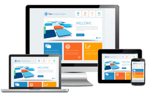
Drupal Responsive Design: A Practical Guide
Responsive design helps a website adapt to the screen on which it is viewed. A page should be easy to read and use on a phone, tablet, laptop, or desktop without requiring visitors to zoom, scroll sideways, or hunt for important controls. In Drupal, responsive design is shaped by the theme, the content structure, and the way images and components behave at different screen sizes.
What Responsive Design Means for Drupal
Drupal provides the tools to build and manage content-rich websites, but a site does not become responsive simply because it uses Drupal. The theme and front-end implementation determine how layouts respond to different viewports. A well-designed Drupal site combines flexible layouts, readable typography, accessible navigation, and appropriately sized media.
Responsive design is not just about shrinking a desktop page to fit a phone. It involves making deliberate choices about what visitors need on each screen, how content should be organized, and how interactive elements can remain comfortable to use.
Start with a Mobile-First Approach
A mobile-first workflow begins with the smallest screen and adds layout enhancements as more space becomes available. This encourages teams to prioritize essential content and functionality before adding more complex desktop arrangements.
When planning a Drupal site, consider questions such as:
- What information should visitors see first?
- Can navigation be used easily with a touchscreen?
- Do forms fit within a narrow screen?
- Will long headings or labels wrap without breaking the layout?
- Can visitors complete key tasks without relying on hover effects?
Choose and Configure a Responsive Drupal Theme
The theme controls much of a Drupal site’s presentation, including layout, typography, colors, and navigation. When choosing a theme, check that it supports responsive layouts and is compatible with the version of Drupal your site uses. Review the theme on real devices or in browser testing tools rather than relying only on promotional screenshots.
For a custom theme, use flexible CSS layouts such as Grid and Flexbox, and define breakpoints based on where the content needs adjustment. A breakpoint should solve a layout problem, not merely match a particular device model. For example, a navigation menu may need to change when its links no longer fit comfortably in one row.
/* Example: a flexible card layout */


.card-grid {


  display: grid;


  grid-template-columns: 1fr;


  gap: 1rem;


}


@media (min-width: 48rem) {


  .card-grid {


    grid-template-columns: repeat(2, minmax(0, 1fr));


  }


}


@media (min-width: 72rem) {


  .card-grid {


    grid-template-columns: repeat(3, minmax(0, 1fr));


  }


}
The exact breakpoints and styles will depend on the design. Keep the CSS organized so that components can adapt consistently across the site.
Make Drupal Content Responsive
Responsive behavior also depends on how content is created and displayed. Drupal content types and fields can help editors enter structured information, while display settings determine how that information appears. Keep content layouts flexible, and avoid assuming that every title, image, or text field will have the same length.
For images, use Drupal’s image styles and responsive image capabilities where appropriate. These can help deliver different image sizes for different display contexts, reducing unnecessary downloads on smaller screens. Add meaningful alternative text for informative images, and avoid using image dimensions that force content outside its container.
Tables can be difficult to view on narrow screens. If a table contains essential information, plan how it will work on mobile. Depending on the content, options may include a horizontally scrollable container, a simplified presentation, or a different content format. Preserve the information and make any scrolling behavior clear to visitors.
Design Navigation and Forms for Touch
Mobile visitors often use touch rather than a mouse. Navigation links, buttons, and form controls should have enough space to be selected comfortably. Menus should be straightforward to open and close, and important pages should not be hidden behind confusing interaction patterns.
Drupal forms should remain usable at every screen size. Use clear labels, helpful instructions, and error messages that are easy to find. Check that input fields fit within the viewport and that the on-screen keyboard does not obscure important controls. Avoid relying only on color to indicate required fields or validation errors.
Keep Accessibility in the Design Process
Responsive design and accessibility support one another. Visitors may zoom in, use a keyboard, browse with assistive technology, or change text size. A flexible Drupal site should continue to work under these conditions.
- Use semantic HTML and a logical heading structure.
- Provide visible keyboard focus indicators.
- Maintain sufficient color contrast.
- Use descriptive link text and image alternatives.
- Make interactive controls usable with a keyboard and touch.
- Test layouts at increased zoom and with larger text.
Test Across Viewports and Devices
Testing should happen throughout development, not just before launch. Browser developer tools can simulate different viewport sizes, but real-device testing can reveal issues with touch controls, text rendering, and performance that simulations may miss.
Test pages with different types of content, including long titles, large images, nested navigation, tables, and lengthy forms. Check both portrait and landscape orientations. Also confirm that menus, dialogs, and other interactive components can be opened, used, and dismissed at every supported size.
Consider Performance
Responsive websites should not only look good; they should load efficiently. Large images, unnecessary scripts, and excessive front-end assets can make a site feel slow, especially on mobile connections. Use appropriately sized media, review the assets included by the theme, and measure performance during development.
Build for Flexibility
Drupal responsive design works best when it is treated as part of the entire site-building process. Start with visitor needs, choose a suitable theme or build a flexible custom one, structure content carefully, and make components adaptable rather than fixed to a single screen size. Regular testing and accessibility checks help ensure the site remains usable as content and devices change.
With thoughtful planning, a Drupal website can deliver a consistent, accessible experience across phones, tablets, and desktops—without sacrificing the depth and flexibility that make content management systems useful.
8 Essential Tips for Mastering Responsive Design in Drupal
- Use a mobile-first theme as your starting point.
- Choose a responsive Drupal theme that fits your needs.
- Set image styles to serve appropriately sized images.
- Use responsive image mappings for different screen sizes.
- Keep layouts flexible with CSS Grid or Flexbox.
- Test menus and forms on touchscreens.
- Preview content at common viewport widths.
- Check accessibility and performance on mobile devices.
Use a mobile-first theme as your starting point.
Start with a mobile-first Drupal theme designed to work well on small screens, then build on it for tablets and desktops. This approach encourages you to prioritize essential content, keep navigation simple, and make buttons and forms easy to use with touch. Before choosing a theme, check that it supports your Drupal version, adapts smoothly across screen sizes, and can be customized to fit your site’s needs.
Choose a responsive Drupal theme that fits your needs.
Choose a responsive Drupal theme that fits your site’s goals, content, and brand—not just one that looks good in a demo. Check that it supports your Drupal version, adapts smoothly to phones, tablets, and desktops, and includes the layout and navigation features you need. Before committing, test it with your own content, such as long headings, images, menus, and forms, to make sure everything remains readable and easy to use across screen sizes.
Set image styles to serve appropriately sized images.
In Drupal, configure image styles to deliver images that fit their display size instead of sending full-resolution files to every device. Create appropriate styles for common uses—such as thumbnails, cards, and featured images—and use responsive image settings to serve smaller versions on narrow screens and larger versions when needed. This can reduce download times and data use while preserving image quality, making pages faster and more enjoyable to use on mobile devices.
Use responsive image mappings for different screen sizes.
Use responsive image mappings to serve the most appropriate image for each screen size and display context. In Drupal, configure responsive image styles to map image styles to your site’s breakpoints, so smaller screens can receive lighter, appropriately sized files while larger displays get higher-resolution images. This can improve loading speed and reduce unnecessary data use without compromising image quality. Test the mappings across devices to make sure images remain sharp, well-cropped, and suited to the surrounding layout.
Keep layouts flexible with CSS Grid or Flexbox.
Keep Drupal layouts flexible with CSS Grid or Flexbox so content can adapt naturally to different screen sizes. Grid works well for arranging items in two-dimensional layouts, such as card galleries, while Flexbox is useful for aligning elements in a row or column, such as navigation links or buttons. Combine either approach with fluid widths and carefully chosen breakpoints, and avoid fixed dimensions that can cause content to overflow on smaller screens.
Test menus and forms on touchscreens.
Test menus and forms on real touchscreens to make sure they’re easy to use without a mouse. Check that menu buttons and links are large enough to tap, spacing prevents accidental selections, and menus open and close predictably. Try completing forms on a phone, including selecting fields, entering information, and responding to validation errors. Make sure the on-screen keyboard doesn’t hide important controls and that labels, instructions, and error messages remain clear at smaller screen sizes.
Preview content at common viewport widths.
Previewing content at common viewport widths helps catch layout problems before visitors do. Check key Drupal pages at sizes commonly used for phones, tablets, and desktop screens, and look for clipped text, awkward spacing, overflowing images, difficult navigation, and buttons that are hard to tap. Test a range of content—not just a polished sample—because long titles, large images, and complex tables can behave differently from short examples. Browser developer tools are useful for quick checks, while testing on real devices can reveal issues that viewport emulation may miss.
Check accessibility and performance on mobile devices.
Check accessibility and performance on mobile devices to make sure your Drupal site works well for everyone, not just visitors with the latest phones. Test keyboard navigation, touch target sizes, text readability, color contrast, and screen reader support on small screens. Also check loading speed over mobile connections by optimizing images, limiting unnecessary scripts, and reducing large page elements. Regular testing on real devices can reveal usability and performance issues that desktop previews may miss.