
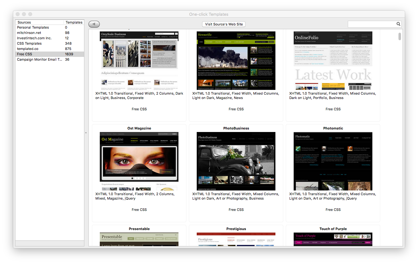
BlueGriffon and Responsive Design: A Practical Guide
Responsive design helps a website adapt to different screen sizes, from wide desktop monitors to phones. BlueGriffon, a visual web editor, can be used to create and edit website pages, but responsive behavior depends mainly on the HTML, CSS, and assets in the project—not on the editor alone.
This guide explains how to approach responsive design in BlueGriffon, what to check as you work, and where testing in a browser remains essential.
What responsive design means
A responsive page adjusts its layout and content to suit the available screen space. A desktop layout might show several columns side by side, while a phone layout stacks those columns vertically. Text should remain readable, images should fit their containers, and navigation should be usable without excessive zooming or horizontal scrolling.
Responsive design commonly relies on three ingredients:
- Flexible layouts: Use relative sizing and layout systems such as Flexbox or CSS Grid instead of relying on fixed pixel widths everywhere.
- Flexible media: Make images and other content fit within their containers.
- Media queries: Apply CSS rules when the viewport meets specified conditions, such as a maximum width.
Set up the page for mobile browsers
For a page to display at its actual device width on many mobile browsers, its document should include a viewport meta tag in the <head> section:
<meta name="viewport" content="width=device-width, initial-scale=1">Without this tag, some mobile browsers may render the page using a wider virtual viewport and scale it down. If you are editing an existing project in BlueGriffon, check the page’s source to see whether the tag is already present before adding another one.
Make images flexible
Large images can cause horizontal scrolling if they extend beyond the screen. A common CSS rule lets images shrink to fit their parent container while preserving their proportions:
img {


  max-width: 100%;


  height: auto;


}
You can add this rule to the page’s stylesheet or an appropriate style block. It is usually better to keep site-wide styling in an external CSS file so it is easier to reuse and maintain.
Use media queries to adjust the layout
Media queries let you change the design at selected viewport widths. For example, a two-column layout could become a single column on narrower screens:
.content-layout {


  display: grid;


  grid-template-columns: 2fr 1fr;


  gap: 2rem;


}


@media (max-width: 700px) {


  .content-layout {


    grid-template-columns: 1fr;


  }


}
The class name in this example must be applied to the relevant HTML element. In BlueGriffon, you can work with the page visually and edit the underlying HTML and CSS as needed. The exact workflow depends on the version and the project’s structure, so check that your changes are being saved to the intended stylesheet.
Choose breakpoints based on when the content starts to feel cramped, rather than targeting a particular phone model. A navigation bar, for example, may need adjustment at a different width from a card grid.
Design with flexible measurements
Fixed pixel dimensions can make a layout difficult to adapt. Consider using percentages, flexible grid tracks, or maximum widths. For example, a centered content area can expand on larger screens while staying within a readable limit:
.page-container {


  width: min(100% - 2rem, 70rem);


  margin-inline: auto;


}
If a project needs to support older browsers, check whether the CSS features you use are supported in the browsers your audience relies on. Simpler percentage-based layouts may be appropriate for legacy projects.
Preview and test beyond the editor
A visual editor can help you build and inspect a page, but its canvas should not be treated as the final authority on how the site will appear. Preview the page in current browsers and test at multiple viewport widths. Browser developer tools can simulate different screen sizes, while testing on real phones and tablets can reveal touch, font, and navigation issues that a desktop preview may not show.
Check for:
- Horizontal scrolling at narrow widths
- Text that is too small or lines that are difficult to read
- Buttons and links that are hard to tap
- Images that appear stretched, cropped, or oversized
- Menus that overlap content or become difficult to use
- Layouts that break when text is enlarged or translated
Common BlueGriffon responsive-design challenges
Responsive design often requires working directly with CSS, even when a page is created in a visual editor. A layout may look correct in the editor but fail at a smaller width if its elements have fixed dimensions or if the stylesheet contains conflicting rules.
When troubleshooting, inspect the page’s HTML and CSS, and use the browser’s developer tools to see which styles are taking effect. Also verify that the page is linked to the stylesheet you are editing. If the project uses a framework or an existing design system, avoid adding rules that conflict with its built-in styles.
BlueGriffon is a legacy web-authoring tool, and its availability and compatibility may vary by operating system and version. For ongoing projects, keep backups of your files and test the finished output in modern browsers. The generated HTML and CSS—not the editor’s visual interface—determine how the site behaves for visitors.
A practical workflow
- Open the project and identify its HTML files and stylesheets.
- Confirm that the document includes the viewport meta tag.
- Make images and other media flexible.
- Use fluid layouts and add media queries where the content needs to change.
- Preview the page at several widths, including narrow phone and wide desktop sizes.
- Test in browsers and on devices, then revise any issues you find.
Conclusion
BlueGriffon can be part of a responsive-design workflow, especially when you are comfortable reviewing the HTML and CSS behind the visual layout. Build with flexible elements, use media queries thoughtfully, and test the actual output in browsers. These habits matter more than any single editor feature—and they help ensure that a website works well across a wide range of screens.
Mastering Responsive Design in BlueGriffon: Top FAQs Answered
- Can BlueGriffon create responsive websites?
- How do I make a BlueGriffon website responsive on mobile devices?
- How do I add a viewport meta tag in BlueGriffon?
- How can I use media queries with BlueGriffon?
- How do I preview a responsive design at different screen sizes in BlueGriffon?
- Why does my BlueGriffon website look different on mobile browsers?
Can BlueGriffon create responsive websites?
Yes, BlueGriffon can be used to create responsive websites, but responsive behavior depends on the HTML and CSS you build into your pages—not just the editor. Use flexible layouts, make images scale to fit, include the viewport meta tag, and add CSS media queries to adjust the design for smaller screens. Preview and test your pages in modern browsers at different screen sizes to make sure everything works as intended.
How do I make a BlueGriffon website responsive on mobile devices?
To make a BlueGriffon website responsive on mobile devices, add the viewport meta tag to the page’s <head>: <meta name="viewport" content="width=device-width, initial-scale=1">. Then use flexible layouts instead of fixed-width elements, make images scale with max-width: 100%; height: auto;, and add CSS media queries to adjust columns, text, and navigation for narrower screens. You can edit the page’s HTML and stylesheet in BlueGriffon, then preview and test the finished site at different screen sizes in modern browsers to catch issues such as horizontal scrolling or hard-to-use menus.
How do I add a viewport meta tag in BlueGriffon?
To add a viewport meta tag in BlueGriffon, open the page’s source or HTML view and insert this tag inside the document’s <head> section: <meta name="viewport" content="width=device-width, initial-scale=1">. Save the page, then preview it in a browser and check it at different screen sizes. If the page already has a viewport tag, edit the existing one rather than adding a duplicate.
How can I use media queries with BlueGriffon?
You can use media queries with BlueGriffon by adding CSS rules to your page’s stylesheet or a style block in the document’s <head>. For example, @media (max-width: 700px) { .content { grid-template-columns: 1fr; } } can change a layout to one column on narrower screens. Apply the matching class to the relevant HTML element, then preview the page at different viewport widths in a browser. Because BlueGriffon’s visual preview may not reflect every browser’s behavior, test the finished page in current browsers and on real devices when possible.
How do I preview a responsive design at different screen sizes in BlueGriffon?
To preview a responsive design in BlueGriffon, use its preview option to open the page in a web browser, then resize the browser window to check how the layout changes at different widths. BlueGriffon’s editing view may not reproduce every device size or browser behavior, so for more precise testing, use your browser’s developer tools to simulate phone and tablet screen sizes. Check that text remains readable, images fit their containers, navigation is usable, and the page doesn’t scroll horizontally.
Why does my BlueGriffon website look different on mobile browsers?
Your BlueGriffon website may look different on mobile because phones have narrower screens, use different browser rendering engines, and may handle fonts, images, and CSS differently than desktop browsers. Check that your page includes the viewport meta tag, such as <meta name="viewport" content="width=device-width, initial-scale=1">, and review your CSS for fixed widths or layouts that don’t adapt to smaller screens. Preview the site at several viewport sizes and test it in mobile browsers; BlueGriffon’s editor preview may not perfectly match the final appearance on a device.