
The Importance of Responsive Design and Development
In today’s digital age, having a responsive website is crucial for businesses to succeed online. Responsive design and development ensure that your website adapts to different screen sizes and devices, providing an optimal user experience for all visitors.
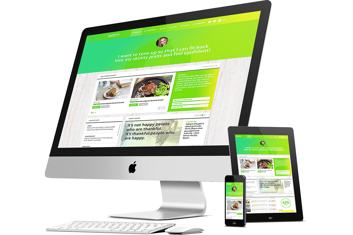
With the increasing use of smartphones and tablets, more people are accessing websites on mobile devices. A responsive website automatically adjusts its layout and content to fit the screen size, whether it’s a desktop computer, a smartphone, or a tablet. This flexibility ensures that users can easily navigate your site and access information without having to pinch and zoom or scroll horizontally.
Responsive design not only improves user experience but also has a positive impact on search engine optimization (SEO). Search engines like Google prioritize mobile-friendly websites in search results, so having a responsive site can help improve your search rankings and drive more traffic to your site.
From a development perspective, implementing responsive design involves using CSS media queries to define different styles for different screen sizes. This allows developers to create fluid layouts that adjust based on the device’s screen width. By using responsive web design techniques, developers can ensure that their websites look great on any device.
Overall, responsive design and development are essential for creating modern websites that provide an optimal user experience across all devices. By investing in responsive design, businesses can attract more visitors, improve their SEO rankings, and ultimately drive more conversions.
Understanding Responsive Design: Key Concepts and FAQs
- What are responsive design techniques?
- Is responsive design UX or UI?
- What is considered responsive design?
- What is responsive design?
- What are the three main elements of responsive design?
- What is responsive web design and development?
What are responsive design techniques?
Responsive design techniques refer to the strategies and approaches used by web developers to create websites that adapt to different screen sizes and devices. These techniques typically involve using CSS media queries, flexible grid layouts, and fluid images to ensure that the design responds to the user’s device. By incorporating responsive design techniques, developers can create websites that provide a consistent and user-friendly experience across desktops, laptops, smartphones, and tablets. This approach not only improves usability but also enhances search engine optimization and helps businesses reach a wider audience in today’s mobile-centric world.
Is responsive design UX or UI?
The question of whether responsive design is UX or UI is a common one in the web development community. In reality, responsive design is more closely related to user experience (UX) than user interface (UI). While UI focuses on the visual elements of a website, such as colors, fonts, and layouts, UX encompasses the overall experience that users have while interacting with a site. Responsive design plays a crucial role in enhancing UX by ensuring that websites are accessible and easy to use across different devices and screen sizes. By prioritizing usability and accessibility, responsive design contributes to a positive user experience, making it an essential aspect of UX design.
What is considered responsive design?
Responsive design refers to a web design approach that aims to create websites that adapt and respond to different screen sizes and devices. In other words, a responsive design ensures that a website’s layout and content adjust dynamically based on the user’s device, whether it’s a desktop computer, a smartphone, or a tablet. This adaptive nature of responsive design allows for an optimal viewing experience, ensuring that users can easily navigate and interact with the website regardless of the device they are using. By incorporating responsive design principles, websites can maintain consistency in design and usability across various platforms, ultimately enhancing user engagement and satisfaction.
What is responsive design?
Responsive design is a web development approach that ensures a website’s layout and content adapt fluidly to different screen sizes and devices. In essence, responsive design allows a website to provide an optimal viewing experience, regardless of whether it is accessed on a desktop computer, smartphone, or tablet. By utilizing flexible grids, images, and CSS media queries, responsive design enables websites to automatically adjust their appearance to fit the screen size, making navigation easy and intuitive for users. This approach not only enhances user experience but also improves search engine rankings by catering to the growing number of mobile users accessing websites on various devices.
What are the three main elements of responsive design?
Responsive design consists of three main elements: fluid grids, flexible images, and media queries. Fluid grids allow the layout of a website to adapt to different screen sizes by using relative units like percentages instead of fixed pixels. Flexible images ensure that images scale proportionally based on the size of the viewport, preventing them from becoming distorted or overflowing their containers. Media queries are CSS rules that allow developers to apply different styles based on the screen size, enabling a website to adjust its layout and design for various devices. These three elements work together to create a responsive website that provides a seamless user experience across desktops, smartphones, and tablets.
What is responsive web design and development?
Responsive web design and development refers to the approach of creating websites that can adapt and respond to various screen sizes and devices. In essence, a responsive website is designed to provide an optimal viewing experience, ensuring that users can easily navigate and interact with the site regardless of whether they are using a desktop computer, smartphone, or tablet. This involves using flexible layouts, fluid images, and CSS media queries to adjust the design and content based on the screen size, ultimately delivering a seamless user experience across different devices.