
The Importance of Web Application Responsive Design
In today’s digital age, more and more people are accessing the internet through various devices, such as smartphones, tablets, and laptops. This shift in user behavior has made responsive design a crucial aspect of web development, especially for web applications.
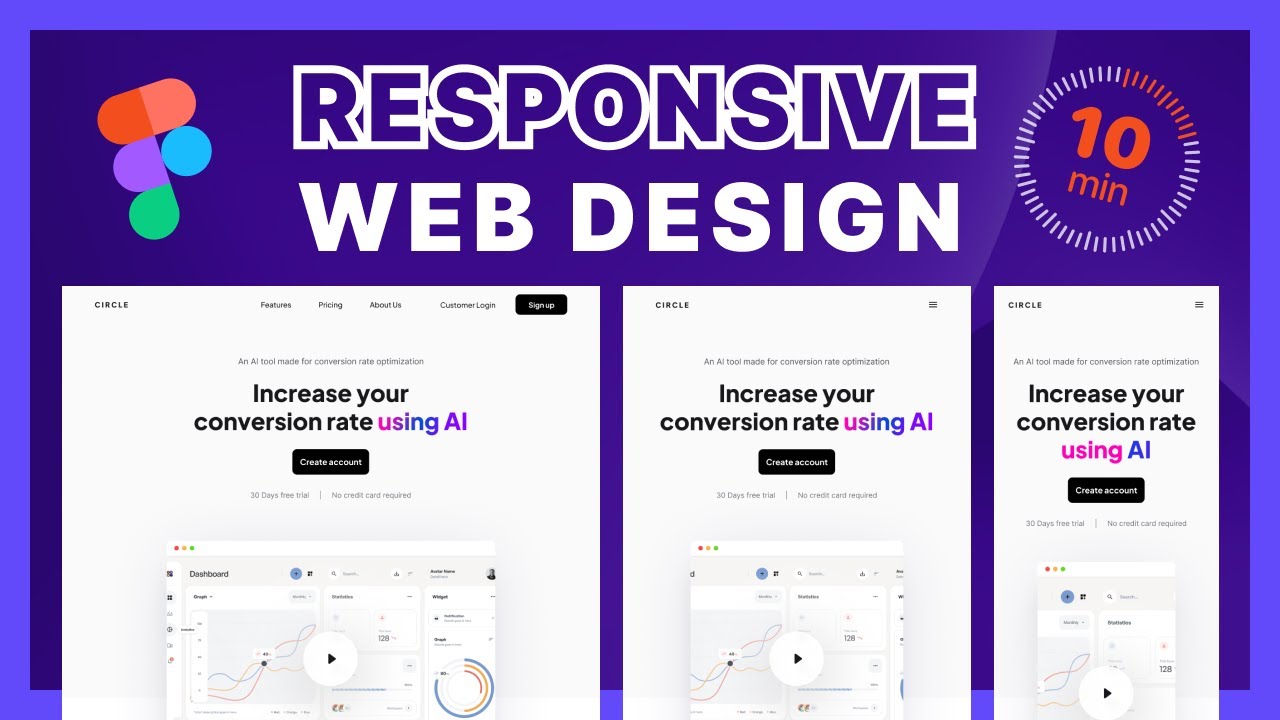
Responsive design is the practice of creating a website or web application that can adapt to different screen sizes and resolutions. This ensures that users have a seamless experience regardless of the device they are using to access the application.
There are several key reasons why responsive design is essential for web applications:
- Improved User Experience: Responsive design allows users to navigate and interact with the web application easily on any device. This leads to higher user satisfaction and engagement.
- Increased Accessibility: By making your web application responsive, you make it accessible to a larger audience. Users can access your application from any device, whether they are at home, work, or on the go.
- SEO Benefits: Search engines like Google prioritize mobile-friendly websites in their search results. Having a responsive design can improve your web application’s search engine ranking and visibility.
- Faster Load Times: Responsive design optimizes your web application for different devices, resulting in faster load times. This is crucial for retaining users and reducing bounce rates.
- Cross-Device Compatibility: With responsive design, you ensure that your web application works seamlessly across all devices and platforms. This consistency enhances the overall user experience.
In conclusion, web application responsive design is no longer just a trend but a necessity in today’s digital landscape. By prioritizing responsiveness in your development process, you can create an engaging and accessible user experience that sets your web application apart from the competition.
6 Essential Tips for Creating a Responsive Web Application Design
- Use a responsive layout that adapts to different screen sizes.
- Optimize images and multimedia for faster loading on mobile devices.
- Prioritize content based on importance for smaller screens.
- Implement touch-friendly elements like larger buttons and input fields.
- Utilize media queries to apply different styles based on screen width.
- Test your web application on various devices and browsers to ensure compatibility.
Use a responsive layout that adapts to different screen sizes.
When implementing web application responsive design, it is crucial to use a responsive layout that adapts to different screen sizes. By creating a layout that adjusts seamlessly to various devices, such as smartphones, tablets, and desktops, you ensure that users have a consistent and user-friendly experience regardless of the device they are using. This approach not only enhances user satisfaction but also improves accessibility and usability, ultimately leading to a more successful web application.
Optimize images and multimedia for faster loading on mobile devices.
Optimizing images and multimedia is a crucial tip for web application responsive design, especially when targeting mobile devices. By reducing the file size of images and videos without compromising quality, you can significantly improve loading times on mobile devices with limited bandwidth and processing power. This optimization not only enhances the user experience by ensuring faster load times but also contributes to lower bounce rates and higher user engagement. Prioritizing image and multimedia optimization is key to creating a seamless and efficient web application experience across all devices.
Prioritize content based on importance for smaller screens.
When implementing web application responsive design, it is crucial to prioritize content based on importance for smaller screens. By focusing on the most essential information and features, you ensure that users on mobile devices can easily access and engage with the core aspects of your application without being overwhelmed by clutter. This approach not only enhances user experience but also improves usability and readability on smaller screens, ultimately leading to higher user satisfaction and engagement.
Implement touch-friendly elements like larger buttons and input fields.
When focusing on web application responsive design, it is crucial to implement touch-friendly elements such as larger buttons and input fields. By making these elements more prominent and easier to tap on mobile devices, you enhance the overall user experience and usability of the application. Users navigating the web application on touchscreens will appreciate the convenience and accuracy that comes with having larger touch targets, ultimately leading to improved engagement and satisfaction with the interface.
Utilize media queries to apply different styles based on screen width.
A crucial tip for effective web application responsive design is to utilize media queries to apply different styles based on screen width. Media queries allow developers to tailor the appearance of the web application to different devices by detecting the screen size and applying specific CSS styles accordingly. By implementing media queries, developers can create a seamless user experience across various devices, ensuring that the web application looks and functions optimally regardless of the screen width. This approach enhances usability and accessibility, ultimately improving user satisfaction and engagement with the application.
Test your web application on various devices and browsers to ensure compatibility.
To ensure the effectiveness of your web application’s responsive design, it is crucial to test it on a variety of devices and browsers. By conducting thorough testing across different platforms, you can identify any compatibility issues and make necessary adjustments to provide a seamless user experience. Testing on various devices and browsers helps ensure that your web application functions correctly and looks visually appealing for all users, regardless of the device they are using to access it.