
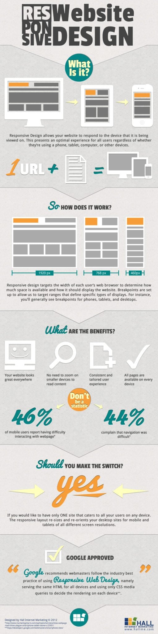
Responsive web design is a crucial aspect of modern website development. With the increasing use of mobile devices to access the internet, it has become essential for websites to adapt to different screen sizes and resolutions. Responsive design ensures that a website looks and functions well on devices of all sizes, from smartphones and tablets to desktop computers.
One of the key benefits of responsive design is improved user experience. A responsive website adjusts its layout and content dynamically based on the device being used, providing a seamless and consistent experience for users across different platforms. This leads to higher engagement, lower bounce rates, and increased conversion rates.
From a development standpoint, responsive design simplifies the process of maintaining a website. Instead of creating separate versions for desktop and mobile users, developers can build a single site that automatically adjusts to fit any screen size. This not only saves time and effort but also reduces the risk of inconsistencies between different versions of the site.
Search engine optimization (SEO) is another area where responsive design plays a crucial role. Google prioritizes mobile-friendly websites in its search results, so having a responsive site can improve your search engine rankings and visibility. Additionally, managing SEO for one website is more efficient than trying to optimize multiple versions for different devices.
In conclusion, responsive web design is no longer optional – it’s a necessity in today’s digital landscape. By creating websites that adapt to the needs of users on various devices, businesses can enhance user experience, streamline development processes, and improve their online visibility through better SEO practices. Embracing responsive design is key to staying competitive in an increasingly mobile-centric world.
Top 5 Benefits of Responsive Web Design: Boost User Experience, Engagement, and SEO
- Improved user experience across all devices
- Higher engagement and lower bounce rates
- Simplified website maintenance with a single responsive design
- Enhanced search engine optimization (SEO) for better rankings
- Adaptability to future devices and screen sizes
Challenges of Responsive Web Design: Navigating Complexity, Performance, Control, and Cost
Improved user experience across all devices
One significant advantage of responsive web design is the enhanced user experience it provides across all devices. By ensuring that a website adapts seamlessly to different screen sizes and resolutions, users can access the site on smartphones, tablets, or desktop computers without any loss of functionality or visual appeal. This consistency in user experience leads to higher engagement, increased satisfaction, and ultimately boosts conversion rates. Responsive design empowers businesses to cater to the diverse needs of their audience, creating a positive and user-friendly interaction regardless of the device being used.
Higher engagement and lower bounce rates
One significant advantage of responsive web design is its ability to drive higher engagement and reduce bounce rates. By providing a seamless and consistent user experience across devices, responsive websites encourage visitors to stay longer and interact more with the content. When users can easily navigate and consume information on any screen size, they are more likely to engage with the site’s features, leading to increased time spent on the site and lower bounce rates. This improved user experience ultimately translates into better retention rates and higher conversion opportunities for businesses.
Simplified website maintenance with a single responsive design
One of the key advantages of implementing responsive design for a website is the simplified website maintenance it offers. By having a single responsive design that automatically adjusts to different screen sizes and devices, developers can streamline the maintenance process. Instead of managing multiple versions of the site for desktop, mobile, and tablet users separately, they can focus on maintaining one cohesive design. This not only saves time and effort but also reduces the chances of inconsistencies between different versions of the site. With a single responsive design, updates and changes can be implemented more efficiently, ensuring a consistent user experience across all devices.
Enhanced search engine optimization (SEO) for better rankings
One significant advantage of responsive web design is its ability to enhance search engine optimization (SEO) and improve website rankings. Search engines like Google prioritize mobile-friendly websites in their search results, rewarding sites that provide a seamless user experience across different devices. By implementing responsive design, websites can ensure that they are accessible and user-friendly on smartphones, tablets, and desktops, which can positively impact their SEO performance. This leads to better visibility in search engine results pages, increased organic traffic, and ultimately, a higher chance of reaching and engaging with a wider audience online.
Adaptability to future devices and screen sizes
One significant advantage of responsive web design is its adaptability to future devices and screen sizes. By creating a website that can fluidly adjust to different screen resolutions and devices, businesses can future-proof their online presence. As new technologies emerge and consumer habits evolve, a responsive site ensures that the user experience remains consistent and optimal across all platforms. This flexibility not only enhances usability but also saves time and resources in the long run by eliminating the need for frequent redesigns or separate mobile versions. Responsive design allows websites to seamlessly transition into the ever-changing landscape of digital devices, ensuring that they remain relevant and accessible to users regardless of how technology advances.
Complexity
One significant drawback of responsive web design is the added complexity it brings to the development process. Implementing responsive design requires meticulous planning and thorough testing to ensure that the website performs consistently across a wide range of devices. Developers must consider factors such as screen size, resolution, and device capabilities when designing a responsive site, which can lead to increased development time and effort. Managing the intricacies of responsive design demands a high level of expertise and attention to detail to avoid issues such as layout inconsistencies or performance problems on certain devices. Despite its benefits, the complexity associated with responsive design can pose challenges for developers and require additional resources to ensure optimal functionality across all platforms.
Performance Issues
One significant drawback of implementing responsive design on a website is the potential for performance issues. Adapting a site to different screen sizes and resolutions can result in increased loading times, particularly on older devices or with limited internet connectivity. The additional code and resources needed to make a website responsive may strain the device’s processing power and slow down the loading speed. This can negatively impact user experience, as visitors may become frustrated with long wait times and choose to navigate away from the site. It is crucial for developers to find a balance between responsiveness and performance optimization to ensure that the website remains fast and accessible across all devices.
Limited Control
One significant drawback of responsive web design is the limited control that designers may encounter when trying to customize the layout and appearance of a website. Adhering strictly to responsive design principles can sometimes restrict the level of creativity and flexibility that designers have in shaping the visual elements of a site. Designers may find it challenging to achieve certain intricate design features or unique layouts while ensuring that the site remains fully responsive across different devices. This limitation can be frustrating for designers who value creative freedom and may require them to find alternative solutions or compromises to maintain both aesthetics and responsiveness in their designs.
Cost
One significant drawback of responsive web design is the cost involved. Developing a responsive website can be more expensive than creating separate desktop and mobile versions, especially for complex or highly customized designs. The intricacies of ensuring that a website functions seamlessly across various devices and screen sizes require additional time and resources, which can result in higher development costs. For businesses with limited budgets or specific design requirements, the initial investment needed to implement responsive design may pose a financial challenge. Despite the long-term benefits of improved user experience and SEO, the upfront cost of developing a responsive website remains a notable con for some organizations.