
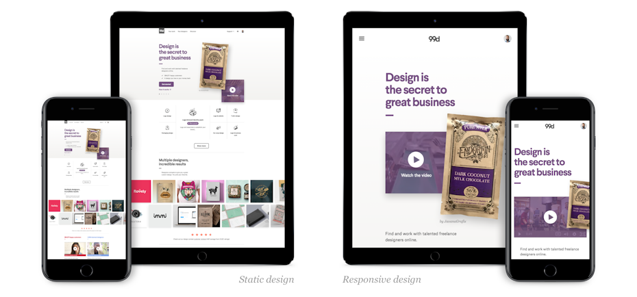
The Importance of Responsive Web Design
In today’s digital age, having a responsive website design is crucial for businesses looking to succeed online. Responsive web design ensures that your website adapts to different screen sizes and devices, providing a seamless user experience across desktops, laptops, tablets, and smartphones.
One of the main benefits of responsive web design is improved user experience. When visitors can easily navigate and interact with your site on any device, they are more likely to stay longer and engage with your content. This can lead to lower bounce rates and higher conversion rates, ultimately boosting your online presence and revenue.
Additionally, responsive web design is essential for search engine optimization (SEO). Search engines like Google prioritize mobile-friendly websites in their search results, meaning that having a responsive design can help improve your site’s visibility and ranking. By catering to mobile users, you can reach a larger audience and drive more organic traffic to your site.
Furthermore, maintaining a single responsive website is more cost-effective than creating separate desktop and mobile versions. With a responsive design, you only need to manage one set of content and codebase, simplifying updates and reducing maintenance time and costs.
In conclusion, responsive web design is no longer optional – it’s a necessity for businesses looking to thrive in the digital landscape. By investing in a responsive website that provides an optimal user experience across all devices, you can attract more visitors, improve search engine rankings, and achieve greater online success.
7 Essential Tips for Creating a Responsive Website Design
- Ensure your website is mobile-friendly for various screen sizes.
- Use responsive design frameworks like Bootstrap or Foundation for consistency.
- Optimize images and videos for faster loading times on all devices.
- Prioritize content hierarchy to maintain readability on smaller screens.
- Implement touch-friendly elements such as larger buttons and clickable areas.
- Test your website on different devices and browsers to ensure compatibility.
- Consider using media queries to customize styles based on screen dimensions.
Ensure your website is mobile-friendly for various screen sizes.
It is essential to ensure that your website is mobile-friendly and responsive to various screen sizes. By optimizing your site for mobile devices, you can provide a seamless user experience across smartphones and tablets, allowing visitors to easily access and navigate your content on the go. This not only enhances user engagement but also improves your site’s visibility in search engine results, ultimately driving more traffic and increasing conversions. Prioritizing mobile-friendliness is key to staying competitive in today’s digital landscape and catering to the growing number of users accessing websites on their mobile devices.
Use responsive design frameworks like Bootstrap or Foundation for consistency.
When implementing responsive web design, it is highly recommended to utilize responsive design frameworks such as Bootstrap or Foundation. These frameworks provide a solid foundation of pre-built components and styles that are designed to be responsive across various devices. By using these frameworks, you can ensure consistency in design and functionality throughout your website, making it easier to create a cohesive and user-friendly experience for visitors on desktops, laptops, tablets, and smartphones. Additionally, responsive design frameworks help streamline the development process by offering ready-to-use elements that can be customized to fit your specific needs, saving time and effort in creating a responsive website.
Optimize images and videos for faster loading times on all devices.
To enhance the performance of your responsive website design, it is essential to optimize images and videos for faster loading times on all devices. By reducing the file sizes of media assets without compromising quality, you can ensure that your website loads quickly and smoothly across desktops, laptops, tablets, and smartphones. This optimization not only improves user experience by minimizing wait times but also contributes to better SEO rankings and increased user engagement. Remember, efficient image and video optimization are key components of a successful responsive web design strategy.
Prioritize content hierarchy to maintain readability on smaller screens.
When implementing responsive web design, it is crucial to prioritize content hierarchy to ensure readability on smaller screens. By organizing content based on importance and relevance, you can maintain a clear and concise layout that adapts well to various screen sizes. This approach not only enhances user experience by making it easier for visitors to consume information but also improves the overall usability of your website on mobile devices. Prioritizing content hierarchy in responsive design is key to keeping users engaged and ensuring that your message is effectively communicated across all devices.
Implement touch-friendly elements such as larger buttons and clickable areas.
When designing a responsive website, it is essential to implement touch-friendly elements such as larger buttons and clickable areas. By making buttons and interactive elements bigger and easier to tap on mobile devices, you can enhance the user experience for touchscreen users. This simple adjustment can help prevent accidental clicks, improve navigation, and make it easier for visitors to interact with your site on smartphones and tablets. Prioritizing touch-friendly design elements ensures that your website is accessible and user-friendly across all devices, ultimately leading to increased engagement and conversions.
Test your website on different devices and browsers to ensure compatibility.
To ensure that your website is responsive and user-friendly across various devices and browsers, it is essential to test it thoroughly. By testing your site on different devices such as desktops, laptops, tablets, and smartphones, you can identify any layout or functionality issues and make necessary adjustments. Additionally, testing on various browsers like Chrome, Firefox, Safari, and Edge helps ensure that your website displays correctly and functions properly for all users. By conducting comprehensive testing, you can guarantee that your responsive web design delivers a seamless experience for visitors regardless of the device or browser they are using.
Consider using media queries to customize styles based on screen dimensions.
Consider using media queries to customize styles based on screen dimensions when implementing responsive web design. Media queries allow you to target specific screen sizes and apply different CSS styles accordingly, ensuring that your website looks and functions optimally on various devices. By utilizing media queries effectively, you can create a seamless and user-friendly experience for visitors across desktops, laptops, tablets, and smartphones. Customizing styles based on screen dimensions through media queries is a powerful technique that can help you achieve a visually appealing and responsive design for your website.