
Responsive Design Services: Creating Better Experiences on Every Screen
People visit websites on phones, tablets, laptops, and desktop computers. A site that looks polished on a large monitor may be difficult to use on a smaller screen if its layout and features do not adapt. Responsive design services help businesses create websites that adjust to different devices, screen sizes, and ways of interacting.
What Are Responsive Design Services?
Responsive design services cover the planning, design, and development needed to make a website work well across a range of devices. Rather than creating a separate site for every screen size, a responsive website uses flexible layouts and adaptable elements to provide a consistent experience.
These services may include a new website design, updates to an existing site, mobile usability improvements, or ongoing testing and maintenance. The scope depends on the website’s goals, platform, content, and technical requirements.
What Responsive Design Services Typically Include
- Responsive layouts: Page elements rearrange or resize to fit different screens.
- Mobile-friendly navigation: Menus and links are designed to be easy to find and use on touchscreens.
- Flexible images and media: Visual content scales appropriately without becoming distorted or overflowing its layout.
- Readable typography: Text sizing, spacing, and line lengths are adjusted for comfortable reading.
- Touch-friendly controls: Buttons, forms, and interactive elements are sized and spaced for practical use on mobile devices.
- Performance improvements: Images, scripts, and page components may be optimized to support faster loading.
- Cross-device testing: Pages are checked at different screen sizes and in commonly used browsers.
- Accessibility considerations: Design and development choices can support keyboard navigation, readable contrast, and assistive technologies.
Why Responsive Design Matters
A responsive website makes it easier for visitors to find information and complete tasks, whether they are browsing on a phone or sitting at a computer. Clear navigation, readable content, and usable forms can reduce friction and help visitors stay engaged.
Responsive design can also simplify website management. With one adaptable website, businesses generally do not need to maintain separate desktop and mobile versions of the same content. This can make updates more consistent and reduce duplicated work.
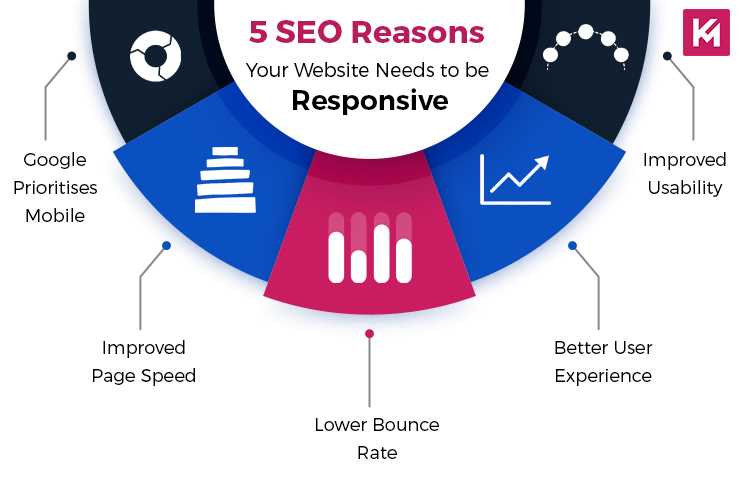
Search engines use mobile versions of websites when evaluating and indexing content. A mobile-friendly experience can therefore support search visibility, although responsive design alone does not guarantee rankings. Site quality, relevant content, performance, and many other factors also matter.
How a Responsive Design Project Works
- Discovery: The project begins with a review of business goals, target audiences, existing content, and technical requirements.
- Planning: The site structure and key user journeys are mapped out, with attention to how content will work on smaller screens.
- Design: Layouts, navigation, typography, and interactive elements are planned for a consistent experience across devices.
- Development: The approved design is built using flexible layouts and adaptable components.
- Testing: Pages are checked across screen sizes, browsers, and device types. Forms, menus, links, and other features are tested as well.
- Launch and maintenance: After launch, ongoing reviews can help keep the website compatible with new devices, browsers, and content needs.
Choosing a Responsive Design Services Provider
When comparing providers, look for clear examples of responsive work and ask how the design will be tested. A portfolio should show more than attractive desktop screenshots; it should demonstrate thoughtful layouts and usable features on mobile devices, too.
It is also useful to discuss project scope, accessibility, performance, content management, and post-launch support. Ask how revisions are handled and what deliverables are included. A well-defined process can help keep expectations, timelines, and responsibilities clear.
Responsive Design Is an Ongoing Commitment
Responsive design is not simply a matter of shrinking a desktop layout to fit a phone. It requires careful decisions about content, navigation, performance, and usability. As websites change and new devices appear, regular testing and updates help ensure the experience remains effective.
With the right responsive design services, businesses can create websites that are easier to use, maintain, and adapt—giving visitors a more consistent experience wherever they choose to browse.
6 Benefits of Responsive Web Design Services
- Works across phones, tablets, and desktops
- Improves mobile usability
- Creates a consistent brand experience
- Makes content easier to read
- Simplifies website maintenance
- Can support better search visibility
6 Drawbacks of Responsive Design Services
- Can be costly to implement.
- May take longer than expected.
- Requires testing across many devices.
- Complex layouts can be challenging to adapt.
- Ongoing updates may be necessary.
- Poor execution can affect loading speed.
Works across phones, tablets, and desktops
Responsive design services help a website work smoothly across phones, tablets, and desktop computers. Layouts, images, text, and navigation adjust to fit different screen sizes, so visitors can browse and use key features without pinching, zooming, or struggling with hard-to-tap controls. This consistent experience makes it easier for people to access your content wherever they are.
Improves mobile usability
Responsive design services improve mobile usability by making websites easier to read, navigate, and interact with on smaller screens. Text stays legible, menus are simpler to use, and buttons and forms are better suited to touch controls. By reducing the need to zoom, scroll sideways, or struggle with awkward layouts, a responsive website helps mobile visitors find information and complete tasks with less frustration.
Creates a consistent brand experience
Responsive design services help create a consistent brand experience by keeping your website’s visual identity and messaging cohesive across phones, tablets, and computers. Colors, fonts, imagery, and key design elements adapt to each screen while still feeling unmistakably like your brand. This consistency helps visitors recognize your business, builds trust, and makes it easier for them to move between devices without feeling as though they have landed on a different website.
Makes content easier to read
Responsive design services make content easier to read by adapting text, spacing, and page layouts to each screen size. On a phone, visitors can read comfortable-sized text without pinching to zoom or scrolling sideways, while headings, paragraphs, and images remain clearly organized. This makes it easier for people to find information and enjoy a consistent reading experience on any device.
Simplifies website maintenance
Responsive design services simplify website maintenance by creating a single site that adapts to phones, tablets, and desktop screens. Instead of managing separate desktop and mobile versions, your team can update content, fix issues, and add features in one place. This helps keep information consistent across devices, reduces duplicated work, and makes ongoing maintenance more efficient.
Can support better search visibility
Responsive design services can support better search visibility by helping a website deliver a consistent, mobile-friendly experience across phones, tablets, and desktops. Search engines consider mobile usability and page experience among many ranking factors, so responsive layouts, readable content, and easy-to-use navigation can help visitors engage with a site. Responsive design alone does not guarantee higher rankings, but it can provide a stronger foundation for search optimization.
Can be costly to implement.
Responsive design services can be costly to implement, especially when a website has many pages, complex features, or an outdated structure that needs a major overhaul. The work may involve design, development, content adjustments, and testing across multiple devices and browsers. While these costs can be a barrier for businesses with limited budgets, careful planning and prioritizing the most important improvements can help keep the project manageable.
May take longer than expected.
Responsive design services may take longer than expected because each page and feature needs to work across a range of screen sizes, browsers, and devices. Testing can reveal layout issues, navigation problems, or performance concerns that require additional revisions. The timeline may also grow if the project involves complex functionality, changing requirements, or content that needs to be reorganized for mobile use. Clear goals, a detailed scope, and regular communication can help keep the work on track, though flexibility is often important.
Requires testing across many devices.
One drawback of responsive design services is the need to test a website across many devices, screen sizes, browsers, and operating systems. A layout or feature that works well on one phone may look awkward or behave differently on another, so thorough testing can take extra time and increase project costs. Ongoing checks are also important as new devices and browser updates become available.
Complex layouts can be challenging to adapt.
Complex layouts can be challenging to adapt across screen sizes because elements that work well on a desktop may feel crowded or confusing on a phone. Designers may need to rethink how content is arranged, simplify certain features, or create alternate ways to display information while preserving the site’s purpose and visual identity. This can require extra planning, development, and testing, especially for websites with detailed charts, layered navigation, or many interactive components.
Ongoing updates may be necessary.
One potential drawback of responsive design services is the need for ongoing updates. New devices, screen sizes, browsers, and software changes can affect how a website looks and works, so regular testing and adjustments may be needed to keep the experience consistent. Businesses should also review new content and features to ensure they display properly across devices, which can add to long-term maintenance costs and workload.
Poor execution can affect loading speed.
Poorly executed responsive design can slow down a website, especially when pages load oversized images, unnecessary scripts, or separate assets for different devices. Visitors on mobile connections may notice longer wait times, which can make the site frustrating to use and increase the chance they leave before it loads. Optimizing images, limiting extra code, and testing performance across screen sizes can help prevent these issues.