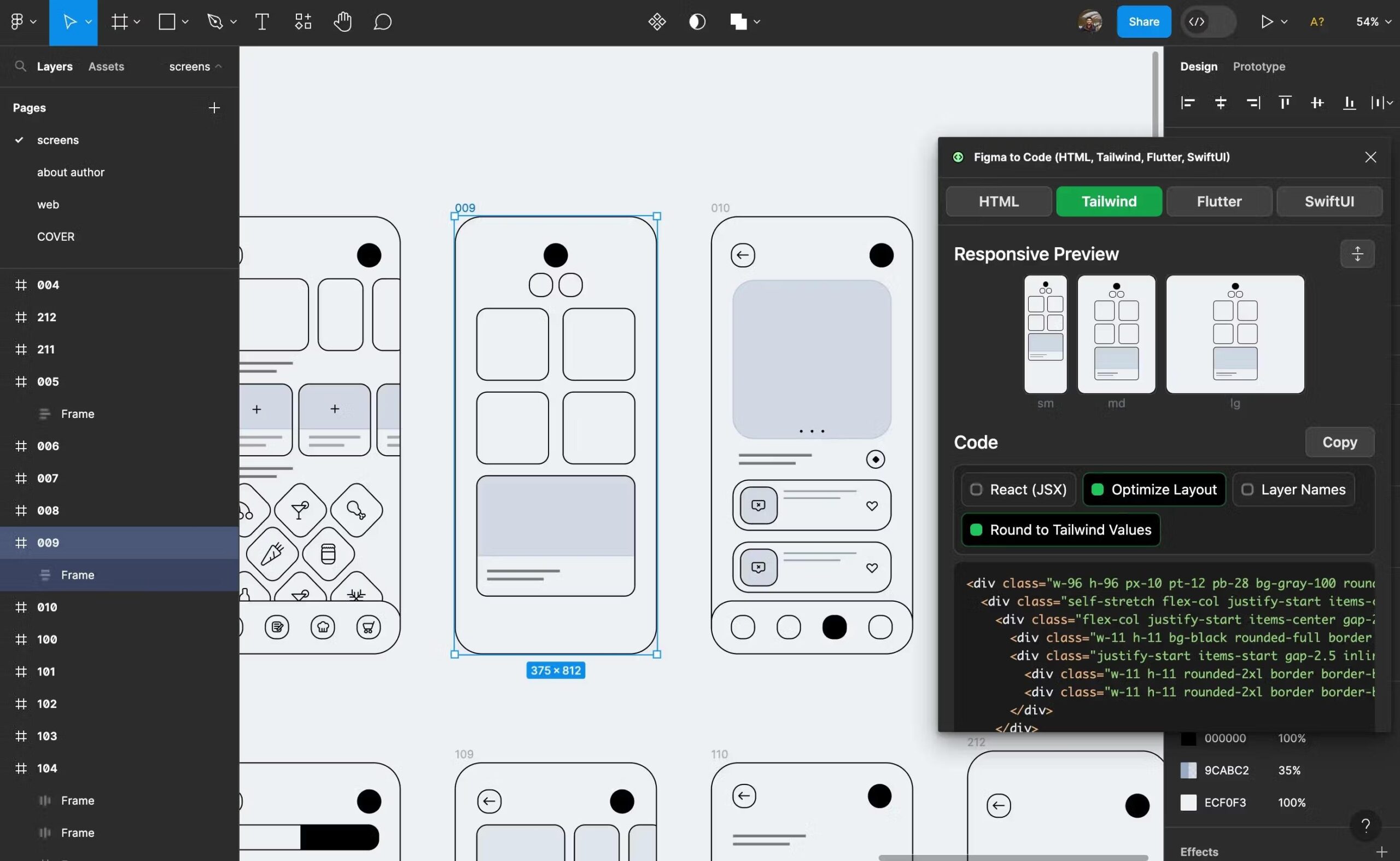
responsive web design in figma

Responsive Web Design in Figma: A Practical Guide for Flexible Layouts

Responsive Web Design in Figma: A Practical Guide Responsive web design helps a website adapt to different screen sizes, from wide desktop monitors to small mobile phones. Figma makes it ... Read MoreRead More
0 Comments
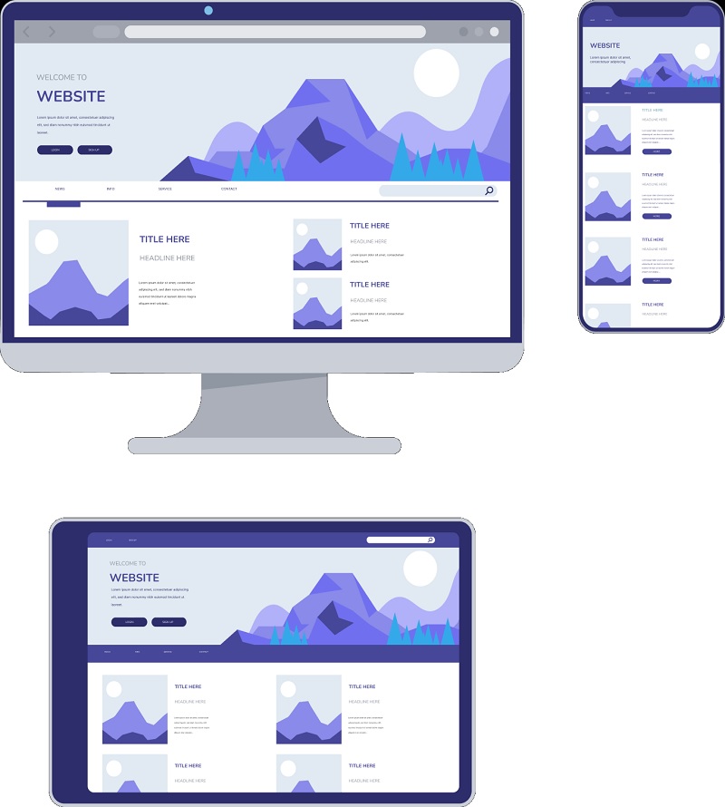
responsive design services

Responsive Design Services for a Seamless Experience on Every Device

Responsive Design Services: Creating Better Experiences on Every Screen People visit websites on phones, tablets, laptops, and desktop computers. A site that looks polished on a large monitor may be ... Read MoreRead More

0 Comments
angular responsive web design

Angular Responsive Web Design: A Practical Guide to Building Adaptable Interfaces

Angular Responsive Web Design: A Practical Guide Responsive web design helps a website adapt to different screen sizes, from small phones to large desktop monitors. In an Angular application, the ... Read MoreRead More

0 Comments
responsive design ethan marcotte

Responsive Design and Ethan Marcotte: The Principles That Shaped the Modern Web

Responsive Design and Ethan Marcotte: The Idea That Changed the Web Today, people browse the web on phones, tablets, laptops, desktops, and screens of many other sizes. A website needs ... Read MoreRead More

0 Comments
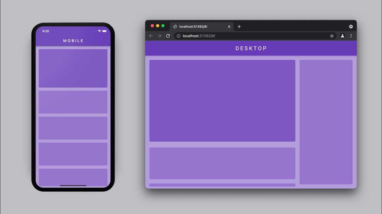
flutter web responsive design

Flutter Web Responsive Design: A Practical Guide to Building Flexible Layouts

Flutter Web Responsive Design: A Practical Guide Responsive design helps a website adapt to different screen sizes, input methods, and browsing contexts. With Flutter, developers can build web experiences from ... Read MoreRead More

0 Comments