
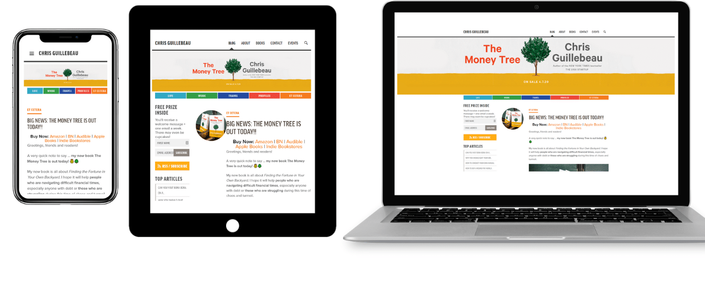
Responsive Design: A Practical Guide to Building Websites for Every Screen
People browse the web on phones, tablets, laptops, desktops, and other devices, often switching between them throughout the day. Responsive design helps a website adapt to different screen sizes and ways of interacting, so visitors can read, navigate, and use it comfortably wherever they are.
The phrase “responsive design W3” may refer to resources about responsive web design from W3Schools, or to web standards published by the World Wide Web Consortium (W3C). These are separate organizations: W3Schools is a web-development learning site, while the W3C develops standards and guidance for the web. The principles in this guide apply broadly to modern website development.
What Is Responsive Design?
Responsive web design is an approach to building websites that adjust their layout and presentation to suit the visitor’s screen and browsing context. Rather than creating a separate site for every device, developers use flexible layouts, adaptable media, and CSS rules to make one website work across a range of screen sizes.
A responsive page might show a three-column layout on a wide monitor, a two-column layout on a tablet, and a single column on a phone. Navigation may also change to fit a smaller screen, while images resize to avoid overflowing their containers.
Core Principles of Responsive Web Design
Fluid layouts
Fluid layouts use flexible measurements, such as percentages or fractional grid units, instead of relying entirely on fixed pixel widths. This lets page sections expand or contract with the available space.
.container {


  width: min(100% - 2rem, 72rem);


  margin-inline: auto;


}
This example gives the content room to shrink on small screens while keeping it from becoming excessively wide on larger displays.
Flexible images and media
Images and other media should fit within their containers. A common baseline is:
img,


video {


  max-width: 100%;


  height: auto;


}
For art direction or different image sizes, HTML features such as <picture> and srcset can help browsers choose an appropriate image for the screen and resolution.
Media queries
CSS media queries apply styles when particular conditions are met, such as a minimum viewport width or a preference for reduced motion. They are often used to refine a layout when it no longer has enough room.
.card-list {


  display: grid;


  grid-template-columns: 1fr;


  gap: 1rem;


}


@media (min-width: 48rem) {


  .card-list {


    grid-template-columns: repeat(2, 1fr);


  }


}


@media (min-width: 72rem) {


  .card-list {


    grid-template-columns: repeat(3, 1fr);


  }


}
The breakpoints in this example are design choices, not universal device categories. It is usually better to add a breakpoint when the content needs one than to target a specific phone or tablet model.
Include the Viewport Meta Tag
For mobile browsers to display a page at the intended scale, include the viewport meta tag in the document’s <head>:
<meta name="viewport" content="width=device-width, initial-scale=1">Without it, some mobile browsers may render the page using a wider virtual viewport and scale the result down, making text and controls difficult to use.
Why Responsive Design Matters
- Better usability: Visitors can read content and interact with controls without unnecessary zooming or horizontal scrolling.
- More consistent experiences: A single site can serve users across many devices and screen sizes.
- Easier maintenance: One responsive website is often simpler to update than several separate device-specific versions.
- Accessibility support: Thoughtful layouts, readable text, and usable controls can benefit people with different needs and browsing preferences.
- Search and sharing clarity: A unified URL structure can make it easier to manage and share pages. Responsive design alone, however, does not guarantee higher search rankings.
Responsive Design and Accessibility
A layout that fits a screen is not automatically accessible. Make sure text remains readable when users zoom in, controls have clear labels, and interactive elements can be reached by keyboard. Avoid conveying important information through color alone, and test pages with assistive technologies where possible.
Pay attention to touch targets as well. Buttons and links should be large enough and spaced well enough to activate comfortably on touchscreens, without making the page difficult to use with a mouse or keyboard.
How to Test a Responsive Website
- Resize the browser: Check the page at narrow, medium, and wide viewport sizes, not only at common device presets.
- Test real devices: Emulators are useful, but real phones and tablets can reveal issues with touch, text rendering, and browser behavior.
- Check for horizontal scrolling: Look for content that extends beyond the viewport, such as wide tables, long code samples, or oversized images.
- Test zoom and text resizing: Confirm that content remains available when users enlarge text or zoom into the page.
- Review navigation and forms: Make sure menus, buttons, input fields, and error messages remain usable at every size.
- Use browser developer tools: Responsive design modes can help identify layout problems and inspect how CSS changes at different widths.
Common Responsive Design Mistakes
- Using fixed widths that cause content to overflow on narrow screens.
- Choosing breakpoints based only on popular device dimensions rather than the needs of the layout.
- Hiding important content on mobile instead of presenting it in a more suitable format.
- Using text or controls that are too small to read or operate comfortably.
- Testing only the homepage while overlooking forms, tables, menus, and other page types.
- Assuming that a responsive layout is automatically fast, accessible, or easy to use.
Getting Started
When building a responsive site, start with the content and the smallest practical layout. Use semantic HTML, flexible sizing, and a viewport meta tag, then add CSS breakpoints as the design requires them. Test regularly while developing instead of waiting until the site is complete.
For learning materials, W3Schools offers tutorials and examples on responsive web design, HTML, and CSS. For authoritative guidance on web technologies and standards, consult the W3C. Whichever resources you use, test examples in current browsers and adapt them to your project’s content and accessibility requirements.
Conclusion
Responsive design is a practical way to make websites work across a wide variety of screens and devices. By combining flexible layouts, adaptable media, carefully chosen CSS breakpoints, and thorough testing, developers can create experiences that remain useful and readable as the viewing environment changes. The goal is not simply to make a page fit a screen—it is to make the page work well for the people using it.
Responsive Web Design FAQs: W3Schools, HTML, CSS, and W3C Explained
- What is responsive web design according to W3Schools?
- How do I make a website responsive using HTML and CSS?
- What does the viewport meta tag do in responsive design?
- How do CSS media queries work in responsive web design?
- What is the difference between responsive design and adaptive design?
- How can I test whether a website is responsive on different devices?
- Is W3Schools the same as the W3C?
What is responsive web design according to W3Schools?
According to W3Schools, responsive web design is an approach that uses HTML and CSS to make a website adapt to different screen sizes and devices. Elements may resize, rearrange, or adjust their presentation so the site remains easy to view and use on phones, tablets, and desktop computers.
How do I make a website responsive using HTML and CSS?
To make a website responsive with HTML and CSS, start with semantic HTML and add the viewport meta tag—<meta name="viewport" content="width=device-width, initial-scale=1">—inside the page’s <head>. Use flexible layouts with CSS Grid or Flexbox, relative units such as percentages and rem, and ensure images scale with max-width: 100%; height: auto;. Then add CSS media queries where the layout needs to change, such as stacking columns on narrow screens or adjusting navigation and font sizes. Test the page at different viewport widths, with browser developer tools and real devices, and check that content remains readable and usable without horizontal scrolling.
What does the viewport meta tag do in responsive design?
The viewport meta tag tells a mobile browser how to size and scale a webpage to fit the device’s screen. Adding <meta name="viewport" content="width=device-width, initial-scale=1"> makes the page’s CSS viewport match the device’s width and sets the initial zoom to 100%. This helps responsive layouts and media queries display as intended, rather than appearing as a zoomed-out desktop page.
How do CSS media queries work in responsive web design?
CSS media queries let a website apply different styles when the browser or device meets specified conditions, such as a minimum viewport width, screen orientation, or reduced-motion preference. In responsive web design, they’re commonly used to adjust layouts as available space changes—for example, switching a navigation menu from a stacked layout on narrow screens to a horizontal layout on wider screens. Add a media query with the `@media` rule, and place the styles inside it; choose breakpoints based on when the content needs to change rather than targeting specific devices.
What is the difference between responsive design and adaptive design?
Responsive design uses flexible layouts, images, and CSS media queries to adjust continuously as the available screen space changes. Adaptive design typically uses a set of predefined layouts for specific screen sizes or breakpoints, then displays the layout that best matches the device or viewport. Both approaches can make a website work well across devices: responsive design emphasizes fluid flexibility, while adaptive design offers more targeted control over layouts at selected sizes.
How can I test whether a website is responsive on different devices?
To test whether a website is responsive, open it at different viewport sizes using your browser’s developer tools, then check it on real phones and tablets when possible. Look for layouts that adjust naturally, readable text, usable navigation and buttons, images that scale correctly, and pages without unwanted horizontal scrolling. Test both portrait and landscape orientations, try zooming in, and check key pages such as forms and menus—not just the homepage. Browser emulation is helpful, but real-device testing can reveal touch and browser-specific issues that a resized desktop window may miss.
Is W3Schools the same as the W3C?
No, W3Schools and the W3C are different organizations. W3Schools is an independent educational website that offers tutorials and examples on web technologies, including responsive design. The World Wide Web Consortium (W3C) is an international standards organization that develops recommendations and guidelines for the web, including standards related to HTML, CSS, and accessibility. W3Schools can be useful for learning, while the W3C is a primary source for web standards and guidance.