
Responsive Design Layout: Creating a Seamless User Experience Across Devices
In today’s digital age, the importance of responsive design layout cannot be overstated. With the proliferation of smartphones, tablets, and various other devices with different screen sizes and resolutions, it has become crucial for websites to adapt and provide a seamless user experience regardless of the device being used.
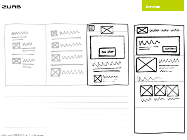
Responsive design layout is a design approach that allows websites to dynamically adjust their layout and content based on the screen size and orientation of the device being used. This ensures that users have optimal viewing and interaction experiences, whether they are accessing the website on a desktop computer, laptop, tablet, or smartphone.
One of the key principles of responsive design layout is fluid grids. Instead of using fixed pixel measurements for layout elements, designers use percentages or em units to define widths and heights. This allows elements to resize proportionally based on the screen size, ensuring that content remains readable and visually appealing across devices.
Media queries are another essential component of responsive design layout. These CSS rules allow designers to apply specific styles based on factors such as screen width, orientation, and resolution. By using media queries, designers can create different layouts for different devices without having to create separate websites or apps.
Flexible images and media are also critical in responsive design layout. Images and videos need to adapt to different screen sizes without losing quality or breaking the layout. Using CSS properties like max-width: 100% ensures that images scale down proportionally to fit smaller screens while maintaining their aspect ratio.
In conclusion, responsive design layout is essential for creating a positive user experience across devices. By implementing fluid grids, media queries, and flexible media elements, designers can ensure that their websites look great and function seamlessly on any device. Embracing responsive design layout not only benefits users but also helps businesses reach a wider audience and stay ahead in today’s competitive digital landscape.
5 Essential Tips for Creating an Effective Responsive Design Layout
- Use a mobile-first approach when designing your layout.
- Utilize media queries to adjust the layout based on different screen sizes.
- Ensure that images and videos are responsive and scale well on all devices.
- Keep the design clean and simple to improve user experience on smaller screens.
- Test your responsive design across various devices and browsers to ensure compatibility.
Use a mobile-first approach when designing your layout.
When implementing responsive design layout, it is highly recommended to adopt a mobile-first approach. This strategy involves designing the website layout with the smallest screen sizes in mind first, then progressively enhancing the layout for larger screens. By starting with a mobile-first approach, designers prioritize essential content and functionality, ensuring that the website delivers a user-friendly experience on smartphones and other mobile devices. This approach not only improves performance and load times on smaller screens but also helps create a more streamlined and efficient design that adapts seamlessly to larger screens. Embracing a mobile-first approach in responsive design layout can lead to better user engagement and satisfaction across all devices.
Utilize media queries to adjust the layout based on different screen sizes.
One effective tip for implementing responsive design layout is to utilize media queries to adjust the layout based on different screen sizes. By using CSS rules within media queries, designers can create specific styles that are applied when the website is viewed on devices of varying dimensions. This allows for a tailored user experience, ensuring that content is displayed optimally and that the layout remains visually appealing across a range of screens, from desktops to smartphones. Media queries empower designers to fine-tune the design elements and optimize the user interface for different devices, ultimately enhancing usability and accessibility for all users.
Ensure that images and videos are responsive and scale well on all devices.
In responsive design layout, it is crucial to ensure that images and videos are responsive and scale well on all devices. By using CSS properties such as max-width: 100%, designers can make sure that images and videos adapt to different screen sizes without losing quality or breaking the layout. This approach allows for a seamless user experience, where visual content remains clear and visually appealing across various devices, enhancing the overall usability and accessibility of the website.
Keep the design clean and simple to improve user experience on smaller screens.
When implementing responsive design layout, it is crucial to keep the design clean and simple to enhance the user experience on smaller screens. By minimizing clutter and focusing on essential elements, users navigating the website on smartphones or tablets can easily find and interact with the content they need. A clean and simple design not only improves readability and navigation but also ensures that the website loads quickly and efficiently on mobile devices. Prioritizing simplicity in design allows for a more intuitive and user-friendly experience, ultimately leading to increased engagement and satisfaction among visitors accessing the site on smaller screens.
Test your responsive design across various devices and browsers to ensure compatibility.
To ensure the effectiveness of your responsive design layout, it is crucial to test it across a range of devices and browsers. By doing so, you can identify any potential issues or inconsistencies in how your website displays and functions on different platforms. Testing on devices with varying screen sizes and resolutions, as well as different web browsers, helps ensure that your website provides a seamless user experience for all visitors. This thorough testing process allows you to make necessary adjustments and optimizations to guarantee compatibility and usability across the board.