
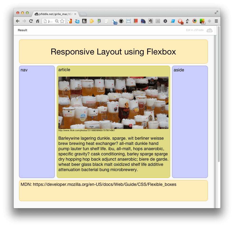
Responsive web design is a crucial aspect of modern web development, ensuring that websites look and function well on a variety of devices, from desktop computers to smartphones and tablets. One valuable resource for learning about responsive web design is MDN Web Docs.
MDN Web Docs offers comprehensive information and guidance on responsive web design principles, techniques, and best practices. By following the resources provided by MDN, web developers can create websites that adapt smoothly to different screen sizes and resolutions.
One key concept in responsive web design is the use of flexible layouts and images. With CSS media queries, developers can define different styles for various screen sizes, allowing content to reflow and adjust dynamically. This approach ensures that users have a consistent and optimized experience regardless of the device they are using.
MDN Web Docs also covers topics such as viewport meta tags, which help control how a webpage is displayed on mobile devices, as well as responsive typography techniques for ensuring text remains readable across different screen sizes.
In addition to technical guidance, MDN Web Docs provides practical examples and code snippets that developers can use to implement responsive design features in their projects. By leveraging the resources available on MDN, developers can stay up-to-date with the latest trends in responsive web design and create websites that deliver an exceptional user experience across all devices.
Overall, MDN Web Docs is a valuable resource for anyone looking to enhance their skills in responsive web design. With its comprehensive documentation and practical examples, MDN empowers developers to create websites that are not only visually appealing but also functional and accessible across a wide range of devices.
6 Essential Tips for Mastering Responsive Web Design
- Use a mobile-first approach when designing your website.
- Make sure to use flexible grids and layouts that can adapt to different screen sizes.
- Utilize media queries to apply specific styles based on the device’s characteristics.
- Optimize images and other media for faster loading times on mobile devices.
- Test your website on various devices and screen sizes to ensure responsiveness.
- Consider using frameworks like Bootstrap or Foundation to help with responsive design.
Use a mobile-first approach when designing your website.
When implementing responsive web design, it is recommended to adopt a mobile-first approach. This means designing and developing the website with a focus on mobile devices first, and then scaling up for larger screens. By starting with the constraints of smaller screens, such as limited space and slower connection speeds, developers can prioritize essential content and functionality. This approach not only ensures a better user experience on mobile devices but also encourages a more streamlined and efficient design process overall. Embracing a mobile-first strategy can lead to faster load times, improved performance, and ultimately a more responsive and user-friendly website across all devices.
Make sure to use flexible grids and layouts that can adapt to different screen sizes.
One essential tip emphasized in MDN’s resources on responsive web design is the importance of using flexible grids and layouts that can adapt to various screen sizes. By implementing CSS media queries and fluid grid systems, developers can create websites that adjust dynamically to different devices, ensuring a seamless and consistent user experience. Flexible grids allow content to reflow smoothly, maintaining readability and usability across desktops, laptops, tablets, and smartphones. By following this tip from MDN, web developers can build responsive websites that effectively respond to the diverse screen sizes and resolutions of modern devices.
Utilize media queries to apply specific styles based on the device’s characteristics.
One essential tip in responsive web design, as highlighted on MDN Web Docs, is the use of media queries to apply specific styles based on the device’s characteristics. By utilizing media queries, web developers can create a more tailored and optimized user experience for different screen sizes and resolutions. This technique allows for the customization of layout, typography, and other design elements to ensure that websites look and function seamlessly across a variety of devices, from desktops to mobile phones. By implementing media queries effectively, developers can enhance the responsiveness and adaptability of their websites, providing users with a consistent and visually appealing experience regardless of the device they are using.
Optimize images and other media for faster loading times on mobile devices.
One important tip in responsive web design from MDN is to optimize images and other media to improve loading times on mobile devices. By reducing the file size of images and videos, developers can ensure that content loads quickly and smoothly on smartphones and tablets, providing a better user experience. Techniques such as compressing images, using responsive image formats like WebP, and lazy loading can help minimize load times without compromising the quality of visual content. Following this tip not only enhances performance but also helps make websites more accessible and user-friendly across various devices with different connection speeds.
Test your website on various devices and screen sizes to ensure responsiveness.
Testing your website on various devices and screen sizes is a crucial step in ensuring responsiveness. By doing so, you can identify any potential issues or inconsistencies that may arise when users access your site on different platforms. This practice allows you to fine-tune your design and layout to provide a seamless and optimized experience for all visitors, regardless of the device they are using. Regular testing on a range of devices helps ensure that your website looks and functions as intended, ultimately improving user satisfaction and engagement.
Consider using frameworks like Bootstrap or Foundation to help with responsive design.
When delving into responsive web design, it is beneficial to consider using frameworks like Bootstrap or Foundation. These frameworks offer a wide range of pre-built components, grid systems, and styles that can streamline the process of creating responsive layouts. By leveraging the tools and resources provided by frameworks like Bootstrap or Foundation, web developers can expedite the development process and ensure a consistent and optimized experience across different devices. Additionally, these frameworks often come with built-in responsiveness features that can help developers create mobile-friendly websites without having to start from scratch. Integrating frameworks into your responsive design workflow can save time and effort while still allowing for customization to meet specific project requirements.