
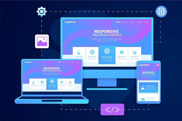
Figma for Responsive Web Design: A Practical Guide
Responsive web design helps a website adapt to different screen sizes, from wide desktop monitors to compact smartphones. Figma is a collaborative design tool that makes it easier to plan, create, and test those layouts before development begins. Features such as Auto Layout, constraints, components, and interactive prototypes can help designers build flexible interfaces and communicate their intent to developers.
What Responsive Design Means in Figma
Figma doesn’t automatically turn a desktop design into a finished responsive website. Instead, it gives you tools to model how a design should behave as its available space changes. You can create layouts for different viewport sizes, define how elements resize or stay positioned, and test common interactions in a prototype.
The goal is not to make every screen look identical. It is to preserve usability and visual hierarchy while adapting the layout to the available space.
Start With Content and a Layout Plan
Before designing screens, identify the content and actions each page needs to support. Consider what users should notice first, what information can be grouped together, and what may need to move or change on smaller screens.
Sketch a basic layout for a few representative sizes, such as mobile, tablet, and desktop. These are useful starting points, not rigid standards. Real breakpoints should be chosen based on where the content or layout stops working well—not simply because a particular device is popular.
Use Frames to Represent Viewports
In Figma, frames can represent pages or viewport sizes. Create frames for the key layouts you plan to design, and label them clearly—for example, “Mobile,” “Tablet,” and “Desktop,” or include the frame dimensions.
Designing more than one frame helps reveal layout changes early. A desktop navigation bar, for example, may need to become a menu button on mobile. A three-column card layout might become one column, while some secondary content may move lower on the page.
Build Flexible Layouts With Auto Layout
Auto Layout helps arrange elements in rows or columns and adjust spacing as content or frame dimensions change. It is useful for navigation bars, buttons, cards, form fields, content sections, and many other interface patterns.
When setting up Auto Layout, consider:
- Direction: Should items flow horizontally or vertically?
- Spacing: Should the gap between items stay fixed or adapt?
- Padding: How much space should remain inside the container?
- Resizing: Should an element hug its content, fill its parent, or keep a fixed size?
- Wrapping: Should items move onto another line when space is limited?
For example, a button can use Auto Layout to maintain consistent padding as its label changes. A card row can be designed to fill its parent frame on desktop, then switch to a vertical stack in a mobile layout.
Set Constraints for Elements That Need Positioning
Constraints describe how a layer should stay positioned relative to its parent frame when that frame changes size. They can be useful for elements such as a logo aligned to the left, a utility icon aligned to the right, or a floating control that should remain near a particular edge.
Constraints and Auto Layout serve different purposes. Auto Layout is generally better for arranging groups of content that flow together. Constraints are useful when an element’s position needs to remain tied to a specific side or area of its parent.
Create Reusable Components
Components make repeated interface elements easier to manage. Common examples include buttons, navigation items, form controls, icons, and cards. Updating a main component can help keep its instances consistent throughout a design.
Component properties and variants can represent meaningful states or options, such as a button’s default, hover, and disabled states. They can also help organize variations in a design system. Keep variants purposeful: a clear set of options is easier to use than one component with an overwhelming number of combinations.
Design for Content That Changes
Responsive layouts need to handle more than different screen widths. Text may be longer than expected, images may have different proportions, and users may increase text size or zoom in. Test designs with realistic and occasionally challenging content to find issues such as clipped labels, crowded navigation, or cards that grow unevenly.
Use text and image behavior deliberately. Decide whether images should maintain their aspect ratio, crop to fill a container, or adapt to a particular content area. For text, make sure containers can expand where needed and that important information is not hidden at smaller sizes.
Prototype Important Responsive Behaviors
Figma prototypes can demonstrate how a design is intended to work. Connect screens to show navigation flows, and use interactive components to illustrate states such as an open menu, selected tab, or expanded accordion.
A prototype does not replace testing in a browser, but it can help teams review the experience before development. It is especially useful for discussing how menus, forms, and other interactive elements behave on mobile devices.
Prepare Designs for Developer Handoff
A useful handoff explains both what the interface looks like and how it should respond. Organize frames and layers, use descriptive names, and document key behavior that may not be obvious from a static screen. Note relevant spacing, typography, image treatment, and layout changes between breakpoints.
Figma’s inspection tools can help developers review design properties and assets. However, generated measurements are not a substitute for context. Explain when a layout should wrap, when a component should change orientation, and which content should remain prominent on smaller screens.
Common Mistakes to Avoid
- Designing only for one screen size: A polished desktop frame does not show how the page behaves on mobile.
- Using fixed dimensions everywhere: Fixed widths can cause overflow when content or viewport size changes.
- Choosing breakpoints without testing: Breakpoints should solve visible layout problems.
- Ignoring content variations: Short sample text can conceal wrapping and spacing issues.
- Overcomplicating components: Reusable systems work best when their properties are understandable.
- Assuming the design file is the final test: Browser testing is still necessary to confirm real-world behavior.
A Simple Responsive Design Workflow
- Define the page’s goals, content, and primary actions.
- Choose a small set of representative viewport sizes.
- Create a clear desktop and mobile layout, adding intermediate sizes when needed.
- Use Auto Layout and constraints to express how elements should adapt.
- Build reusable components for repeated interface patterns.
- Test longer content, different image proportions, and interactive states.
- Prototype key interactions and gather feedback.
- Document responsive behavior for development and verify the implementation in a browser.
Conclusion
Figma can make responsive web design easier to plan, communicate, and refine. Its most effective use comes from combining flexible layout tools with thoughtful decisions about content, hierarchy, and behavior. By designing for a range of viewport sizes, testing realistic content, and documenting how layouts should adapt, teams can create more usable experiences across devices.
Mastering Responsive Web Design in Figma: Your Essential FAQ Guide
- How do you create a responsive web design in Figma?
- Can Figma automatically make a design responsive?
- How do Auto Layout and constraints work in Figma?
- How should I choose breakpoints for a responsive design in Figma?
- How can I preview and test responsive layouts in Figma?
- Can developers use Figma designs to build responsive websites?
How do you create a responsive web design in Figma?
To create a responsive web design in Figma, start by designing key layouts for representative screen sizes, such as mobile, tablet, and desktop. Use Auto Layout to arrange content that should resize or reflow, and apply constraints to control how elements stay positioned as frames change size. Create reusable components for repeated elements like buttons and navigation, then test the layouts with realistic content and prototype important interactions. Since Figma designs don’t automatically become responsive websites, document how elements should adapt and verify the final behavior in a browser during development.
Can Figma automatically make a design responsive?
No, Figma can’t automatically turn a design into a fully responsive website. Its tools, including Auto Layout, constraints, and responsive resizing, help you create layouts that adapt as frames change size, but you still need to decide how content should reflow, which elements should resize or move, and when layouts should change. Test your designs at different viewport sizes, then check the finished implementation in a browser to confirm it behaves as intended.
How do Auto Layout and constraints work in Figma?
In Figma, Auto Layout arranges layers in a frame or component and adjusts their spacing and size as content or the container changes. It’s useful for flexible groups such as buttons, navigation bars, and cards, with settings for direction, padding, spacing, and whether items hug content or fill available space. Constraints control how an individual layer stays positioned relative to its parent frame as that frame resizes—for example, keeping an icon aligned to the right edge. Use Auto Layout for elements that flow together, and constraints when an element needs to remain anchored to a particular side or area.
How should I choose breakpoints for a responsive design in Figma?
Choose breakpoints based on when your content or layout needs to change—not just on specific device models or preset screen sizes. In Figma, start with a few representative viewport widths, then resize your frames to find where elements become cramped, text wraps awkwardly, or navigation stops working well. Set a breakpoint just before those problems appear, and use it to make a purposeful adjustment, such as changing columns to a stack or replacing full navigation with a menu. Test the layout at widths between your chosen breakpoints, too, to make sure it remains usable.
How can I preview and test responsive layouts in Figma?
To preview and test responsive layouts in Figma, create frames for the screen sizes you want to support, then use Auto Layout and constraints to show how elements resize, wrap, or reposition. Resize frames to check how the design behaves between your planned sizes, and use Present mode to explore prototypes and test interactions such as mobile navigation. Try realistic content—including longer text and different image proportions—to spot overflow or spacing issues. Figma previews help communicate and refine the design, but testing the implemented website in a browser is still important.
Can developers use Figma designs to build responsive websites?
Yes. Developers can use Figma designs as a reference for building responsive websites, using frames, Auto Layout, constraints, components, and design specifications to understand layouts, styling, and assets. However, Figma doesn’t automatically generate a complete responsive website: developers still need to write and test the code, decide how layouts adapt between screen sizes, and verify the result in browsers and on real devices. Clear notes about breakpoints, content behavior, and interactive states make the handoff more effective.