
Responsive web design is a crucial aspect of creating a successful website in today’s digital landscape. With the increasing variety of devices used to access the internet, such as smartphones, tablets, laptops, and desktop computers, it is essential to ensure that your website looks and functions well on all screen sizes.
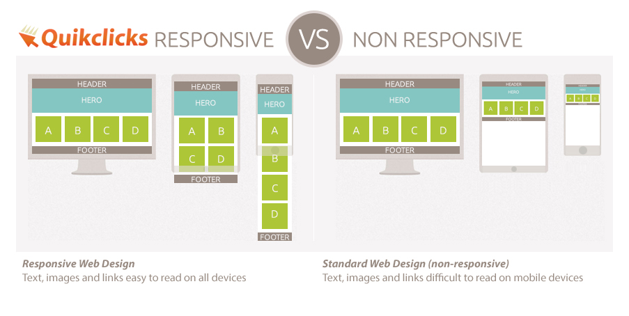
A responsive website is designed to adapt and respond to the user’s behavior and environment based on screen size, platform, and orientation. This means that the layout of the site will automatically adjust to fit the screen size of the device being used. Whether a visitor is viewing your site on a small smartphone screen or a large desktop monitor, they should have an optimal viewing experience.
One of the key benefits of responsive design is improved user experience. Visitors are more likely to stay on your site and engage with your content if it is easy to read and navigate, regardless of the device they are using. Responsive design also helps with search engine optimization (SEO), as search engines like Google prioritize mobile-friendly websites in their rankings.
From a development perspective, responsive design simplifies maintenance efforts by allowing you to manage one set of code for all devices instead of creating separate websites for different screen sizes. This can save time and resources in the long run.
In conclusion, responsive web design is not just a trend but a necessity in today’s digital world. By ensuring that your website is responsive, you can reach a wider audience, improve user experience, boost SEO rankings, and streamline development efforts. Embracing responsive design will help your website stay relevant and competitive in an ever-evolving online landscape.
6 Frequently Asked Questions About Responsive Web Design
- What is responsive web design?
- Why is responsive design important for websites?
- How does responsive design benefit user experience?
- What are the key features of a responsive website?
- How can I make my website responsive?
- Does responsive design impact SEO?
What is responsive web design?
Responsive web design refers to the practice of creating websites that adapt and respond to various screen sizes and devices. In essence, a responsive website will automatically adjust its layout and content to provide an optimal viewing experience for users, regardless of whether they are accessing the site on a desktop computer, laptop, tablet, or smartphone. This approach ensures that the website remains user-friendly and visually appealing across different devices, ultimately improving user experience and engagement. By embracing responsive web design, businesses can reach a wider audience and stay competitive in today’s mobile-driven digital landscape.
Why is responsive design important for websites?
Responsive design is crucial for websites because it ensures optimal user experience across various devices. With the increasing use of smartphones and tablets to access the internet, having a responsive website design is essential to accommodate different screen sizes and resolutions. A responsive website adapts its layout and content to fit the screen size of the device being used, providing a seamless and user-friendly experience for visitors. By implementing responsive design, websites can reach a wider audience, improve engagement, enhance SEO rankings, and simplify maintenance efforts by managing one set of code for all devices. In today’s digital age, where users expect a consistent experience regardless of the device they are using, responsive design has become a standard practice for successful websites.
How does responsive design benefit user experience?
Responsive design benefits user experience by ensuring that a website adapts and responds seamlessly to the user’s device, screen size, and orientation. This means that visitors can easily access and navigate the site on any device, whether it be a smartphone, tablet, laptop, or desktop computer. With responsive design, content is optimized for readability and usability across all screen sizes, leading to a consistent and user-friendly experience. By providing a responsive design, websites can enhance user engagement, reduce bounce rates, and ultimately improve customer satisfaction by making it easier for users to access the information they need quickly and efficiently.
What are the key features of a responsive website?
A responsive website incorporates several key features to ensure optimal user experience across various devices. One essential feature is fluid grid layout, which allows content to adapt and reflow based on the screen size. Flexible images and media are also crucial, as they resize proportionally to fit different screens without losing quality. Media queries enable the site to apply different styles based on device characteristics, ensuring a consistent look and feel. Additionally, responsive websites often include touch-friendly navigation elements and fast loading times to enhance usability on mobile devices. By integrating these key features, a responsive website can effectively cater to users on smartphones, tablets, laptops, and desktops alike.
How can I make my website responsive?
Making your website responsive involves several key steps to ensure that it adapts well to various screen sizes and devices. Firstly, you can start by using a responsive design framework or template that is mobile-friendly and adjusts layouts based on screen width. Next, prioritize using flexible grid layouts and fluid images that can scale up or down without losing quality. Implement CSS media queries to apply different styles based on screen size breakpoints, allowing for a seamless transition between different devices. Test your website across multiple devices and screen sizes to identify any issues and make necessary adjustments to optimize the user experience. By following these steps and staying updated on best practices in responsive design, you can effectively make your website responsive and accessible to a wider audience.
Does responsive design impact SEO?
Yes, responsive design does impact SEO. Google, the leading search engine, has explicitly stated that mobile-friendliness is a ranking factor in search results. Websites that are not mobile-friendly may be penalized in search rankings, making it harder for users to find them. By implementing responsive design, you ensure that your website is optimized for all devices, which can improve your SEO performance and help you rank higher in search engine results pages. Additionally, having a responsive website provides a better user experience, which can lead to lower bounce rates and higher engagement metrics, further signaling to search engines that your site is valuable to users. In summary, responsive design plays a significant role in SEO by enhancing user experience and increasing the visibility of your website in search results.