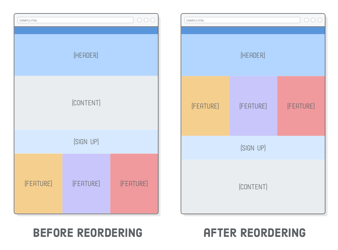
. These elements help organize your content in a meaningful way and make it easier for search engines to understand your site.
Next, use CSS media queries to apply different styles based on the screen size. Media queries allow you to set breakpoints where your layout will change to accommodate smaller or larger screens. For example, you can adjust the width of elements, change font sizes, or hide certain content on smaller screens.
In addition to media queries, you can also use flexible units like percentages and viewport units (vw, vh) to create layouts that adapt fluidly to different screen sizes. By using these units instead of fixed pixel values, you can ensure that your website looks good on devices with varying screen resolutions.
Another important aspect of building a responsive website with HTML5 is optimizing images for different screen sizes. Use the srcset attribute to provide multiple image sources at different resolutions, so the browser can choose the best one based on the device’s pixel density.
In conclusion, building an HTML5 website with a responsive layout involves structuring your content semantically, using CSS media queries for styling, and optimizing images for different screen sizes. By following these best practices, you can create a website that looks great and functions well on any device, providing users with an optimal browsing experience.
Top 5 Benefits of Building an HTML5 Website with a Responsive Layout
Enhanced user experience across various devices Improved SEO performance with mobile-friendly design Cost-effective solution for reaching a wider audience Easier maintenance and updates with a single responsive website Future-proofing your site for upcoming devices and screen sizes
Challenges of Building an HTML5 Website with a Responsive Layout: Complexity, Compatibility, Performance, and Testing
Complexity Browser Compatibility Performance Issues Testing Effort
Enhanced user experience across various devices
One of the key benefits of building an HTML5 website with a responsive layout is the enhanced user experience it provides across various devices. By designing a website that adapts seamlessly to different screen sizes and resolutions, users can access your content on smartphones, tablets, laptops, and desktops without any loss of functionality or visual appeal. This responsive design approach ensures that visitors have a consistent and user-friendly experience regardless of the device they are using, ultimately leading to higher engagement, increased time spent on the site, and improved overall satisfaction.
One significant advantage of building an HTML5 website with a responsive layout is the improved SEO performance that comes with having a mobile-friendly design. Search engines like Google prioritize mobile-friendly websites in their search results, as they provide a better user experience for mobile users. By ensuring that your website is responsive and adapts seamlessly to different screen sizes, you increase the chances of ranking higher in search engine results pages, driving more organic traffic to your site. This mobile-friendly design not only benefits your SEO efforts but also enhances user engagement and satisfaction, ultimately leading to better overall performance for your website.
Cost-effective solution for reaching a wider audience
One significant advantage of building an HTML5 website with a responsive layout is that it offers a cost-effective solution for reaching a wider audience. By creating a single website that can adapt to different screen sizes and devices, businesses can save money on development and maintenance costs compared to building separate desktop and mobile versions. This approach not only streamlines the design process but also ensures that all users, regardless of their device, have access to the same content and functionality. Ultimately, investing in a responsive HTML5 website allows businesses to expand their reach and engage with a broader audience without breaking the bank.
Easier maintenance and updates with a single responsive website
One of the key benefits of building an HTML5 website with a responsive layout is the ease of maintenance and updates that come with having a single responsive website. With a responsive design, you only need to manage one set of content and codebase, which simplifies the maintenance process significantly. This means that any updates or changes you make to your website will automatically apply across all devices, eliminating the need to maintain separate versions for desktop, tablet, and mobile. By streamlining maintenance tasks, you can save time and resources while ensuring consistency and cohesiveness across all platforms.
Future-proofing your site for upcoming devices and screen sizes
By building an HTML5 website with a responsive layout, you are future-proofing your site for upcoming devices and screen sizes. With the ever-evolving landscape of technology, new devices with different screen resolutions and sizes are constantly being introduced to the market. By creating a responsive design using HTML5, you ensure that your website will adapt seamlessly to these new devices, providing a consistent user experience across all platforms. This proactive approach not only saves time and resources in the long run but also helps you stay ahead of the curve in catering to the needs of your audience on any device they may use in the future.
Complexity
One significant drawback of building a responsive layout with HTML5 is the increased complexity it introduces. Unlike creating a fixed layout, designing a responsive website requires careful consideration of different screen sizes and devices, as well as the use of CSS media queries and flexible units. This added complexity can make the development process more time-consuming and challenging, especially for those who are not familiar with responsive design principles. Additionally, troubleshooting issues related to responsiveness can be more intricate, requiring thorough testing across various devices to ensure a consistent user experience.
Browser Compatibility
One significant challenge of building an HTML5 website with a responsive layout is browser compatibility. Ensuring a consistent display across various browsers and their different versions can be quite challenging when implementing responsive design. Different browsers may interpret CSS styles and HTML elements differently, leading to discrepancies in how the website appears to users. This can result in extra time and effort spent on testing and troubleshooting to ensure that the website functions properly and looks consistent across all browsers, adding complexity to the development process.
One notable drawback of building an HTML5 website with a responsive layout is the potential for performance issues. Implementing responsive designs that include heavy media files or complex animations can result in slower loading times, especially on devices with limited processing power or slower internet connections. This can lead to a less than optimal user experience, as visitors may become frustrated with long loading times and may choose to navigate away from the site. Careful consideration of the size and complexity of media elements and animations is essential to ensure that the website maintains good performance across various devices.
Testing Effort
One notable drawback of building an HTML5 website with a responsive layout is the increased testing effort it demands. Ensuring that the website functions seamlessly across various devices and screen sizes can be a time-consuming process that requires additional resources. Testing on different devices, browsers, and resolutions is essential to identify and address any layout or functionality issues that may arise. This thorough testing process adds complexity to the development timeline and may require investing in a wider range of testing tools and devices to guarantee optimal performance across the board.
Tags:
build an html5 website with a responsive layout ,
cost-effective solution ,
css media queries ,
flexible units ,
html5 ,
mobile-friendly design ,
responsive layout ,
semantic elements ,
seo performance ,
srcset attribute ,
user experience ,
viewport units ,
wider audience