
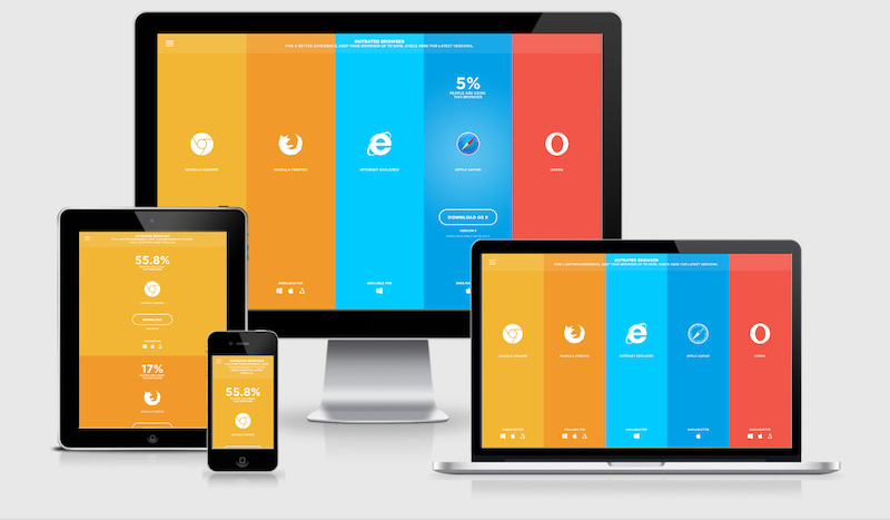
Responsive Web Design for All Devices
People visit websites on phones, tablets, laptops, desktops, and a growing range of other devices. A site that looks polished on a large monitor may be difficult to use on a small screen. Responsive web design helps solve this problem by allowing a website’s layout and content to adapt to different screen sizes and ways of interacting.
Rather than creating a separate website for every device, responsive design uses flexible layouts, adaptable images, and CSS rules to serve one experience across many screen sizes. The result is a site that is easier to navigate, read, and use wherever visitors happen to be.
What Is Responsive Web Design?
Responsive web design is an approach to building websites that adjust to the space available on a user’s screen. A page might show several columns on a desktop, for example, then rearrange those columns into a single vertical layout on a phone.
Responsive design is not limited to shrinking content. It considers how the whole experience changes across devices, including text size, navigation, images, spacing, forms, and interactive controls.
Why Responsive Design Matters
- It improves usability. Visitors can read content and use controls without excessive zooming, scrolling sideways, or struggling to tap small targets.
- It supports a wider audience. People can access the same site on the device that suits them, including devices with different screen sizes and orientations.
- It makes updates simpler. A shared website is generally easier to maintain than separate desktop and mobile versions.
- It can support search visibility. A clear, mobile-friendly experience helps people use a site from search results and other sources. Responsive design is one part of a broader approach to search optimization.
- It helps protect the brand experience. Consistent design and messaging make a business easier to recognize across devices.
Core Principles of Responsive Web Design
Start With Flexible Layouts
Fixed-width layouts can overflow or leave awkward gaps when a screen is wider or narrower than expected. Flexible layouts use relative units, such as percentages or fractional grid units, so elements can adjust to the available space.
CSS Grid and Flexbox are useful tools for arranging page content. They let developers define how items share space, wrap, and move into new rows or columns as the viewport changes.
Use Breakpoints Thoughtfully
Breakpoints are points where a layout changes to better fit the available width. For instance, a navigation bar might become a compact menu when there is no longer enough room for its links.
Breakpoints should be based on the content and layout, not only on specific device models. A good approach is to start with a narrow layout and add breakpoints when the design needs more space or a different arrangement.
Make Images and Media Adaptable
Images should fit within their containers rather than forcing the page to scroll horizontally. In many cases, a simple CSS rule such as max-width: 100%; can keep an image from exceeding its available width.
For large images, responsive image techniques can deliver appropriately sized files for different screens and resolutions. This can help reduce unnecessary downloads, especially for visitors on mobile connections. Videos and other embedded media should also resize without breaking the layout.
Design for Readability
Text should remain comfortable to read on every screen. Choose legible fonts, adequate line spacing, and sensible line lengths. Avoid making body text so small that visitors must zoom in, and make sure headings create a clear content hierarchy.
Spacing matters, too. A layout that feels balanced on a desktop may seem cramped on a phone. Adjust margins, padding, and line breaks so content remains easy to scan.
Make Navigation Easy to Use
Navigation should be clear and accessible at every screen size. On smaller screens, a menu may need to collapse, but visitors should still be able to find important pages without guesswork.
Interactive controls should have enough space around them to reduce accidental taps. Links should be distinguishable from surrounding text, and menus should work with both touch and keyboard input.
Design for Different Ways of Interacting
Responsive design is about more than screen dimensions. Some visitors use a mouse, while others use a touchscreen, keyboard, voice input, or assistive technology. Buttons, menus, forms, and other controls should work reliably across these interaction methods.
Use semantic HTML elements where appropriate, provide visible focus indicators for keyboard users, and add descriptive labels to form fields. Images that convey information should have useful alternative text, while decorative images can be treated so they do not add unnecessary noise for screen reader users.
Performance Is Part of the Experience
A responsive layout should also load efficiently. Large image files, unnecessary scripts, and heavy page elements can make a site feel slow, especially on mobile devices or slower connections.
To improve performance, consider compressing images, loading only the resources a page needs, and removing outdated or unused code. Test pages under different network conditions instead of relying only on a fast office connection.
How to Test a Responsive Website
Testing should begin during design and continue as the site is developed. A browser’s responsive preview tools can help check layouts at different widths, but they should not be the only testing method.
- Check common phone, tablet, and desktop widths, as well as sizes between them.
- Test both portrait and landscape orientations.
- Look for horizontal scrolling, clipped content, overlapping elements, and awkward spacing.
- Try navigation, forms, buttons, and menus with touch, a keyboard, and a mouse.
- Check text readability, color contrast, and visible focus states.
- Test on real devices when possible, especially for important customer journeys.
- Review page speed and image behavior on slower connections.
Common Responsive Design Mistakes
Several issues can undermine an otherwise thoughtful responsive site:
- Designing for only a few exact screen sizes: Real screens come in many widths, so layouts should adapt smoothly between breakpoints.
- Hiding useful content on mobile: Smaller screens may require a different arrangement, but visitors should not lose access to essential information or features.
- Using tiny controls: Buttons and links that are easy to click with a mouse may be difficult to tap accurately.
- Ignoring real content: Short placeholder text can hide problems that appear when actual headings, product names, or paragraphs are longer.
- Testing only in a desktop browser: Preview tools are valuable, but real devices can reveal issues with touch behavior, performance, and readability.
A Practical Approach to Getting Started
Begin by identifying the most important tasks visitors need to complete, such as finding information, booking a service, or making a purchase. Organize the page around those needs, then create a simple layout that works well on a narrow screen.
From there, expand the layout as more space becomes available. Add columns or larger visual elements only when they improve the experience. Throughout the process, test the actual content and refine the design based on what is difficult to read, find, or use.
Conclusion
Responsive web design helps a website work across devices without sacrificing clarity or usability. Flexible layouts, adaptable media, readable text, accessible controls, and consistent testing all contribute to a better experience.
The goal is not to make every screen look identical. It is to make sure every visitor can access the content and complete important tasks comfortably, whatever device they use.
9 Benefits of Responsive Web Design for Every Device
- Improves usability on every screen size.
- Makes content easier to read on phones.
- Keeps navigation simple across devices.
- Reduces horizontal scrolling.
- Supports a consistent brand experience.
- Helps visitors complete tasks more easily.
- Adapts layouts to different orientations.
- Can improve mobile search experience.
- Simplifies website maintenance.
5 Drawbacks of Responsive Web Design Across Devices
- Can increase design and development costs.
- Requires testing across many screen sizes.
- Complex layouts may be difficult to adapt.
- Large images can slow mobile loading.
- Some features may not work equally well on every device.
Improves usability on every screen size.
Responsive web design improves usability on every screen size by adapting a website’s layout, text, images, and controls to fit the device a visitor is using. Content stays easy to read, navigation remains simple to use, and buttons are easier to tap on smaller screens. This helps visitors browse and complete tasks comfortably on phones, tablets, laptops, and desktops—without excessive zooming or horizontal scrolling.
Makes content easier to read on phones.
Responsive web design makes content easier to read on phones by adjusting text size, spacing, and page layout to fit smaller screens. Visitors can read without zooming in or scrolling sideways, while clear headings and comfortable line lengths make information easier to scan. This creates a more convenient reading experience wherever people access the site.
Keeps navigation simple across devices.
Responsive web design keeps navigation simple across devices by adapting menus and links to fit each screen. On a desktop, visitors may see a full navigation bar, while on a phone, the same options can appear in a compact, easy-to-use menu. This helps people find what they need without clutter, excessive scrolling, or tiny controls.
Reduces horizontal scrolling.
Responsive web design reduces horizontal scrolling by adjusting content to fit the width of each screen. Text wraps naturally, images resize, and page elements rearrange on smaller devices instead of extending beyond the viewport. This makes pages easier to read and navigate, especially on phones, where visitors can focus on the content without repeatedly swiping from side to side.
Supports a consistent brand experience.
Responsive web design helps your brand feel consistent across phones, tablets, and computers. By keeping your visual style, messaging, and key features cohesive while adapting the layout to each screen, it makes your business easier to recognize and gives visitors a familiar, reliable experience wherever they browse.
Helps visitors complete tasks more easily.
Responsive web design helps visitors complete tasks more easily by adapting page layouts and controls to the device they’re using. Clear navigation, readable text, and easy-to-tap buttons make it simpler to find information, fill out forms, book services, or make purchases—without awkward zooming, side-to-side scrolling, or struggling with tiny controls.
Adapts layouts to different orientations.
Responsive web design adapts layouts to both portrait and landscape orientations, so content remains easy to read and use when a visitor rotates a phone or tablet. Instead of stretching awkwardly or leaving large empty spaces, elements can rearrange to make better use of the available width and height. This flexibility keeps navigation, images, and controls accessible in either orientation.
Can improve mobile search experience.
Responsive web design can improve the mobile search experience by making pages easier to read, navigate, and use on phones and tablets. When visitors arrive from search results, responsive layouts help content fit the screen, links and buttons remain accessible, and pages avoid frustrating horizontal scrolling or excessive zooming. This smoother experience can make it easier for people to find what they need and continue exploring the site.
Simplifies website maintenance.
Responsive web design simplifies website maintenance by letting you manage one site that adapts to phones, tablets, and desktops. Instead of updating separate versions for different devices, you can make changes to content, design, or features in one place. This saves time, reduces the risk of inconsistent information, and makes it easier to keep the entire website up to date.
Can increase design and development costs.
Responsive web design can increase design and development costs because a site must be planned, built, and tested across a wide range of screen sizes, browsers, and interaction methods. Teams may need extra time to refine layouts, adapt images and navigation, and fix device-specific issues. These upfront costs can be higher than building a simple website for one screen size, though they may be offset by the reduced need to maintain separate desktop and mobile sites.
Requires testing across many screen sizes.
Responsive web design requires testing across a wide range of screen sizes, orientations, browsers, and devices to ensure layouts work as intended. A page that looks polished on one phone may have cramped text, misaligned images, or awkward navigation on another screen. This ongoing testing can take extra time and resources, especially for complex websites with many pages and interactive features.
Complex layouts may be difficult to adapt.
Complex layouts can be difficult to adapt across devices because elements that work well on a large screen may feel crowded, confusing, or out of order on a phone. Multi-column pages, detailed navigation, and interactive features may require significant redesign rather than simple resizing. This can increase development time and make it harder to preserve a consistent, easy-to-use experience at every screen size.
Large images can slow mobile loading.
Large images can slow mobile loading, especially for visitors using limited data plans or slower connections. High-resolution files may take longer to download and can make a page feel sluggish even when displayed in a small space. Optimizing images through compression, responsive image sizes, and modern file formats can help pages load faster without sacrificing visual quality.
Some features may not work equally well on every device.
Some features may not work equally well on every device. A complex animation, hover effect, or interactive menu that feels natural with a mouse may be difficult to use on a touchscreen or keyboard. Differences in browser support, screen size, and device performance can also affect how features behave. As a result, responsive websites need thorough testing and, in some cases, alternative controls or simplified experiences to ensure key functions remain accessible to everyone.