
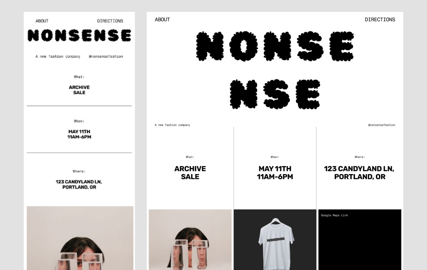
Responsive Web Design for Mobile Devices
People visit websites on phones, tablets, laptops, and large desktop screens. Responsive web design helps a website adapt to these different screen sizes so that content remains readable, navigation stays usable, and important features continue to work.
Rather than creating a separate website for every device, responsive design uses flexible layouts and adaptable elements. A well-designed page can rearrange its content as the available screen space changes, without forcing visitors to zoom, scroll sideways, or struggle with small controls.
What Makes a Website Responsive?
A responsive website combines several techniques:
- Fluid layouts: Page sections use flexible widths that adjust to the screen instead of relying on fixed pixel dimensions.
- Media queries: CSS rules change a layout’s appearance at certain screen widths or other conditions.
- Flexible images and media: Images and videos scale within their containers to avoid overflowing the page.
- Adaptable content: Text, menus, forms, and other elements are arranged to suit the space and the visitor’s needs.
The goal is not simply to make a desktop page smaller. It is to make the experience work well at every size.
Start with a Mobile-Friendly Foundation
A mobile-first approach begins with the smallest screen and adds layout enhancements for larger screens. This encourages teams to prioritize the essentials: clear content, straightforward navigation, and fast access to key actions. Additional columns, decorative details, or expanded navigation can be introduced when more space is available.
For mobile browsers to display a page at the device’s actual width, include the viewport setting in the document’s head:
<meta name="viewport" content="width=device-width, initial-scale=1">Without this setting, some mobile browsers may render a page as though it were designed for a wider screen, making text and controls appear too small.
Build Layouts That Adapt
Fixed-width layouts can cause horizontal scrolling on narrow screens. Flexible CSS layouts, such as Flexbox and CSS Grid, make it easier to rearrange content as the viewport changes. Relative units such as percentages, rem, and minmax() can also help components respond to available space.
Media queries can apply targeted changes when a layout reaches a particular width. For example, a three-column section might become a single column on a phone. Breakpoints should be chosen based on where the content needs adjustment—not only on the dimensions of specific devices.
.content {


  display: grid;


  grid-template-columns: repeat(3, minmax(0, 1fr));


  gap: 1.5rem;


}


@media (max-width: 700px) {


  .content {


    grid-template-columns: 1fr;


  }


}
Make Text and Controls Easy to Use
Small screens leave less room for text and interactive elements. Use readable font sizes, comfortable line spacing, and enough contrast between text and its background. Avoid requiring visitors to zoom in to read important information.
Buttons, links, and form controls should be easy to tap with a finger. Give interactive elements enough space to reduce accidental taps, and make their purpose clear through labels and visual states. Forms should use suitable input types, such as email for email addresses, so mobile devices can offer a more relevant keyboard.
Design Navigation for Small Screens
Desktop navigation bars do not always fit comfortably on phones. A compact menu can be useful, but it should be clearly labeled and simple to open and close. Keep essential destinations easy to find, and avoid hiding important information behind unclear icons or complicated menu layers.
Navigation should also work with a keyboard and assistive technology. Use semantic HTML, provide accessible names for controls, and make sure focus remains visible as visitors move through the page.
Optimize Images and Performance
Large image files can slow down a mobile experience, especially on a limited or unreliable connection. Choose appropriate image dimensions and formats, compress files, and avoid loading images that are much larger than their display size. HTML features such as srcset and sizes can help browsers select an image that fits the visitor’s screen.
Performance involves more than images. Reduce unnecessary scripts and styles, limit heavy animations, and test pages on realistic network connections. Faster pages are generally easier to use and can help visitors reach the information they need sooner.
Test on Realistic Screen Sizes
Browser developer tools can simulate different viewport sizes, but testing on physical devices can reveal issues that emulation misses. Check common phones and tablets when possible, and test both portrait and landscape orientations. Look for clipped content, awkward line breaks, overlapping elements, slow-loading media, and controls that are difficult to tap.
Testing should include more than the home page. Review forms, menus, product or service pages, and any other parts of the site visitors rely on. Also test with a keyboard and accessibility tools to catch barriers that are not apparent from visual checks alone.
Common Responsive Design Mistakes
- Using fixed widths that force horizontal scrolling.
- Making text or controls too small to read or tap comfortably.
- Hiding useful content on mobile instead of reorganizing it.
- Choosing breakpoints based only on a list of device models.
- Using large images or animations that slow down the page.
- Testing only at one screen size or only in a desktop browser.
Conclusion
Responsive web design helps a website stay useful across phones, tablets, and larger screens. Flexible layouts, readable content, accessible controls, optimized media, and thoughtful testing all contribute to a better mobile experience. By designing for real visitor needs rather than a single device, site owners can make their content easier to access wherever people choose to browse.
Top 6 Benefits of Responsive Web Design for Mobile Devices
- Improves readability on small screens.
- Makes navigation easier on mobile devices.
- Eliminates the need for horizontal scrolling.
- Creates a consistent experience across devices.
- Can improve mobile engagement and conversions.
- Supports better accessibility for diverse users.
Challenges of Responsive Web Design for Mobile Devices: 7 Key Drawbacks
- Can increase design and development time.
- Requires testing across many screen sizes.
- Complex layouts can be harder to maintain.
- Large images may slow mobile pages.
- Some desktop features may need redesigning.
- Older browsers may not support every technique.
- Responsive layouts can still have usability issues.
Improves readability on small screens.
Responsive web design improves readability on small screens by adjusting text size, spacing, and page layout to fit a phone or tablet. Instead of shrinking a desktop page until words become difficult to read, a responsive design can reflow text into comfortable line lengths, add breathing room between elements, and keep headings and buttons clear. Visitors can read content without pinching to zoom or scrolling sideways, making the experience easier and more enjoyable.
Makes navigation easier on mobile devices.
Responsive web design makes navigation easier on mobile devices by adapting menus and links to fit smaller screens. Clear layouts, touch-friendly buttons, and well-spaced options help visitors find what they need without zooming or tapping the wrong link. This creates a smoother browsing experience and makes it easier to move through the site on the go.
Eliminates the need for horizontal scrolling.
Responsive web design eliminates the need for horizontal scrolling by adjusting page layouts and content to fit a mobile device’s screen. Text wraps naturally, images scale within their containers, and columns can rearrange into a single, easy-to-follow layout. Visitors can focus on reading and using the site with simple vertical scrolling instead of dragging the page from side to side to find information.
Creates a consistent experience across devices.
Responsive web design creates a consistent experience across devices by keeping a website’s content, branding, and core features familiar on phones, tablets, and desktops. The layout may change to fit each screen, but visitors can still find the same information and complete the same tasks without having to learn a different version of the site. This continuity makes browsing easier and helps build trust in the brand.
Can improve mobile engagement and conversions.
Responsive web design can improve mobile engagement and conversions by making a website easier to use on phones and tablets. When pages load and display smoothly, text is readable, navigation is simple, and buttons and forms are easy to interact with, visitors are more likely to stay, explore, and complete actions such as making a purchase, booking a service, or signing up.
Supports better accessibility for diverse users.
Responsive web design can make websites more accessible to people with diverse needs by adapting content to different screen sizes, zoom levels, and ways of interacting. Clear layouts, readable text, well-spaced controls, and navigation that works across devices can help visitors with visual, motor, or cognitive disabilities use a site more comfortably. When responsive design is paired with semantic HTML, keyboard support, and assistive-technology testing, it can make essential information and features easier for more people to access.
Can increase design and development time.
Responsive web design can increase design and development time because a site must be planned, built, and tested across a range of screen sizes and devices. Designers and developers may need to adjust layouts, navigation, images, and interactive features to work well on both small and large screens. Thorough testing and revisions can add extra steps to a project, especially when the website has complex features or a large amount of content.
Requires testing across many screen sizes.
Responsive web design requires testing across a wide range of screen sizes to make sure layouts, text, images, and interactive elements work as intended. A page that looks polished on one phone may have overlapping content, awkward spacing, or hard-to-use controls on another device. This ongoing testing can take extra time and effort, especially for sites with many pages, features, or older devices to support.
Complex layouts can be harder to maintain.
Complex layouts can be harder to maintain in responsive web design because each component may need to adapt across multiple screen sizes and orientations. A page with intricate grids, overlapping elements, or many breakpoints can require extra CSS and testing, making updates more time-consuming and increasing the chance that a change for one device will cause problems on another. Keeping the layout simpler and using consistent, reusable components can make ongoing maintenance easier.
Large images may slow mobile pages.
Large images can slow down mobile pages, especially for visitors using slower connections or limited data plans. High-resolution files may take longer to download and use more data than a small screen requires, delaying the page’s content and making the site feel sluggish. Compressing images, choosing appropriate dimensions, and serving smaller versions to mobile devices can help improve load times.
Some desktop features may need redesigning.
One challenge of responsive web design is that some features built for desktop screens may not translate well to mobile devices. Complex navigation menus, hover effects, wide data tables, and multi-column layouts can feel crowded or difficult to use on a small touchscreen. Rather than simply shrinking these elements, designers may need to rethink how they work—for example, replacing hover interactions with tap-friendly controls or presenting detailed information in a more compact format. This redesign can take extra time and planning, but it helps ensure that important features remain useful across devices.
Older browsers may not support every technique.
One drawback of responsive web design is that older browsers may not support every modern layout technique or CSS feature. As a result, some visitors could see elements displayed incorrectly, experience limited functionality, or miss parts of the intended design. Testing across a range of browsers and providing simpler fallbacks for newer features can help keep the site usable for more people.
Responsive layouts can still have usability issues.
Responsive layouts can still create usability issues if content and controls are not carefully adapted for smaller screens. Navigation may become difficult to find, buttons may be too small to tap comfortably, and text or images may feel crowded or out of balance. A layout can technically fit a phone screen yet still be frustrating to use, so it’s important to test pages on real devices and refine the experience for touch, readability, and ease of navigation.