
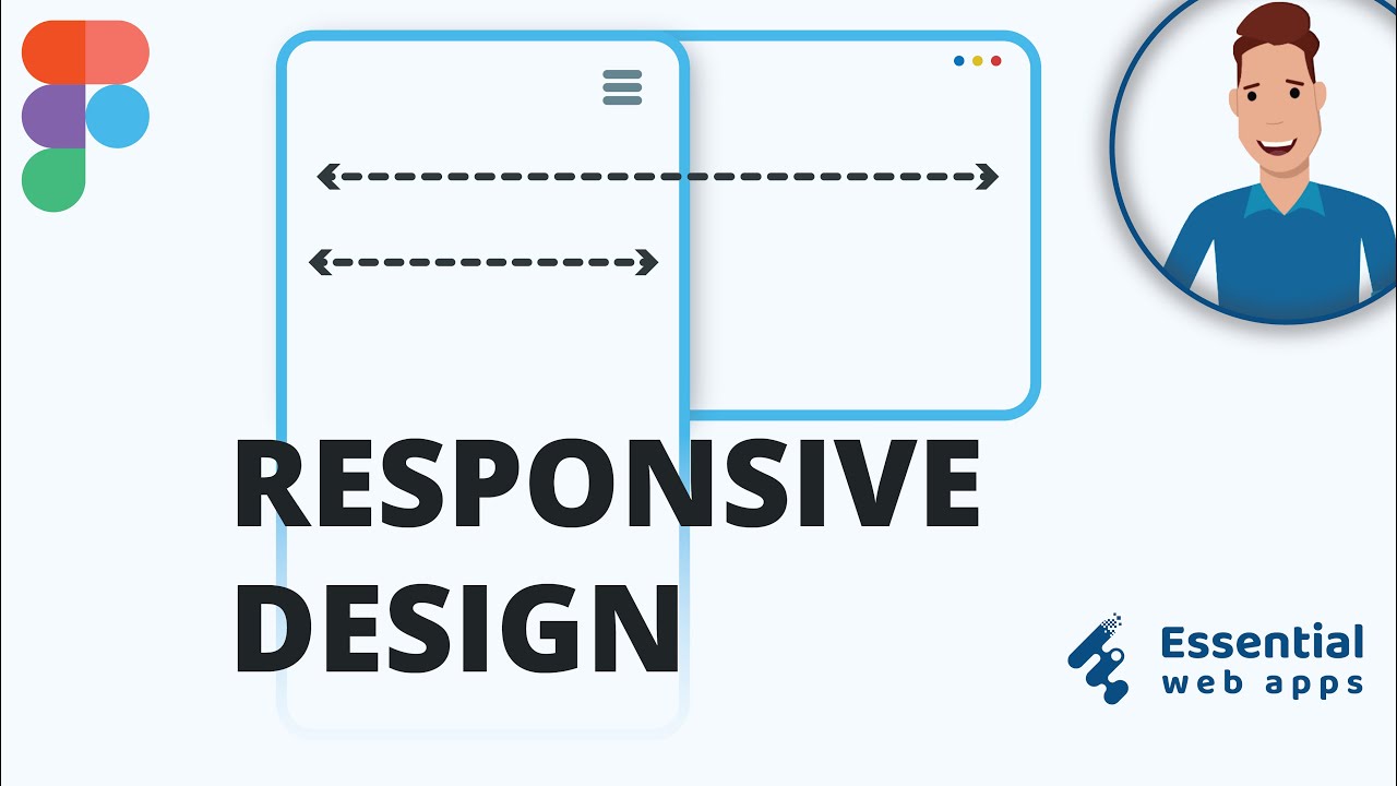
Responsive Web Design in Figma: A Practical Guide
Responsive web design helps a website adapt to different screen sizes, from large desktop monitors to small mobile phones. Figma makes it easier to plan and prototype these experiences in one workspace. Designers can create layouts, test different screen widths, share feedback, and prepare designs for development.
Figma does not automatically make a website responsive. Instead, it provides tools and workflows for designing flexible layouts and communicating how they should behave. A thoughtful approach to frames, Auto Layout, constraints, components, and prototyping can make responsive design work more consistent and efficient.
What responsive design means
A responsive website adjusts its layout and content to suit the available space. For example, a three-column product grid on desktop might become two columns on a tablet and a single column on a phone. Navigation may shift from a full menu to a compact menu button, while text and images resize or rearrange to remain easy to use.
Responsive design is more than making desktop elements smaller. It involves deciding what should change, what should stay consistent, and how people will interact with the page at each screen size.
Start with a clear layout plan
Before designing in Figma, identify the main content and actions on each page. Consider the order in which users should encounter them, especially on mobile, where space is limited. A simple content hierarchy can help guide decisions about what to stack, hide, expand, or move.
Rather than designing for every possible device, choose a small set of representative screen widths. These might include a mobile layout, a medium-width layout, and a desktop layout. The specific widths should reflect the content and project requirements, not just a list of popular devices.
Use frames to explore screen sizes
In Figma, frames can represent pages or viewports. Create frames for the screen sizes you want to explore, then use them to compare how the same content behaves across layouts. Naming frames clearly, such as “Home — Mobile” and “Home — Desktop,” helps keep the file organized.
It can be useful to design the narrow layout early. Starting with mobile encourages focus on essential content and clear actions. The desktop version can then use additional space for wider layouts, richer navigation, or side-by-side content where appropriate.
Build flexible layouts with Auto Layout
Auto Layout is one of Figma’s most useful tools for responsive design. It arranges items in a horizontal or vertical flow and can add consistent spacing and padding around them. When content changes, an Auto Layout frame can adjust instead of relying on manually placed elements.
Auto Layout works well for navigation bars, buttons, cards, form fields, lists, and stacked page sections. Set padding and spacing deliberately, and consider whether items should have fixed, content-based, or flexible dimensions. For example, a button can grow with its label, while a card might fill the available width of its parent frame.
Auto Layout does not replace layout decisions. Designers still need to decide how elements should wrap, stack, or change at different widths. The tool helps make those decisions easier to manage.
Set constraints and resizing behavior
Constraints define how a layer behaves as its parent frame changes size. An element might stay aligned to the left, remain centered, stretch horizontally, or maintain a fixed distance from an edge. Choosing the right behavior can prevent layouts from breaking when a frame is resized.
For example, a logo may remain anchored to the left side of a header, while a search field expands to use available space. A profile icon may stay anchored to the right. Test these behaviors by resizing the frame and checking whether the layout still matches the intended design.
Create reusable components and variants
Components help keep repeated interface elements consistent. A button, navigation item, or card can be created once and reused across screens. If the shared design changes, updating the component can help keep instances aligned.
Variants can represent meaningful states or styles, such as a primary and secondary button, or an expanded and collapsed navigation menu. Keep variants focused and clearly named so that designers and developers can understand when each one should be used.
Design for touch and readability
Mobile layouts should be comfortable to use, not merely compact. Make interactive areas easy to tap, leave enough space between controls, and use text sizes that remain readable. Check that buttons and links are visually distinct from surrounding content.
Also consider content length. A heading that fits on one line on desktop may wrap to several lines on a phone. Test realistic text rather than relying only on short placeholder copy. Long labels, error messages, and translated content can all affect a layout.
Prototype important responsive behaviors
Figma prototypes can demonstrate interactions such as opening a mobile menu, expanding an accordion, or moving between screens. Prototyping is especially helpful when a responsive change affects how people navigate or use a feature.
A prototype will not reproduce every behavior of a production website, but it can clarify intent and help teams review key flows before development begins. Include notes where a behavior needs explanation.
Review the design at more than one width
Check layouts at the selected screen sizes and at widths between them. A design may look correct in a mobile and desktop frame but become awkward in the space between. Watch for overflowing text, cramped controls, uneven spacing, and content that becomes difficult to scan.
Review the page as a whole, not just individual components. Navigation, content sections, images, and calls to action should work together at every size. If a layout feels crowded, reconsider the structure rather than simply shrinking everything.
Prepare a clear handoff
A useful Figma handoff explains how the design should adapt. Organize frames, use consistent layer names, and document important changes between layouts. Notes can clarify when columns stack, when navigation changes, or whether an image uses a crop or a flexible aspect ratio.
Figma provides measurements and asset details that can help developers inspect a design, but a file alone may not communicate every responsive rule. Clear documentation and a conversation with the development team can reduce guesswork.
Common mistakes to avoid
- Designing only for fixed device sizes: A responsive layout should work across a range of widths, not just inside a few preset frames.
- Using Auto Layout without a plan: Auto Layout supports flexible behavior, but the layout still needs intentional rules.
- Reducing everything on mobile: Mobile often requires a different content order or navigation pattern, not a scaled-down desktop page.
- Ignoring real content: Longer headlines and labels can expose problems that placeholder text hides.
- Skipping intermediate widths: Test how the design behaves between the main breakpoints.
Conclusion
Figma can support a clear and collaborative responsive design process. By planning content hierarchy, using Auto Layout and constraints thoughtfully, reusing components, and testing layouts at multiple widths, teams can create designs that are easier to review and build.
The goal is not to create a separate design for every device. It is to define a flexible system that keeps the experience useful, readable, and consistent as the available space changes.
9 Figma Tips for Responsive Web Design
- Use Auto Layout for flexible spacing.
- Design with frames at key breakpoints.
- Use constraints to control resizing.
- Create reusable components for consistency.
- Test layouts at mobile, tablet, and desktop widths.
- Use min and max widths to prevent awkward stretching.
- Keep text readable with scalable type styles.
- Check images and icons at different sizes.
- Preview prototypes on multiple screen dimensions.
Use Auto Layout for flexible spacing.
Use Auto Layout in Figma to create flexible spacing that adjusts as content or screen sizes change. Instead of positioning every element manually, arrange items in a horizontal or vertical flow and set consistent spacing and padding. This works especially well for buttons, cards, navigation bars, and content sections. When text changes or a frame is resized, Auto Layout helps maintain the intended alignment and spacing without requiring you to reposition every element by hand.
Design with frames at key breakpoints.
In Figma, create frames at a few key breakpoints—such as mobile, tablet, and desktop—to see how your layout adapts as the screen gets wider or narrower. Choose widths based on your content and where the design needs to change, rather than trying to represent every device. Comparing these frames makes it easier to spot layout issues, decide when elements should stack or rearrange, and communicate responsive behavior to developers.
Use constraints to control resizing.
Use constraints in Figma to control how elements respond when their parent frame changes size. For example, anchor a logo to the left, keep an icon aligned to the right, or set a content area to stretch with the frame. Choosing the right constraints helps preserve spacing and alignment across screen sizes and makes layouts easier to test and refine.
Create reusable components for consistency.
Create reusable components in Figma for interface elements that appear across your website, such as buttons, navigation links, cards, and form fields. Components help maintain consistent spacing, colors, and styles across desktop and mobile layouts, while making updates faster: change the main component once, and its instances can stay in sync throughout the design. Use clear names and variants for meaningful differences, such as button sizes or menu states, so the whole team can understand and reuse them.
Test layouts at mobile, tablet, and desktop widths.
Test your Figma layouts at mobile, tablet, and desktop widths to make sure the design works across different screen sizes. Check that text stays readable, buttons are easy to use, images fit as intended, and content shifts or stacks naturally. Reviewing all three layouts can reveal spacing issues, awkward transitions, or elements that feel cramped before development begins.
Use min and max widths to prevent awkward stretching.
Use minimum and maximum widths in Figma to keep layouts comfortable across different screen sizes. A text column, card, or form that stretches too far can become difficult to read or use, while one that gets too narrow may feel cramped. Set sensible width limits, then let the element adapt within that range. This creates a more balanced layout on both small and large screens.
Keep text readable with scalable type styles.
Keep text readable by creating scalable type styles in Figma for headings, body copy, and supporting text. Define a consistent type scale, then adjust font sizes and line heights for different screen widths so text remains comfortable to read without overwhelming smaller layouts. Use realistic content to check line wrapping, and avoid shrinking text simply to make everything fit—rework the layout or spacing instead.
Check images and icons at different sizes.
Check images and icons at different sizes in Figma to make sure they stay clear, balanced, and easy to recognize across desktop, tablet, and mobile layouts. Preview images with different crops and aspect ratios, and confirm that important details aren’t cut off as containers resize. For icons, check that strokes and shapes remain legible at smaller sizes, and use consistent sizing and alignment so they feel polished throughout the interface.
Preview prototypes on multiple screen dimensions.
Previewing prototypes at multiple screen dimensions helps reveal layout issues that may not appear in a single Figma frame. Test your design on narrow mobile screens, wider phones, tablets, and desktop-sized viewports to check that content remains readable, controls are easy to use, and navigation works as intended. Pay special attention to overflowing text, cramped spacing, and elements that shift or resize unexpectedly. Testing a range of widths makes it easier to refine the design before handing it off for development.