
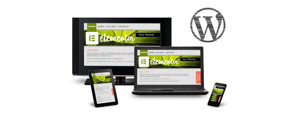
Responsive Web Design in Elementor: A Practical Guide
A website should be easy to use whether someone visits on a desktop, tablet, or phone. Responsive web design helps make that possible by adapting a page’s layout and content to different screen sizes. Elementor includes tools for adjusting page elements across devices, so you can create flexible designs without building separate websites for each screen.
This guide explains how to use Elementor’s responsive controls, what to check as you design, and how to test your finished pages.
What Is Responsive Web Design?
Responsive web design is an approach to building websites that adjusts their layout to fit the visitor’s screen. A desktop page might show several columns side by side, while the same content could stack into a single column on a phone. Images, text, spacing, and navigation can also change to remain clear and usable.
Responsive design is more than making a page narrower. It means keeping the content readable, the controls easy to tap, and the most important information easy to find on every device.
How Elementor Supports Responsive Design
Elementor provides responsive editing controls for many common design settings, including font size, margins, padding, alignment, and column or container layout. You can preview a page at different device widths and adjust settings for specific device categories.
To start, open a page in the Elementor editor and select the responsive preview controls. Choose a device view, then review the layout and make changes where needed. Responsive settings are available in the relevant widget, container, or section controls. The exact options may vary depending on the element and your Elementor setup.
Start with a Flexible Layout
A responsive page is easier to build when its structure can adapt. Use containers or columns thoughtfully, and avoid relying on fixed widths that only work at one screen size. Flexible widths and sensible maximum widths can help content fit different screens without becoming too stretched or cramped.
For example, a two-column section can work well on desktop, with text beside an image. On a narrow screen, the layout may need to stack vertically. Check the order of the content as it stacks so the most useful information appears first.
Adjust Typography for Smaller Screens
Text that looks balanced on a large monitor may be oversized on a phone—or too small to read comfortably. Use Elementor’s responsive typography controls to review headings, body copy, and button labels at each device size.
- Keep body text comfortably readable on mobile.
- Use a clear hierarchy so headings stand out without taking over the screen.
- Check line length and line spacing, especially in long paragraphs.
- Avoid manual line breaks that only look right at one width.
Review Spacing and Alignment
Large margins and padding can create a polished desktop layout, but they may leave very little room for content on a phone. Review spacing for each screen size and reduce it where necessary. Also check whether elements should remain centered, align to the left, or span the available width.
Pay close attention to buttons, forms, and navigation. A control should be easy to see and tap without crowding nearby elements.
Optimize Images and Media
Images should fit their containers without stretching or obscuring important content. Check image sizing, cropping, and focal points in each responsive view. A decorative image may work as a wide background on desktop but require a different crop on mobile.
Large media files can also slow down a page, particularly on mobile connections. Use appropriately sized image files and avoid adding video or animation unless it supports the page’s purpose.
Use Breakpoints with Care
Breakpoints are screen widths at which a layout changes. Elementor provides device previews and responsive controls to help you adjust the design at different widths. Depending on your setup, you may also be able to customize breakpoint values.
Do not design only for a few named devices. Screen sizes vary, even among phones and tablets. Preview the page at different widths when possible and look for awkward transitions, overflowing elements, or unexpectedly large gaps.
Be Careful with Hide-on-Device Settings
Elementor can let you hide some elements on particular device types. This can be useful for simplifying a crowded layout, but hiding important content may create a confusing experience. Before removing an element from mobile or tablet views, consider whether it can be rearranged or redesigned instead.
Make sure essential information and functionality remain available to all visitors, regardless of the device they use.
Test the Page Before Publishing
Elementor’s preview is helpful, but it should not be the only test. Review important pages in real browsers and on actual devices when possible. Check both portrait and landscape orientations, and test interactive elements such as menus, forms, tabs, and buttons.
Look for common issues, including:
- Horizontal scrolling caused by an element extending beyond the screen
- Text that is too small, too large, or difficult to scan
- Images with awkward crops or missing context
- Buttons that are difficult to tap
- Navigation menus that cover content or fail to open
- Excessive empty space or crowded sections
Responsive Design and Accessibility
A responsive page should also be accessible. Use clear heading structure, descriptive link text, sufficient color contrast, and meaningful alternative text for informative images. Test navigation with a keyboard and make sure focus states are visible. Responsive design is most effective when people can use the page comfortably in different contexts and with different abilities.
Conclusion
Elementor makes it possible to adapt many parts of a web page for desktop, tablet, and mobile layouts. Start with a flexible structure, then refine typography, spacing, images, and interactions at smaller widths. Preview the page at a range of sizes and test it in real browsers before publishing.
With careful planning and testing, responsive web design in Elementor can help create a site that feels clear, consistent, and easy to use on every screen.
5 Elementor Responsive Design Tips for Better Layouts on Every Device
- Use Elementor’s responsive mode to preview desktop, tablet, and mobile layouts.
- Set font sizes and spacing separately for each screen size.
- Use flexible widths and containers instead of fixed pixel dimensions.
- Hide decorative elements on mobile when they clutter the layout.
- Test pages on real devices and adjust breakpoints as needed.
Use Elementor’s responsive mode to preview desktop, tablet, and mobile layouts.
Use Elementor’s Responsive Mode to preview your page in desktop, tablet, and mobile layouts as you build. Switching between views makes it easier to spot text that looks too large, crowded spacing, misaligned elements, or images that don’t fit the screen. Adjust the relevant settings for each device, then check the layout again at different widths to help ensure the page remains clear and easy to use everywhere.
Set font sizes and spacing separately for each screen size.
Use Elementor’s responsive controls to set font sizes and spacing separately for desktop, tablet, and mobile screens. Headings that look balanced on a large monitor may feel oversized on a phone, while generous margins and padding can crowd a smaller layout. Preview each device size, then adjust typography, margins, and padding so text remains easy to read and content has room to breathe without wasting valuable screen space.
Use flexible widths and containers instead of fixed pixel dimensions.
In Elementor, flexible widths and containers help your layout adapt naturally to different screen sizes. Fixed pixel dimensions can cause content to overflow on smaller screens or leave awkward gaps on larger ones, while percentage-based widths, max-width settings, and responsive containers let elements resize and rearrange as needed. Use fixed values only when a specific dimension is essential, and preview the page across desktop, tablet, and mobile to make sure everything remains balanced and easy to use.
Hide decorative elements on mobile when they clutter the layout.
In Elementor, consider hiding decorative elements on mobile when they make the layout feel crowded or distract from the main content. Background shapes, extra icons, and ornamental images may look balanced on a large screen but take up valuable space on a phone. Use Elementor’s responsive visibility settings to hide only nonessential elements, and preview the page afterward to make sure the content still feels complete and easy to follow.
Test pages on real devices and adjust breakpoints as needed.
Previewing a page in Elementor is useful, but testing it on real phones and tablets can reveal issues that a simulator may miss. Check how the layout, text, images, menus, and buttons behave on different screen sizes and in both portrait and landscape orientations. If content feels cramped, overlaps, or leaves awkward gaps, adjust the layout and Elementor breakpoints as needed. Test again after each change to make sure the page remains clear and easy to use across devices.