
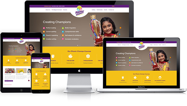
W3 Responsive Web Design: A Practical Guide
Responsive web design helps a website adapt to different screen sizes, from phones and tablets to laptops and desktop monitors. If you have searched for “W3 responsive web design,” you may be looking for W3Schools’ tutorials or its W3.CSS framework. Both offer ways to learn and apply responsive design techniques.
This guide explains the core principles of responsive web design and shows how W3.CSS can help you build layouts that work across devices.
What Is Responsive Web Design?
Responsive web design is an approach to building websites that adjust their layout and content to suit the screen and device being used. Rather than creating a separate website for every device, a responsive site uses flexible layouts, adaptable images, and CSS rules to provide a useful experience at different viewport sizes.
A responsive page might show three columns on a large screen, two on a tablet, and one on a phone. Text, images, navigation, and spacing can all adjust as the available space changes.
Three Core Principles
Fluid layouts
Fluid layouts use flexible measurements, such as percentages, instead of relying entirely on fixed pixel widths. A column set to 50% of its container can shrink or grow as the screen changes size.
Flexible images
Images should fit within their containers instead of overflowing them. A common CSS rule is:
img {


  max-width: 100%;


  height: auto;


}
This allows an image to shrink when its container is narrower while preserving its proportions.
Media queries
CSS media queries apply different styles when certain conditions are met, such as a particular viewport width. For example, a two-column layout can switch to a single column on smaller screens.
.content {


  display: grid;


  grid-template-columns: 1fr 1fr;


  gap: 1rem;


}


@media (max-width: 600px) {


  .content {


    grid-template-columns: 1fr;


  }


}
Set the Viewport
For mobile browsers to display a page at the device’s actual width, include the viewport meta tag in the document’s <head> section:
<meta name="viewport" content="width=device-width, initial-scale=1">Without this setting, some mobile browsers may render a page as if it were designed for a wider screen, then scale it down.
Using W3.CSS for Responsive Layouts
W3.CSS is a lightweight CSS framework provided by W3Schools. It includes responsive grid classes, utility styles, and other components that can help you build layouts without writing every rule from scratch. It is not a web standard published by the World Wide Web Consortium (W3C), so it’s useful to distinguish W3.CSS from W3C standards and recommendations.
A basic page can load W3.CSS with a stylesheet link:
<link rel="stylesheet" href="https://www.w3schools.com/w3css/4/w3.css">W3.CSS grid classes can define how many columns an element occupies at different screen sizes. For example:
<div class="w3-row">


  <div class="w3-col s12 m6 l4">


    <div class="w3-padding w3-light-grey">Column one</div>


  </div>


  <div class="w3-col s12 m6 l4">


    <div class="w3-padding w3-light-grey">Column two</div>


  </div>


  <div class="w3-col s12 m6 l4">


    <div class="w3-padding w3-light-grey">Column three</div>


  </div>


</div>
In this example, each column uses the full row width on small screens with s12, half the width on medium screens with m6, and one-third of the width on large screens with l4. W3.CSS uses a 12-column grid, so these numbers describe how much of the row each element occupies.
Responsive Design Best Practices
- Design for small screens first. Start with the narrow layout, then add enhancements for wider screens.
- Use content-based breakpoints. Add a breakpoint when the layout stops working well, rather than choosing device sizes arbitrarily.
- Make text easy to read. Use a comfortable font size, sufficient line spacing, and clear contrast.
- Keep navigation usable. Make links and buttons easy to tap, and avoid menus that depend only on hover.
- Test real interactions. Check forms, menus, images, and buttons—not just whether the page fits on screen.
- Check performance. Large images and unnecessary scripts can make a mobile site slow, even if its layout is responsive.
Responsive Design and Accessibility
A flexible layout can support accessibility, but responsiveness alone does not guarantee an accessible website. Use semantic HTML, provide descriptive alternative text for meaningful images, label form fields, and ensure interactive elements can be used with a keyboard. Also test text zoom and make sure content remains usable when enlarged.
How to Test a Responsive Website
Resize your browser window to see how the layout changes, and use your browser’s developer tools to simulate different screen widths. Test on actual phones and tablets when possible, since touch controls, browser behavior, and network conditions can differ from desktop simulations.
Look for common problems such as horizontal scrolling, clipped text, images that overflow their containers, and controls that are too small or too close together.
Conclusion
W3 responsive web design usually refers to learning responsive techniques through W3Schools or using its W3.CSS framework. The fundamentals are the same whichever tools you choose: create flexible layouts, make media adapt to its container, use media queries where needed, and test the experience at multiple sizes. These practices help make websites clearer and easier to use on phones, tablets, and desktop screens.
7 Essential W3 Responsive Web Design Tips
- Use the viewport meta tag to match the page to the device width.
- Build layouts with flexible grids and percentages.
- Use CSS media queries to adapt styles at breakpoints.
- Make images responsive with max-width
- Design for mobile screens first, then scale up.
- Use readable font sizes and touch-friendly controls.
- Test pages across screen sizes and browsers.
Use the viewport meta tag to match the page to the device width.
Add the viewport meta tag to your page’s <head> section so mobile browsers match the page width to the device’s screen. Without it, a browser may render the page as if it were designed for a wider desktop screen, making text and controls appear too small. Use <meta name="viewport" content="width=device-width, initial-scale=1"> to set the viewport to the device width and start the page at its natural scale.
Build layouts with flexible grids and percentages.
Build layouts with flexible grids and percentage-based widths so your content can adapt to different screen sizes. Instead of assigning every column a fixed pixel width, use a grid system or relative values that let columns expand and shrink with their container. For example, two columns set to 50% each can share the available space on a desktop, then stack vertically on a smaller screen. This approach helps prevent horizontal scrolling and keeps your page readable across phones, tablets, and computers.
Use CSS media queries to adapt styles at breakpoints.
Use CSS media queries to adapt your styles at breakpoints—the screen widths where your layout needs to change. For example, a media query can switch a multi-column layout to a single column on smaller screens, adjust font sizes, or simplify navigation for mobile users. Choose breakpoints based on when your content starts to feel cramped, rather than targeting specific devices, so your design stays usable across a wide range of screen sizes.
Make images responsive with max-width
To make images responsive in W3 responsive web design, set max-width: 100%; and height: auto; in your CSS. The image can then shrink to fit its container on smaller screens without stretching or overflowing, while keeping its original proportions. Because max-width limits the image to the container’s width, it also won’t grow larger than its natural size.
Design for mobile screens first, then scale up.
Designing for mobile screens first means starting with the smallest layout and prioritizing the content and features people need most. This approach helps keep pages clear, fast, and easy to use on phones, where space is limited. Then, use CSS media queries to add columns, larger navigation, and other enhancements as the screen gets wider. Building up from a simple mobile layout can make a responsive design more consistent across phones, tablets, and desktop screens.
Use readable font sizes and touch-friendly controls.
Use readable font sizes and touch-friendly controls to make your W3 responsive web design comfortable to use on every device. Text should remain clear without forcing visitors to zoom, and buttons, links, and form fields should be large enough to tap easily on a phone or tablet. Leave enough space between interactive elements to help prevent accidental taps, and check that text and controls remain usable as the layout changes across screen sizes.
Test pages across screen sizes and browsers.
Test your responsive web design across a range of screen sizes and browsers to make sure every visitor gets a smooth, consistent experience. Check how layouts, navigation, images, and text behave on phones, tablets, and desktop screens, and look for issues such as horizontal scrolling, clipped content, or buttons that are hard to tap. Testing in multiple browsers can also reveal differences in how styles and features are displayed, giving you a chance to fix problems before they affect your users.