
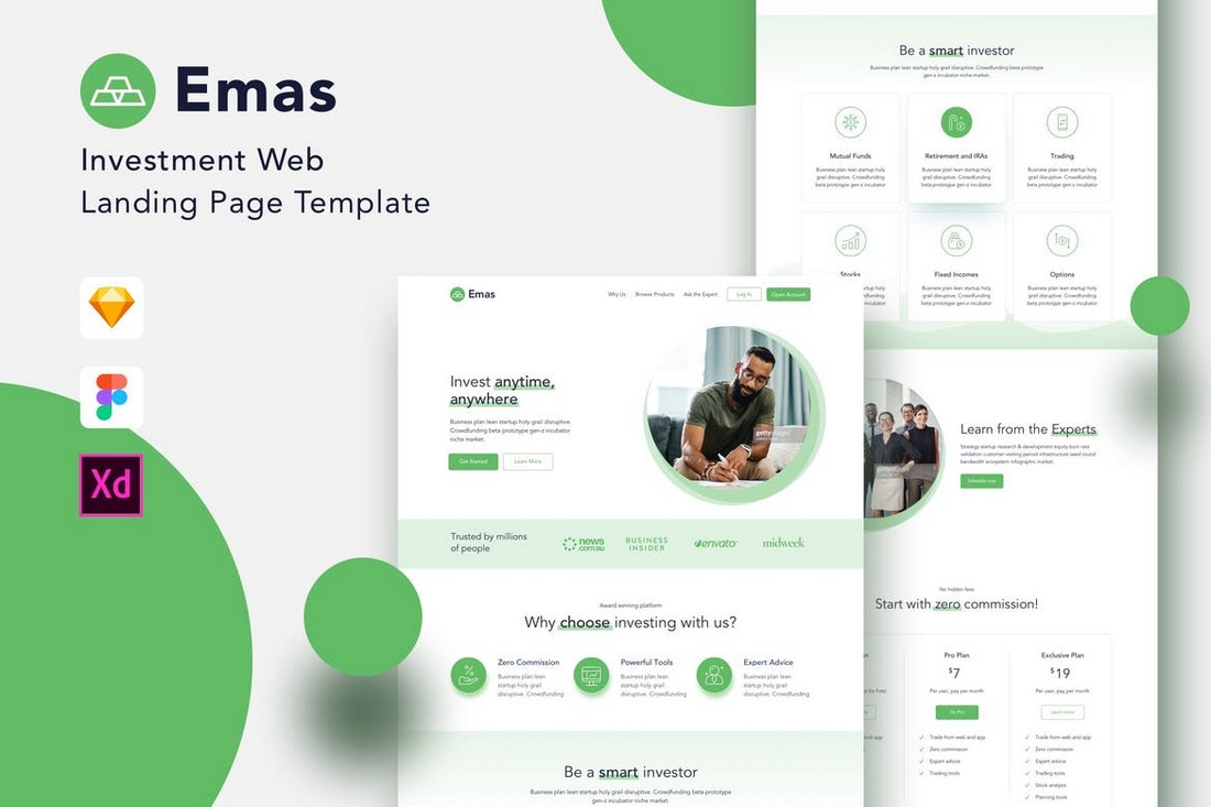
Responsive Web Design in Adobe XD: A Practical Guide
Responsive web design helps a website adapt to different screen sizes, from wide desktop monitors to phones. Adobe XD can support the design and prototyping stages of this work by letting you create layouts, explore breakpoints, and share concepts with teammates. It is important to remember, though, that XD produces design files and prototypes—not the finished responsive website. Developers still need to build and test the design in code.
What Responsive Design Means
A responsive website adjusts its layout and content to suit the available space. On a desktop, a page might show a full navigation menu and several columns. On a phone, the same page may use a compact menu and stack its content vertically. Text, images, buttons, and other elements should remain readable and usable at every size.
Responsive design is not simply a matter of shrinking a desktop page. It involves deciding how the layout should change, which content needs priority, and how people will interact with the site on different devices.
Planning Your Layouts in Adobe XD
Before opening XD, identify the main page types and the content each one needs. A simple wireframe can help you establish the page structure without getting distracted by colors or visual details. Consider the site’s navigation, headings, images, calls to action, and any forms or interactive elements.
Next, choose a set of viewport sizes to design around. These might include a large desktop, a tablet, and a mobile phone. The exact sizes should reflect the project and its audience rather than a rigid list of devices. A layout should work across a range of widths, not just at the dimensions of a few artboards.
Creating Artboards for Different Screen Sizes
In Adobe XD, use separate artboards to explore how a page might look at different viewport sizes. Start with the layout that makes the most sense for the project, then create additional artboards for narrower screens. These versions make it easier to compare design decisions side by side.
As you move from a wide layout to a narrow one, consider changes such as:
- Reducing the number of columns or stacking them vertically
- Replacing a full navigation bar with a compact menu
- Resizing or repositioning images
- Increasing the prominence of important buttons
- Adjusting spacing and typography for readability
- Reordering content to prioritize what mobile visitors need most
Keep the underlying visual system consistent. Typography, colors, button styles, and spacing should feel related across artboards, even when the layout changes.
Using Responsive Resize and Constraints
Adobe XD includes layout tools that can help elements respond when an artboard or group changes size. Responsive Resize can adjust selected objects automatically, while constraints help control how an object stays positioned in relation to its container. These features can speed up variations, especially for straightforward layouts.
Automatic resizing is a starting point, not a substitute for design judgment. A text block may need a different width, an image may need a new crop, or a navigation element may need to disappear or transform at a smaller size. Review each artboard carefully and make manual adjustments where the design requires them.
Build Reusable Components
Components help keep repeated interface elements consistent. Create components for items such as buttons, navigation links, cards, icons, and form controls. When a shared element changes, reusable components can make updates across a design more manageable.
For elements that need different arrangements on different screens, plan those variations deliberately. A desktop navigation component, for example, may not simply scale down well; it may need to become a menu button with a separate mobile interaction.
Prototype Key Interactions
Use XD’s prototyping features to demonstrate how people move through the proposed experience. Link screens, show menu states, and create examples of important interactions such as opening a navigation panel or submitting a form. A prototype can help clients and teammates understand the intent behind the design before development begins.
However, a prototype does not prove that a website will behave responsively at every width. It represents selected screens and interactions. The final implementation must still be tested in a browser on real devices or with suitable browser tools.
Prepare Designs for Handoff
A useful handoff explains more than how each screen looks. Include notes about layout behavior, content priority, image treatment, spacing, and the points at which the design should change. Clarify whether elements should wrap, stack, resize, or be hidden as the viewport narrows.
Share organized artboards and clearly named components. If a particular behavior is not obvious from the screens, add a brief note or prototype link. Clear documentation gives developers a stronger basis for translating the design into responsive code.
Common Mistakes to Avoid
- Designing only for fixed device sizes: Artboards are useful references, but the site must also work between them.
- Scaling everything down equally: Small screens often need a different content order and layout, not a miniature desktop page.
- Relying completely on automatic resizing: Automated adjustments can produce awkward spacing or text wrapping.
- Ignoring touch interaction: Buttons and links should be easy to use on touchscreens.
- Leaving behavior undocumented: Developers may not know how a layout should adapt if the design only shows static screens.
- Skipping browser testing: A design tool cannot reveal every issue that may appear in the finished website.
Adobe XD’s Role in a Responsive Workflow
Adobe XD can be useful for mapping responsive layouts, creating visual concepts, building interface components, and presenting interactive prototypes. Its role is strongest when it helps a team discuss and document design decisions.
Tool availability and support can change over time, so teams should confirm that Adobe XD fits their current software requirements and collaboration workflow. Regardless of the tool, the core process remains the same: design for flexible layouts, communicate how they should adapt, and test the implementation across a range of screen sizes.
Conclusion
Responsive web design in Adobe XD is about planning how a website’s structure and interactions change across screen sizes—not merely creating a few resized mockups. Use artboards to explore key layouts, apply constraints thoughtfully, build reusable components, and document behavior for handoff. Then validate the coded website in browsers to ensure it works smoothly beyond the designs shown in the file.
Top 9 FAQs About Responsive Web Design in Adobe XD
- What is responsive web design in Adobe XD?
- How do I create responsive layouts in Adobe XD?
- How do I use Responsive Resize in Adobe XD?
- How do constraints work in Adobe XD for responsive designs?
- Can Adobe XD automatically create mobile and tablet layouts from a desktop design?
- How do I choose breakpoints for an Adobe XD responsive design?
- How can I preview and prototype responsive designs in Adobe XD?
- How do I share responsive Adobe XD designs with developers?
- Can I use Adobe XD to build and publish a responsive website?
What is responsive web design in Adobe XD?
Responsive web design in Adobe XD is the process of planning and prototyping how a website’s layout and interface will adapt to different screen sizes, such as desktop, tablet, and mobile. Designers can create artboards for different viewports, adjust elements using responsive resizing and constraints, and prototype key interactions. XD helps visualize and communicate the design, but the finished website still needs to be built and tested in code across a range of devices and screen widths.
How do I create responsive layouts in Adobe XD?
To create responsive layouts in Adobe XD, start by designing your page for a primary screen size, then add artboards for narrower and wider viewports to explore how the layout should adapt. Use Responsive Resize and constraints to help reposition or resize elements, but review each artboard and adjust content, spacing, typography, and navigation manually where needed. Test key interactions with a prototype, and include notes about how elements should behave between artboard sizes so developers can implement the design accurately.
How do I use Responsive Resize in Adobe XD?
To use Responsive Resize in Adobe XD, select the group or elements you want to adapt, then enable Responsive Resize in the Properties panel. XD will try to adjust the selection when you change its size or move it to an artboard with different dimensions. You can switch between automatic and manual resizing, and use constraints to control how elements stay anchored to their container. After resizing, review the layout and make any needed adjustments—text, images, and complex groups may not adapt exactly as intended.
How do constraints work in Adobe XD for responsive designs?
In Adobe XD, constraints control how an object stays positioned relative to its parent artboard or group when that container changes size. You can anchor an element to one or more edges, or set it to maintain its position or size, so items such as logos, buttons, and images behave more predictably when a layout is resized. Constraints are helpful for creating responsive design variations, but they don’t automatically create a complete responsive website. Review each screen size and adjust elements manually when the layout needs to change, such as stacking content or simplifying navigation.
Can Adobe XD automatically create mobile and tablet layouts from a desktop design?
Adobe XD can help adapt a desktop design using features such as Responsive Resize, but it cannot reliably generate polished mobile and tablet layouts automatically. You’ll usually need to adjust each version by hand—for example, stacking columns, changing navigation, resizing images, and improving text readability. Treat automatic resizing as a starting point, then review the layouts at different screen widths and refine them to suit each device.
How do I choose breakpoints for an Adobe XD responsive design?
Choose breakpoints based on when your layout or content stops working well—not just on specific device models. In Adobe XD, create artboards at representative widths, then test how navigation, text, images, and columns behave as the screen narrows. Add a breakpoint where the design needs a meaningful change, such as stacking columns or switching to a compact menu. Keep the number of breakpoints manageable, and tell developers how the layout should adapt between the artboard sizes.
How can I preview and prototype responsive designs in Adobe XD?
To preview and prototype responsive designs in Adobe XD, create artboards for key screen sizes, such as desktop, tablet, and mobile, then use the Prototype tab to connect screens and demonstrate interactions like navigation menus, buttons, and page transitions. Preview the flow in XD’s desktop or mobile preview, or share a link so others can review it in a browser. Because prototypes show only the layouts and behaviors you create, test the finished website at a range of viewport sizes in a browser as well.
How do I share responsive Adobe XD designs with developers?
To share responsive Adobe XD designs with developers, organize your artboards by page and screen size, use clear names for artboards and components, and add notes explaining how layouts should adapt between breakpoints. Then share the XD document or a link with the appropriate access, and use the handoff or developer inspection features available in your version to provide measurements, colors, typography, and exportable assets. Include prototype links for important interactions, and call out behaviors that may not be obvious from static screens, such as when navigation collapses or content stacks.
Can I use Adobe XD to build and publish a responsive website?
Adobe XD is designed for creating website layouts, interactive prototypes, and design handoffs—not for building and publishing a finished responsive website on its own. You can use it to show how a design may adapt to desktop, tablet, and mobile screens, then share those specifications with a developer or recreate the design in a website-building platform. The final site must be implemented and tested separately to ensure it works across screen sizes and browsers.