
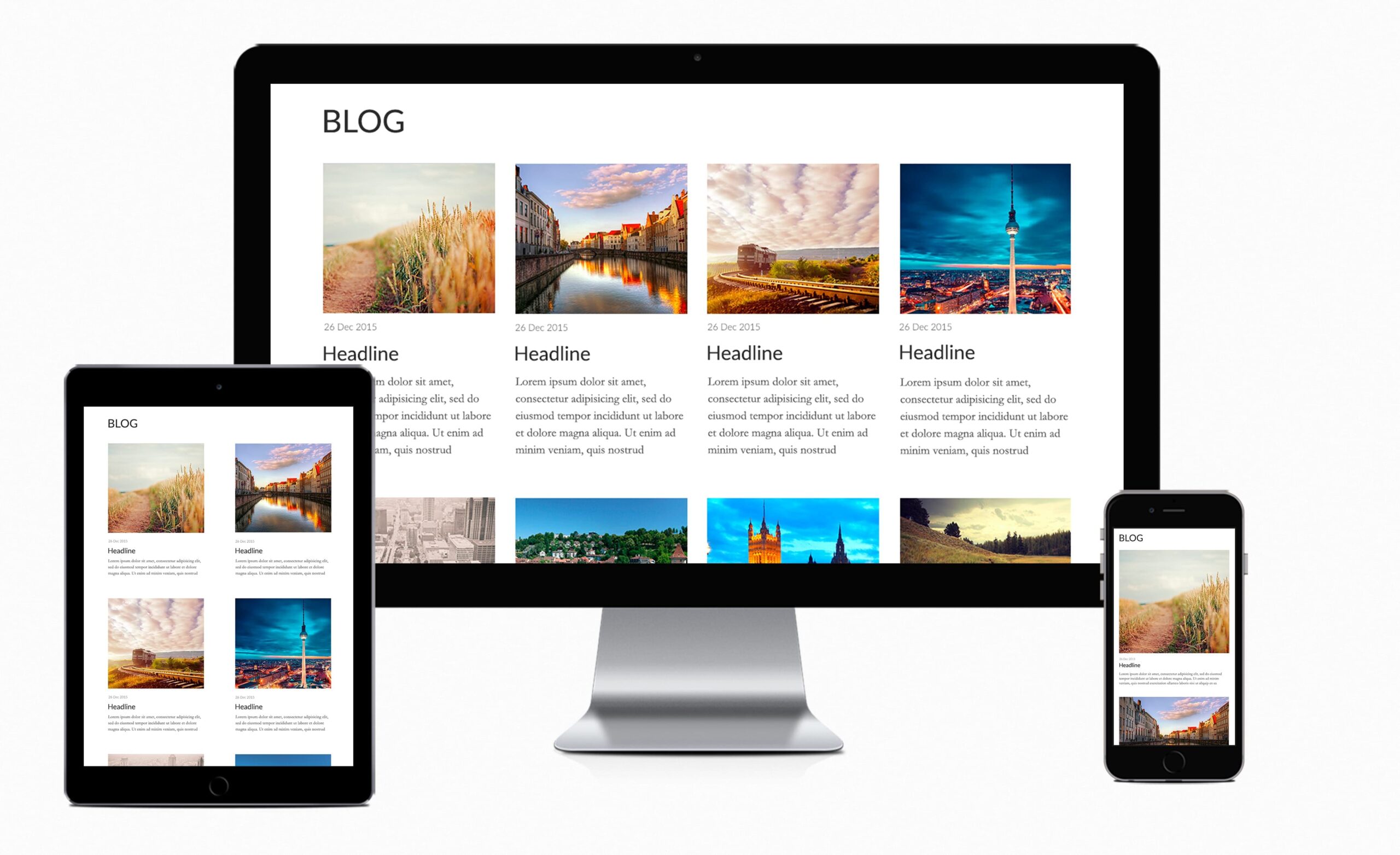
Responsive Design Online: Building Websites for Every Screen
People browse the web on phones, tablets, laptops, and large desktop monitors. A website that looks polished on one screen can feel cramped, difficult to navigate, or incomplete on another. Responsive design helps solve this problem by allowing a website’s layout and content to adapt to different screen sizes and browsing conditions.
What Is Responsive Design?
Responsive design is an approach to web design and development that makes a website work well across a range of devices. Instead of creating a separate site for every screen size, designers build flexible layouts that adjust as the available space changes.
A responsive website can rearrange columns, resize images, change navigation menus, and adjust text spacing to suit the screen. The goal is not simply to make a desktop page smaller. It is to make the site comfortable and useful wherever someone visits it.
Why Responsive Design Matters
People expect websites to be easy to use on the device in front of them. If text is too small, buttons are hard to tap, or important content disappears off-screen, visitors may leave before finding what they need. A responsive experience can make it easier for people to read, browse, shop, and get in touch.
Responsive design also helps organizations maintain a consistent online presence. With one adaptable website, teams can update content in one place rather than manage separate versions for mobile and desktop users. Search engines also use mobile-focused signals when evaluating pages, so a mobile-friendly experience can support a site’s visibility in search results.
Core Elements of a Responsive Website
Flexible Layouts
Responsive layouts use proportions and adaptable structures instead of relying entirely on fixed dimensions. A multi-column layout on a wide screen might become a single column on a phone. This keeps content readable without forcing visitors to scroll sideways.
Scalable Images and Media
Images, videos, and other media should fit within their containers and display clearly at different sizes. Designers may also choose different image crops or resolutions for different devices to preserve important visual details while helping pages load efficiently.
Readable Typography
Text should remain comfortable to read on both small and large screens. Responsive typography can adjust font sizes, line spacing, and line length so visitors do not have to zoom in or struggle through long, overly wide lines of text.
Touch-Friendly Navigation
Menus and controls designed for a mouse may not work as well on a touchscreen. Links and buttons need enough space to tap accurately, and navigation should be easy to find and understand. On smaller screens, a compact menu can help keep the page uncluttered.
Responsive Breakpoints
Breakpoints are points where a layout changes to better fit the available space. For example, a navigation bar may collapse into a menu when the screen becomes too narrow for its links. Breakpoints should be selected based on how the content behaves, rather than on a list of specific device models.
How to Plan a Responsive Design
- Start with the content. Identify the information and actions visitors need most, then make them easy to find at every screen size.
- Design for smaller screens early. Beginning with a compact layout encourages clear priorities and helps prevent unnecessary clutter.
- Use flexible components. Build layouts that can expand, shrink, or rearrange instead of depending on fixed-width sections.
- Make interactions accessible. Check that buttons, forms, and menus work with touch, keyboard, and assistive technologies.
- Test across screen sizes. Preview pages at different widths and test them on actual devices when possible.
Common Responsive Design Mistakes
One common mistake is treating mobile design as an afterthought. Shrinking a desktop layout without reconsidering the content or interactions can lead to tiny text, awkward spacing, and hard-to-use controls.
Another mistake is hiding important information on smaller screens. A responsive layout should prioritize content thoughtfully, not remove essential details simply to make a page shorter. Designers should also watch for oversized images, horizontal scrolling, and menus that are difficult to open or close.
Finally, testing only one or two screen sizes can leave problems undiscovered. A page may look good on a particular phone but break at a width between common device sizes. Testing a range of viewport widths helps reveal these issues.
Responsive Design and Accessibility
Responsive design and accessibility work well together. Clear headings, strong color contrast, descriptive links, keyboard-friendly controls, and properly labeled forms benefit visitors across devices. A layout should also remain usable when people increase text size or use screen magnification.
Accessibility is not just a final checklist. It should inform decisions throughout the design and development process so the site remains understandable and functional for as many people as possible.
Keeping a Website Responsive Over Time
Responsive design is not a one-time task. New pages, features, and content can introduce layout problems, so websites should be reviewed regularly. Check key pages after updates, monitor performance, and gather feedback from visitors to identify areas that need improvement.
A well-designed responsive website adapts to its audience without making the technology noticeable. By focusing on flexible layouts, readable content, accessible interactions, and thorough testing, businesses and creators can offer a consistent online experience on virtually any screen.
9 Benefits of Responsive Design: Enhancing Usability, Accessibility, and Brand Consistency Across Devices
- Works across phones, tablets, and desktops
- Improves mobile usability
- Keeps content easy to read
- Makes navigation simpler
- Supports accessibility
- Reduces horizontal scrolling
- Creates a consistent brand experience
- Can improve search visibility
- Simplifies website maintenance
Challenges of Responsive Design: Time, Complexity, and Performance
- Can require extra design and testing time.
- Complex layouts may be difficult to adapt across screens.
- Large images and scripts can slow mobile loading.
Works across phones, tablets, and desktops
Responsive design allows a website to work smoothly across phones, tablets, and desktop computers. Its layout, images, text, and navigation adjust to fit each screen, so visitors can read content and use features without excessive zooming or horizontal scrolling. This consistent experience helps people access a website wherever they are and on whichever device they prefer.
Improves mobile usability
Responsive design improves mobile usability by adapting a website’s layout and features to smaller touchscreens. Text stays readable, buttons are easier to tap, and menus and forms are simpler to navigate without excessive zooming or horizontal scrolling. This makes it easier for mobile visitors to find information and complete tasks, creating a smoother experience wherever they browse.
Keeps content easy to read
Responsive design keeps content easy to read by adjusting text size, line length, spacing, and layout to fit each screen. On a phone, paragraphs can flow in a single column without forcing visitors to zoom or scroll sideways; on larger screens, text can use more space while remaining comfortable to scan. This makes it easier for people to find information and enjoy a consistent reading experience across devices.
Makes navigation simpler
Responsive design makes navigation simpler by adapting menus and controls to the screen people are using. On a phone, a full desktop menu can become a compact, easy-to-tap menu, while larger screens can display more navigation options at once. Clear layouts, appropriately sized buttons, and fewer unnecessary elements help visitors find what they need quickly—whether they’re browsing with a touchscreen, mouse, or keyboard.
Supports accessibility
Responsive design supports accessibility by helping websites remain usable across different devices, screen sizes, and viewing preferences. Clear layouts, readable text, touch-friendly controls, and content that adapts when users zoom in can make it easier for more people to navigate and understand a site. When responsive design is paired with features such as keyboard navigation, descriptive labels, and strong color contrast, it creates a more inclusive online experience.
Reduces horizontal scrolling
Responsive design reduces horizontal scrolling by adjusting a website’s layout to fit the width of the visitor’s screen. Text, images, and page sections resize or rearrange instead of extending beyond the viewport, so visitors can read and navigate without swiping sideways. This makes browsing more comfortable—especially on phones—and helps ensure that important content and controls remain easy to access.
Creates a consistent brand experience
Responsive design helps create a consistent brand experience by ensuring that a website’s colors, typography, imagery, and overall style feel familiar across phones, tablets, and computers. Visitors can move between devices without encountering a site that looks or works like a different brand. This visual and functional consistency builds recognition, supports trust, and makes it easier for customers to connect with a business wherever they browse online.
Can improve search visibility
Responsive design can improve search visibility by making a website easier to use on mobile devices, where many people browse and search. Clear text, accessible navigation, and pages that fit different screen sizes can create a better experience for visitors. Search engines consider mobile usability and page experience among many ranking signals, so a responsive website can support stronger visibility in search results.
Simplifies website maintenance
Responsive design simplifies website maintenance by allowing businesses to manage one website that adapts to phones, tablets, and desktop screens. Instead of updating separate desktop and mobile versions, teams can make changes to content, features, and branding in one place. This saves time, reduces the risk of inconsistent information, and makes ongoing updates easier to coordinate.
Can require extra design and testing time.
One drawback of responsive design is that it can require extra design and testing time. Designers and developers need to consider how layouts, images, menus, and interactive features behave across a range of screen sizes and devices. They also need to test those experiences and fix issues that may appear at different widths, which can add time to a project compared with building for a single screen size.
Complex layouts may be difficult to adapt across screens.
Complex layouts can be difficult to adapt across screens because their many columns, visual elements, and interactive features may not fit neatly on smaller devices. Designers often need to rearrange or simplify these elements while preserving the page’s clarity and functionality. Without careful planning and testing, the result can feel cluttered, confusing, or inconsistent from one screen size to another.
Large images and scripts can slow mobile loading.
Large images and complex scripts can slow down a responsive website, especially on mobile devices with limited bandwidth or processing power. Even when images resize to fit a smaller screen, their files may still be unnecessarily large, while scripts can delay page rendering and interaction. Optimizing images, removing unused code, and loading nonessential scripts only when needed can help pages load faster and provide a smoother mobile experience.