
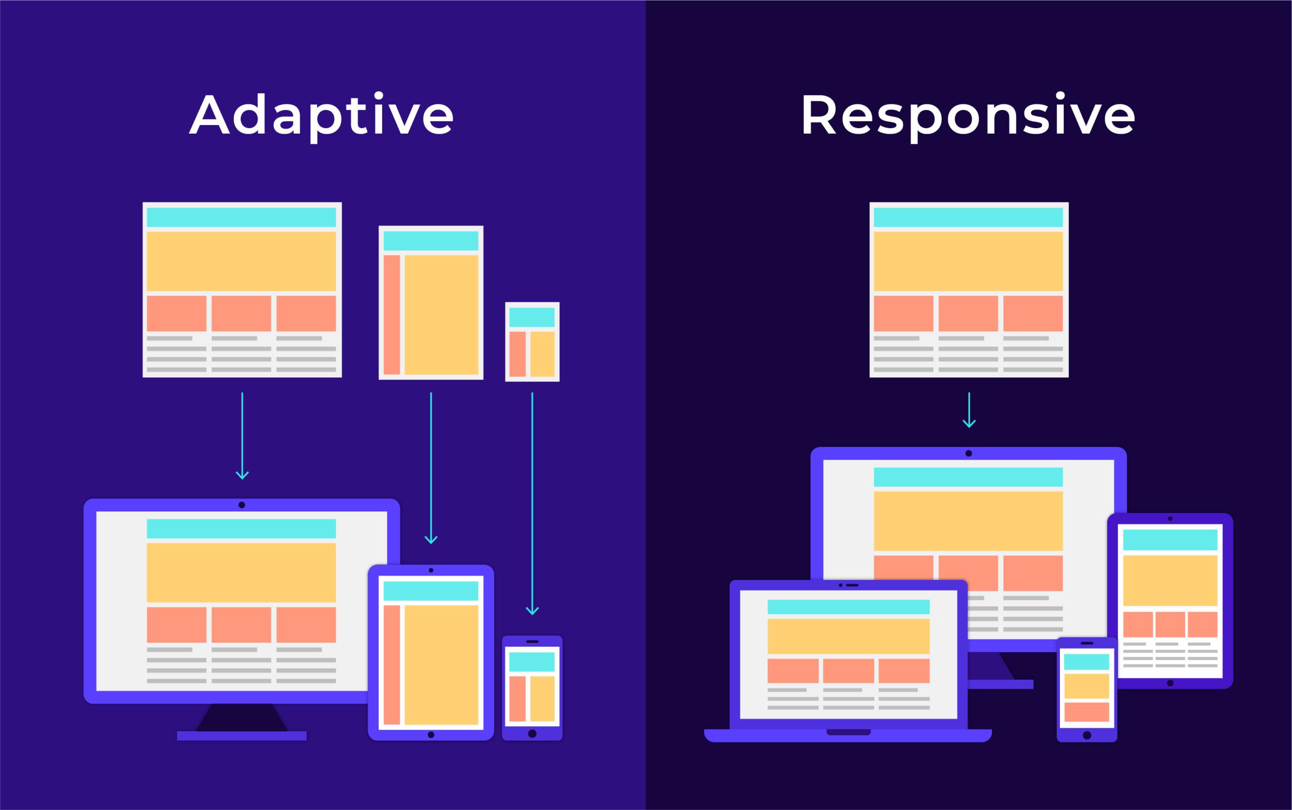
What is Responsive Web Design?
Responsive web design is an approach to building websites that ensures optimal viewing and interaction experiences across a wide range of devices, from desktop computers to mobile phones. In today’s digital age, where people access the internet on various devices with different screen sizes and resolutions, having a responsive website is essential for providing a seamless user experience.
Responsive web design uses flexible layouts and grids, as well as CSS media queries, to automatically adjust the layout of a website based on the screen size and orientation of the device being used. This means that the website will adapt its design and content to fit the screen size, ensuring that users can easily navigate and consume the information without having to zoom in or scroll horizontally.
By implementing responsive web design, websites can reach a wider audience and improve user engagement. With more people browsing the internet on mobile devices, having a responsive website can also boost search engine rankings, as search engines like Google prioritize mobile-friendly websites in their search results.
In conclusion, responsive web design is crucial for creating modern websites that provide an optimal user experience across all devices. By adopting responsive design principles, businesses and individuals can ensure that their websites are accessible, user-friendly, and visually appealing on any device.
5 Essential Tips for Mastering Responsive Web Design
- Responsive web design ensures that a website looks good and functions well on various devices, including desktops, tablets, and smartphones.
- Use fluid grids and flexible images to create a responsive layout that adapts to different screen sizes.
- Media queries can be used to apply specific styles based on the device’s characteristics like screen width or orientation.
- Optimize images and content for faster loading times on mobile devices to improve user experience.
- Regularly test your responsive design across different devices to ensure consistent performance and usability.
Responsive web design ensures that a website looks good and functions well on various devices, including desktops, tablets, and smartphones.
Responsive web design is a crucial approach to ensuring that a website not only looks visually appealing but also functions seamlessly across a wide range of devices, such as desktops, tablets, and smartphones. By incorporating responsive design principles, websites can adapt their layout and content to fit the screen size and orientation of different devices, providing users with an optimal viewing experience regardless of the device they are using. This versatility in design helps to enhance user engagement and accessibility, making the website more user-friendly and accommodating to a diverse audience.
Use fluid grids and flexible images to create a responsive layout that adapts to different screen sizes.
When implementing responsive web design, it is essential to use fluid grids and flexible images to create a layout that can adapt seamlessly to various screen sizes. By utilizing fluid grids, the website’s layout can adjust proportionally based on the screen size, ensuring that content remains readable and visually appealing across different devices. Flexible images further enhance this adaptability by resizing accordingly without losing quality, contributing to a cohesive and user-friendly experience for visitors accessing the website on desktops, laptops, tablets, or smartphones.
Media queries can be used to apply specific styles based on the device’s characteristics like screen width or orientation.
Media queries are a powerful tool in responsive web design that allow developers to apply specific styles based on the characteristics of the user’s device, such as screen width or orientation. By using media queries, designers can create custom layouts and adjust elements like font sizes, spacing, and image sizes to ensure that the website looks and functions optimally on different devices. This level of customization helps to enhance the user experience by tailoring the design to fit the specific capabilities of each device, ultimately leading to a more engaging and user-friendly website.
Optimize images and content for faster loading times on mobile devices to improve user experience.
To enhance user experience on mobile devices, optimizing images and content for faster loading times is essential in responsive web design. By reducing file sizes, utilizing efficient image formats, and implementing lazy loading techniques, websites can ensure that users have quick access to content without delays or interruptions. This not only improves user satisfaction but also helps in retaining visitors and boosting overall engagement on mobile platforms.
Regularly test your responsive design across different devices to ensure consistent performance and usability.
Regularly testing your responsive design across various devices is crucial to ensure consistent performance and usability. By testing on different screen sizes and resolutions, you can identify any potential issues and make necessary adjustments to optimize the user experience. This proactive approach helps in delivering a seamless browsing experience for all visitors, regardless of the device they are using. Consistent testing not only improves user satisfaction but also boosts your website’s credibility and accessibility across a wide range of devices.