to organize your content into different sections. By using these semantic tags, you not only improve the accessibility of your webpage but also make it easier for search engines to understand its structure.
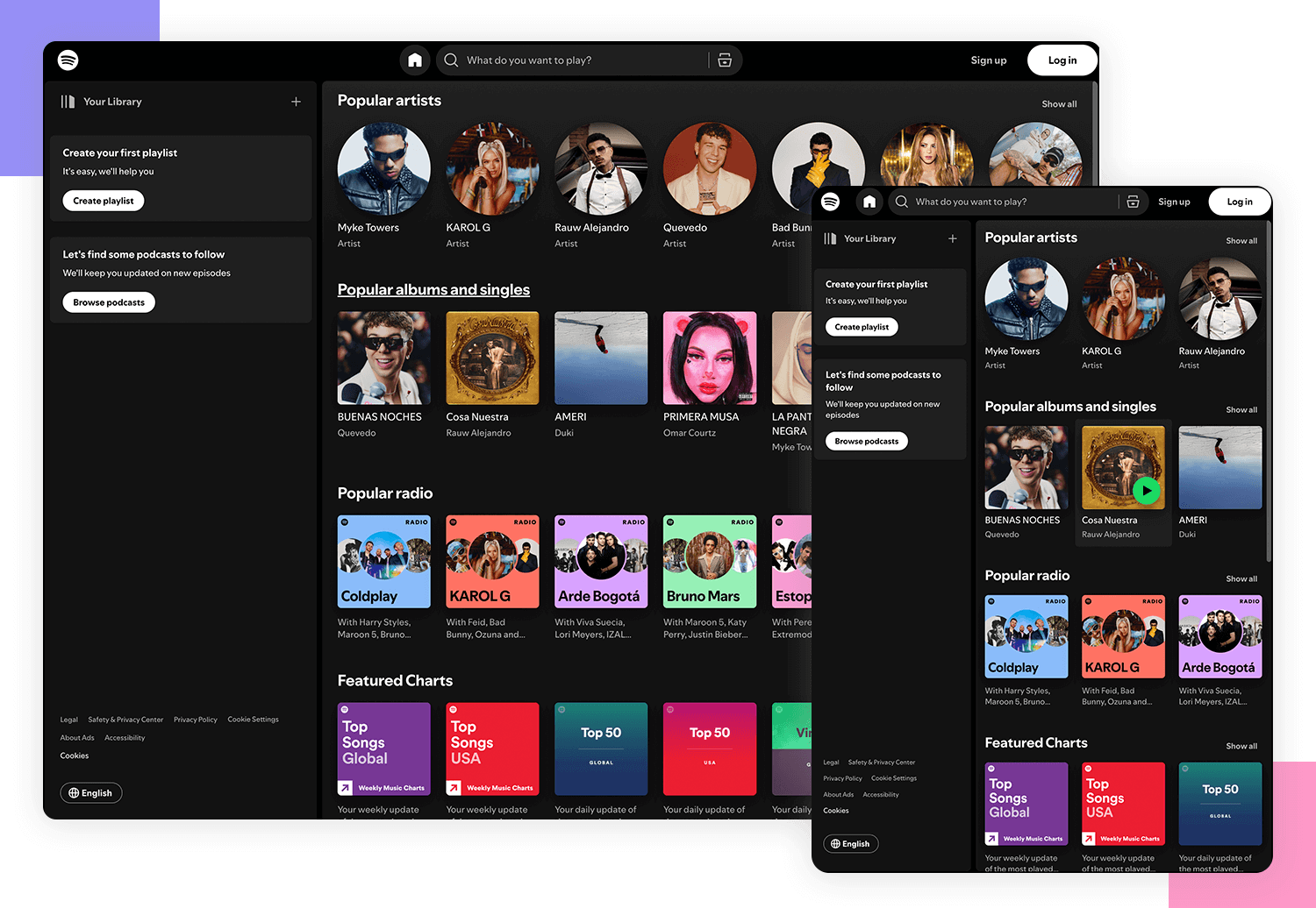
In your CSS stylesheet, you can use media queries to define different styles for various screen sizes. For example, you can set specific widths, margins, and font sizes for desktop screens and adjust them accordingly for tablets and mobile devices.
To ensure that your images are also responsive, you can use CSS properties like max-width: 100% to make them scale proportionally based on the size of the viewport.
Additionally, consider using flexible units like percentages or viewport widths (vw) instead of fixed pixel values for sizing elements on your webpage. This approach allows your content to adapt fluidly to different screen sizes without losing its layout integrity.
By following these steps and incorporating responsive design principles into your web development process, you can create a simple yet effective responsive web page that looks great on any device. Remember to test your webpage across various devices to ensure that it functions properly and provides an optimal user experience for all visitors.
8 Essential Tips for Creating a Simple and Effective Responsive Web Page
Use a responsive framework like Bootstrap or Flexbox for layout Prioritize mobile-first design to ensure good user experience on smaller screens Optimize images and videos for fast loading times on all devices Utilize media queries to adjust styling based on screen size Ensure text is readable by choosing appropriate font sizes and line heights Keep navigation simple and accessible, especially on smaller devices Test your website across different devices and browsers to catch any responsiveness issues Consider performance optimization techniques like lazy loading for better user experience
Use a responsive framework like Bootstrap or Flexbox for layout
When creating a simple responsive web page, utilizing a responsive framework like Bootstrap or Flexbox for layout can greatly streamline the design process. These frameworks offer pre-built components and grid systems that automatically adjust to different screen sizes, making it easier to create a visually appealing and consistent layout across devices. By leveraging the power of these responsive frameworks, web developers can save time and effort while ensuring that their web pages are optimized for a wide range of screen sizes and devices.
Prioritize mobile-first design to ensure good user experience on smaller screens
Prioritizing mobile-first design is essential for creating a simple responsive web page that delivers a good user experience on smaller screens. By starting with a mobile-focused approach, you ensure that your website is optimized for the constraints and capabilities of mobile devices, such as smartphones and tablets. This strategy allows you to streamline content, prioritize key information, and design intuitive navigation that caters to users accessing your site on smaller screens. Embracing mobile-first design not only enhances usability but also helps improve load times and overall performance across all devices, ultimately leading to a more engaging and effective user experience.
Optimize images and videos for fast loading times on all devices
Optimizing images and videos for fast loading times on all devices is crucial for ensuring a smooth user experience on a responsive web page. By reducing the file size of media assets through compression and using the appropriate formats, you can significantly improve loading times without compromising quality. Additionally, implementing lazy loading techniques can help prioritize the loading of visible content first, enhancing the overall performance of your webpage across different devices. Prioritizing optimization of images and videos not only enhances user experience but also contributes to better SEO rankings and increased user engagement.
Utilizing media queries to adjust styling based on screen size is a crucial technique in creating a responsive web page. By using media queries in your CSS stylesheet, you can define specific styles for different screen sizes, ensuring that your content looks visually appealing and remains accessible across various devices. This allows you to tailor the layout, font sizes, margins, and other design properties to provide an optimal viewing experience for users on desktops, laptops, tablets, and mobile devices. By implementing media queries effectively, you can enhance the responsiveness of your web page and create a seamless user experience regardless of the device being used.
Ensure text is readable by choosing appropriate font sizes and line heights
When creating a simple responsive web page, it is essential to prioritize the readability of text by selecting suitable font sizes and line heights. Choosing fonts that are legible and adjusting their sizes based on different screen sizes can significantly enhance the user experience. Additionally, setting appropriate line heights ensures that text is well-spaced and easy to read, especially on smaller devices. By focusing on these details, you can improve the accessibility and overall quality of your website for all visitors.
Keep navigation simple and accessible, especially on smaller devices
When designing a simple responsive web page, it is essential to prioritize the navigation’s simplicity and accessibility, particularly on smaller devices. By keeping the navigation straightforward and easy to use, users can quickly find the information they need without getting lost or frustrated. Utilizing clear labels, concise menus, and intuitive navigation elements ensures that visitors can easily navigate the website on devices with limited screen real estate. This approach enhances the user experience and encourages engagement across all devices, contributing to a more effective and user-friendly website overall.
Test your website across different devices and browsers to catch any responsiveness issues
Testing your website across different devices and browsers is essential to identify and address any responsiveness issues that may arise. By conducting thorough testing, you can ensure that your web page looks and functions as intended on various screen sizes and platforms, providing a seamless user experience for all visitors. Regular testing helps you catch any layout inconsistencies, font scaling issues, or navigation problems that may affect how your website is displayed on different devices, ultimately improving the overall usability and accessibility of your site.
When creating a simple responsive web page, it is essential to consider performance optimization techniques to enhance the user experience. One effective strategy is implementing lazy loading, which defers the loading of non-essential resources such as images and videos until they are needed. By incorporating lazy loading into your webpage, you can improve its loading speed and reduce bandwidth usage, resulting in a smoother and more efficient browsing experience for your visitors.
Tags:
bootstrap ,
css ,
design ,
flexbox ,
flexible units ,
framework ,
grid systems ,
html ,
images optimization ,
layout ,
media queries ,
mobile-first design ,
responsive web page ,
responsive website ,
screen size ,
simple responsive web page ,
user experience ,
videos optimization