
The Difference Between Responsive Design and Adaptive Design
When it comes to creating a user-friendly and visually appealing website, two terms that often come up are responsive design and adaptive design. While both approaches aim to improve the user experience across different devices, they do so in slightly different ways.
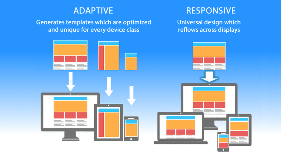
Responsive Design
Responsive design is a web design approach that aims to create a flexible website layout that automatically adjusts to fit the screen size of the device being used. This means that a responsive website will look good and function well on desktop computers, laptops, tablets, and smartphones without the need for separate designs or code bases.
One of the key features of responsive design is its use of fluid grids and flexible images. These elements allow the content on a website to resize and reflow based on the screen size, ensuring that users have a consistent experience no matter what device they are using.
Adaptive Design
Adaptive design, on the other hand, involves creating multiple fixed layout sizes based on specific breakpoints. These breakpoints are predetermined screen widths at which the layout of the website changes to accommodate different devices. Instead of fluidly adjusting like responsive design, adaptive design serves up pre-defined layouts based on the device’s screen size.
This approach allows designers more control over how their websites appear on different devices, as they can tailor specific layouts for each breakpoint. However, it also requires more upfront planning and development work compared to responsive design.
Which One Should You Choose?
Deciding between responsive design and adaptive design depends on your specific needs and goals. Responsive design offers a more flexible and future-proof solution that can adapt to any screen size or device orientation. On the other hand, adaptive design provides more control over how your website looks on different devices but requires more effort to implement.
In conclusion, both responsive design and adaptive design have their strengths and weaknesses. Ultimately, choosing the right approach for your website comes down to understanding your audience’s needs, your development resources, and your long-term goals for your online presence.
6 Essential Tips for Mastering Responsive and Adaptive Design
- Responsive Design
- Use fluid grids to create a flexible layout.
- Incorporate media queries to adjust styles based on screen size.
- Adaptive Design
- Utilize device detection to deliver appropriate designs.
- Consider server-side components for dynamic content adaptation.
Responsive Design
Responsive design is a versatile web design approach that automatically adjusts the layout of a website to fit the screen size of any device, ensuring a consistent user experience across desktops, laptops, tablets, and smartphones. By using fluid grids and flexible images, responsive design allows content to resize and reflow dynamically, making it an ideal choice for websites that prioritize adaptability and accessibility on various screen sizes.
Use fluid grids to create a flexible layout.
When designing a website with responsive design or adaptive design in mind, utilizing fluid grids is essential to creating a flexible layout that can adapt to various screen sizes seamlessly. By using fluid grids, elements on the webpage can resize proportionally based on the user’s device, ensuring a consistent and visually appealing experience across different platforms. This approach allows for a more user-friendly interface and enhances the overall responsiveness of the website, making it easier for visitors to navigate and engage with the content regardless of the device they are using.
Incorporate media queries to adjust styles based on screen size.
To optimize your website for various devices, it is essential to incorporate media queries into your design process. Media queries allow you to adjust styles based on the screen size of the device being used, ensuring a seamless and responsive user experience. By implementing media queries effectively, you can customize the layout, font sizes, images, and other design elements to adapt to different screen sizes, whether it’s a desktop, tablet, or smartphone. This approach not only enhances user engagement but also ensures that your website looks polished and professional across all devices.
Adaptive Design
Adaptive design is a web design approach that involves creating multiple fixed layout sizes based on specific breakpoints. By serving up pre-defined layouts tailored for different device screen sizes, adaptive design allows for more control over how a website appears on various devices. While it requires more upfront planning and development work compared to responsive design, adaptive design offers the flexibility to customize layouts for optimal user experience across different screen sizes and resolutions.
Utilize device detection to deliver appropriate designs.
Utilizing device detection is a crucial tip when implementing responsive design and adaptive design strategies. By detecting the type of device being used to access a website, developers can deliver appropriate designs tailored to that specific device’s screen size and capabilities. This ensures that users have a seamless and optimized experience, whether they are browsing on a desktop, laptop, tablet, or smartphone. Device detection helps in determining the best layout and design elements to display, ultimately enhancing usability and improving overall user satisfaction.
Consider server-side components for dynamic content adaptation.
When implementing responsive design and adaptive design strategies, it is important to consider incorporating server-side components for dynamic content adaptation. By utilizing server-side technologies, such as server-side scripting languages or content management systems, you can tailor the content delivered to users based on their device type or screen size. This approach allows for more customized and optimized user experiences, ensuring that your website adapts seamlessly to different devices and provides relevant content to enhance user engagement.