
Responsive Web Design vs. Adaptive Web Design
When it comes to creating a user-friendly and visually appealing website, two popular approaches are responsive web design and adaptive web design. While both aim to provide an optimal viewing experience across different devices, they have distinct differences that set them apart.
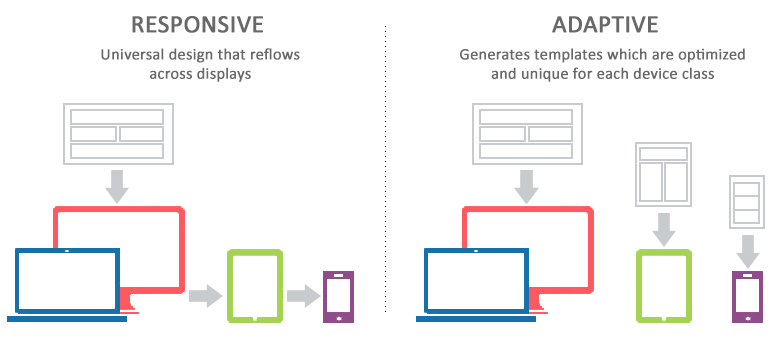
Responsive Web Design
Responsive web design is a flexible approach that uses CSS media queries to adjust the layout of a website based on the screen size of the device being used. This means that a responsive website will automatically resize and reformat its content to fit various screen sizes, from desktop computers to smartphones and tablets. The design fluidly adapts to different viewport sizes, providing a seamless user experience regardless of the device.
Adaptive Web Design
Adaptive web design, on the other hand, involves creating multiple fixed layout sizes based on specific breakpoints. Instead of fluidly adjusting to any screen size like responsive design, adaptive design serves pre-defined layouts optimized for different devices. When a user accesses the website, the server detects the device type and loads the appropriate layout designed for that specific viewport size.
Key Differences
- Flexibility: Responsive design offers more flexibility as it can adapt to any screen size without needing separate layouts.
- Performance: Adaptive design may load faster as it serves pre-optimized layouts based on detected device sizes.
- Maintenance: Responsive design requires less maintenance as changes apply universally across all devices, while adaptive design may need updates for each layout.
Conclusion
Both responsive and adaptive web design have their strengths and weaknesses. The choice between them depends on factors such as project requirements, budget, and target audience preferences. Ultimately, selecting the right approach will help ensure your website delivers an optimal user experience across various devices.
9 Essential Tips for Mastering Responsive and Adaptive Web Design
- Responsive Web Design Tips
- Use CSS media queries to adjust layout based on screen size.
- Prioritize content hierarchy for smaller screens.
- Optimize images for faster loading on mobile devices.
- Implement flexible grids and relative units like percentages.
- Adaptive Web Design Tips
- Utilize server-side components to deliver optimized content.
- Consider device capabilities when designing interactions.
- Regularly analyze user data to refine adaptive strategies.
Responsive Web Design Tips
When considering responsive web design, it is essential to prioritize user experience across different devices. Implementing fluid layouts and flexible images can help ensure that your website adapts seamlessly to various screen sizes. Additionally, optimizing loading times and prioritizing mobile-friendly navigation are key factors in creating a user-friendly responsive design. By focusing on these aspects, you can enhance the accessibility and usability of your website for all visitors, regardless of the device they are using.
Use CSS media queries to adjust layout based on screen size.
Using CSS media queries to adjust the layout based on screen size is a fundamental tip in both responsive web design and adaptive web design. By implementing media queries in your CSS code, you can define specific styles that apply when certain conditions, such as screen width or device orientation, are met. This allows your website to adapt seamlessly to different viewport sizes, ensuring a consistent and user-friendly experience across a variety of devices. Whether you opt for responsive design’s fluid layout adjustments or adaptive design’s predefined breakpoints, leveraging CSS media queries is key to creating a visually appealing and functional website that caters to diverse screen sizes.
Prioritize content hierarchy for smaller screens.
When implementing responsive web design and adaptive web design, it is crucial to prioritize content hierarchy for smaller screens. By focusing on the most important elements and structuring content in a logical order, you ensure that users on mobile devices can easily access key information without overwhelming them with cluttered layouts. This approach not only enhances user experience but also improves the overall usability of your website across different screen sizes. By strategically organizing content based on its importance, you create a seamless and intuitive browsing experience for all visitors, regardless of the device they are using.
Optimize images for faster loading on mobile devices.
To enhance the performance of your website on mobile devices, it is crucial to optimize images for faster loading times. By resizing and compressing images without compromising quality, you can significantly reduce page load times on smartphones and tablets. This practice is essential for both responsive and adaptive web design approaches, ensuring that users have a seamless browsing experience regardless of the device they are using. Prioritizing image optimization not only improves loading speed but also contributes to a more efficient and user-friendly mobile web design.
Implement flexible grids and relative units like percentages.
Implementing flexible grids and relative units like percentages is a key tip in both responsive web design and adaptive web design. By using these techniques, you can create layouts that adapt smoothly to different screen sizes and resolutions. Flexible grids allow your design to scale proportionally, ensuring that elements maintain their relative positions and sizes across various devices. Using percentages for widths and heights instead of fixed pixels enables your website to adjust dynamically based on the viewport size, providing a more consistent user experience. This approach helps in designing websites that are not only visually appealing but also functional across a wide range of devices.
Adaptive Web Design Tips
When focusing on Adaptive Web Design, it is essential to pay attention to creating distinct layout options tailored to specific device sizes. By defining breakpoints and designing layouts optimized for different screen dimensions, you can ensure a seamless user experience across various devices. Testing the adaptability of your website on different devices and refining the layouts based on user feedback will help enhance the performance and usability of your adaptive design approach.
Utilize server-side components to deliver optimized content.
To enhance the performance and user experience of your website, consider utilizing server-side components to deliver optimized content in both responsive web design and adaptive web design approaches. By leveraging server-side processing, you can tailor the content delivery based on the specific requirements of different devices, ensuring that users receive the most suitable layout and resources for their viewing environment. This strategy not only improves loading times but also allows for more efficient content delivery, contributing to a seamless browsing experience across various devices.
Consider device capabilities when designing interactions.
When designing interactions for responsive web design and adaptive web design, it is crucial to consider the capabilities of the devices users will be using to access your website. Tailoring interactions to leverage the unique features and limitations of different devices can enhance user experience significantly. By optimizing interactions based on device capabilities, you can ensure that users have a seamless and intuitive experience across various platforms, ultimately improving engagement and satisfaction with your website.
Regularly analyze user data to refine adaptive strategies.
Regularly analyzing user data is crucial in refining adaptive strategies for web design. By tracking user behavior, preferences, and device usage patterns, designers can gain valuable insights into how different layouts perform across various devices. This data-driven approach allows for adjustments to be made to the adaptive design to better cater to the needs and expectations of users. Continuous analysis and refinement based on user data ensure that adaptive strategies remain effective in providing a seamless and optimized experience for all visitors, regardless of the device they use to access the website.