
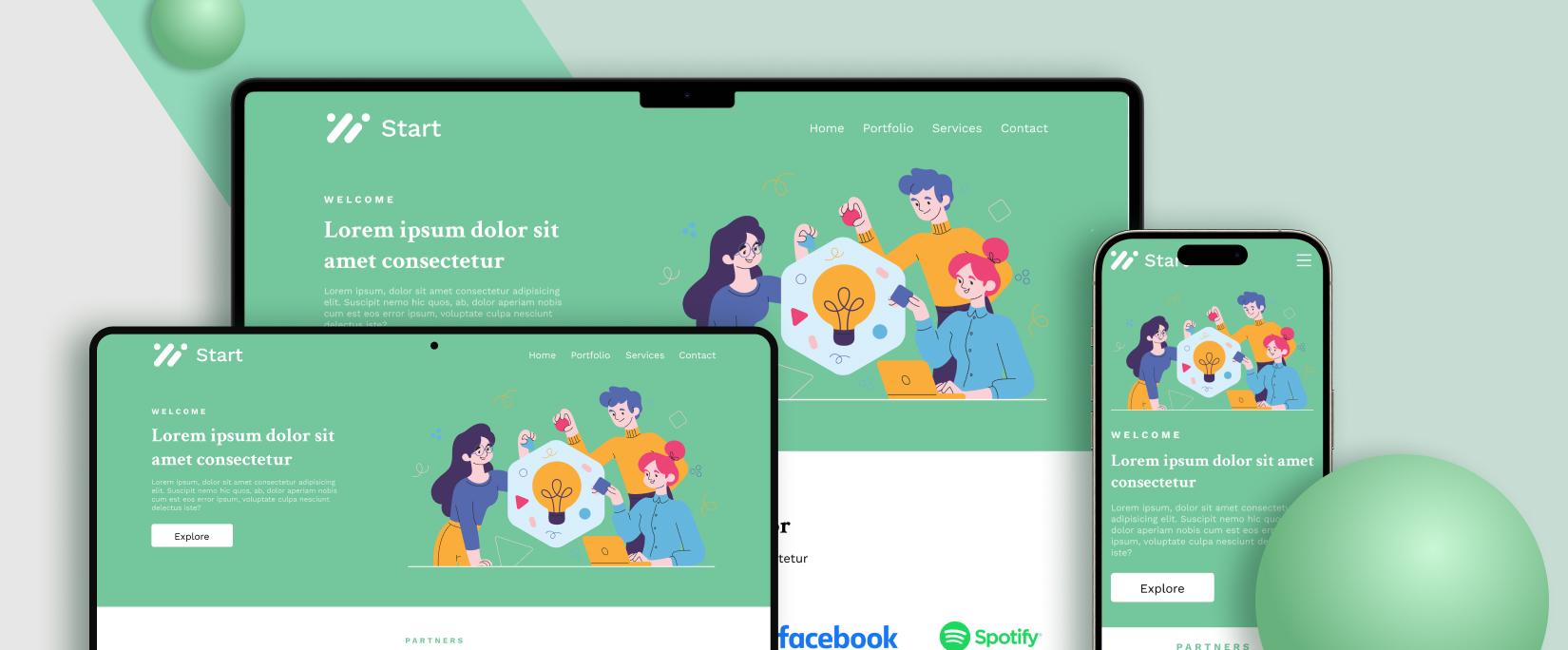
The Importance of Mobile Responsive Website Design
In today’s digital age, the majority of internet users access websites on their mobile devices. This shift in user behavior has made it crucial for businesses and website owners to prioritize mobile responsive design.
A mobile responsive website is one that is designed to adapt and display correctly on various screen sizes and devices, such as smartphones and tablets. This ensures that users have a seamless browsing experience regardless of the device they are using.
There are several reasons why mobile responsive design is essential:
- Improved User Experience: A mobile responsive website provides a better user experience by ensuring that content is easily accessible and readable on smaller screens. This leads to higher engagement and lower bounce rates.
- SEO Benefits: Search engines like Google prioritize mobile-friendly websites in their search results. Having a mobile responsive design can improve your website’s search engine ranking and visibility.
- Increased Reach: With the growing number of mobile users worldwide, having a mobile responsive website allows you to reach a larger audience and cater to the needs of users on the go.
- Faster Loading Times: Mobile responsive websites are optimized for speed, leading to faster loading times on mobile devices. This is crucial for retaining visitors and reducing site abandonment.
- Enhanced Brand Reputation: A well-designed mobile responsive website reflects positively on your brand image. It shows that you care about providing a seamless experience for your audience, which can help build trust and credibility.
In conclusion, investing in a mobile responsive website design is no longer optional but a necessity in today’s digital landscape. By prioritizing user experience, SEO performance, reach, loading times, and brand reputation, you can ensure that your website remains competitive and relevant in the ever-evolving online world.
6 Essential Tips for Designing a Mobile-Responsive Website
- Prioritize mobile responsiveness in your design from the beginning.
- Use a responsive layout that adapts to different screen sizes and orientations.
- Optimize images and media for faster loading on mobile devices.
- Ensure that text is easily readable without zooming on smaller screens.
- Implement touch-friendly navigation elements for better user experience.
- Test your website on various devices to ensure consistent performance.
Prioritize mobile responsiveness in your design from the beginning.
When it comes to mobile responsive website design, a crucial tip is to prioritize mobile responsiveness from the beginning of the design process. By considering mobile users’ needs and optimizing for various screen sizes and devices early on, you can ensure a seamless browsing experience across all platforms. Starting with a mobile-first approach not only enhances user experience but also sets a strong foundation for your website’s overall design and functionality. Remember, putting mobile responsiveness at the forefront of your design strategy can lead to better engagement, improved SEO performance, and increased reach among your target audience.
Use a responsive layout that adapts to different screen sizes and orientations.
When designing a mobile responsive website, it is essential to utilize a responsive layout that can adapt seamlessly to various screen sizes and orientations. By incorporating a flexible design approach, the website can automatically adjust its elements and content to provide an optimal viewing experience for users on different devices, whether they are using smartphones in portrait or landscape mode, tablets, or desktop computers. This ensures that the website remains user-friendly and visually appealing across all platforms, enhancing usability and engagement for visitors.
Optimize images and media for faster loading on mobile devices.
Optimizing images and media for faster loading on mobile devices is a crucial tip in mobile responsive website design. By reducing file sizes, choosing the appropriate formats, and implementing lazy loading techniques, you can significantly improve the loading speed of your website on smartphones and tablets. This not only enhances user experience by minimizing wait times but also contributes to lower bounce rates and higher engagement levels. Prioritizing image and media optimization is key to ensuring that your mobile responsive website performs efficiently across various devices, ultimately leading to a more satisfying browsing experience for your visitors.
Ensure that text is easily readable without zooming on smaller screens.
When designing a mobile responsive website, it is crucial to ensure that text is easily readable without the need for users to zoom in on smaller screens. Legible text enhances the user experience by making content accessible and engaging, regardless of the device being used. By maintaining clear and readable text on mobile devices, you can improve user engagement, encourage longer site visits, and ultimately enhance the overall effectiveness of your website design.
Implement touch-friendly navigation elements for better user experience.
To enhance the user experience on mobile devices, it is crucial to implement touch-friendly navigation elements in your website design. By incorporating features such as larger buttons, intuitive swipe gestures, and easy-to-access menus, you can ensure that users can navigate your site effortlessly on touchscreens. This approach not only improves usability but also contributes to a seamless and enjoyable browsing experience for visitors accessing your website on smartphones and tablets.
Test your website on various devices to ensure consistent performance.
It is crucial to test your website on various devices to ensure consistent performance across different screen sizes and resolutions. By conducting thorough testing, you can identify any layout or functionality issues that may arise on specific devices and address them promptly. Ensuring that your website is responsive and functions smoothly on all devices will enhance the user experience and help maintain a positive impression of your brand.