
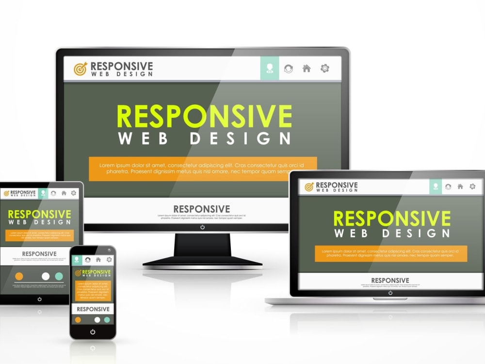
The Importance of Fully Responsive Design
In today’s digital age, having a fully responsive design for your website is more crucial than ever. With the increasing use of smartphones and tablets, users are accessing websites on a variety of devices with different screen sizes. A fully responsive design ensures that your website adapts and displays correctly on any device, providing an optimal user experience.
One of the key benefits of a fully responsive design is improved usability. Users should be able to navigate your website easily and access all content regardless of the device they are using. A responsive design eliminates the need for horizontal scrolling or zooming in and out, making it easier for users to find the information they need.
Furthermore, having a fully responsive design can boost your search engine rankings. Search engines like Google prioritize mobile-friendly websites in their search results, so having a responsive design can help improve your site’s visibility and attract more organic traffic.
Another advantage of fully responsive design is increased conversion rates. When users have a positive experience on your website, they are more likely to stay longer, engage with your content, and ultimately convert into customers or leads. By providing a seamless experience across all devices, you can enhance user satisfaction and drive better results for your business.
In conclusion, investing in a fully responsive design for your website is essential in today’s competitive online landscape. By ensuring that your site looks great and functions well on any device, you can attract more visitors, improve user engagement, and ultimately achieve your business goals.
Understanding Fully Responsive Design: Key Concepts and FAQs
- What are examples of responsive design?
- What is the responsive design approach?
- What is fully responsive design?
- What is RWD in programming?
- What are the three main components of responsive design?
What are examples of responsive design?
Responsive design is a versatile approach that allows websites to adapt and provide an optimal viewing experience across various devices. Examples of responsive design can be seen in websites that seamlessly adjust their layout and content based on the screen size and orientation. Popular examples include media outlets like CNN and The New York Times, e-commerce platforms such as Amazon and eBay, as well as tech giants like Apple and Google. These websites demonstrate how responsive design enhances user experience by ensuring that content remains accessible and visually appealing on desktops, laptops, tablets, and smartphones alike.
What is the responsive design approach?
The responsive design approach is a method used in web development to create websites that adapt and respond to different screen sizes and devices. This approach involves designing and coding a website in a way that allows it to fluidly adjust its layout, content, and elements based on the screen size of the device being used. By implementing responsive design principles, websites can provide an optimal viewing experience for users across desktops, laptops, tablets, and smartphones, ensuring that the site remains user-friendly and visually appealing regardless of the device being used.
What is fully responsive design?
Fully responsive design refers to a web design approach that aims to create a seamless user experience across all devices, regardless of screen size or orientation. In essence, a fully responsive design ensures that a website adapts and scales dynamically to provide optimal viewing and interaction, whether accessed on a desktop computer, laptop, tablet, or smartphone. By utilizing flexible grids and layouts, along with CSS media queries, fully responsive design allows content to adjust fluidly to different screen sizes, ensuring that users can easily navigate and engage with the website on any device.
What is RWD in programming?
Responsive Web Design (RWD) in programming refers to the approach of creating websites that can adapt and respond to different screen sizes and devices. RWD uses a combination of flexible grids, layouts, images, and CSS media queries to ensure that a website looks and functions optimally on desktop computers, laptops, tablets, and smartphones. By implementing RWD techniques, developers can create a seamless user experience across various devices, eliminating the need for separate mobile or desktop versions of a website.
What are the three main components of responsive design?
In responsive design, the three main components are fluid grids, flexible images, and media queries. Fluid grids enable the layout of a website to adjust proportionally based on the screen size, ensuring a consistent user experience across different devices. Flexible images allow images to scale and adapt to various screen sizes without losing quality or breaking the layout. Media queries are CSS rules that define styles based on specific conditions like screen width, allowing for targeted styling adjustments for different devices. By incorporating these three components effectively, a website can achieve full responsiveness and provide an optimal viewing experience for users on any device.