
Understanding Responsive Web Design
People visit websites on phones, tablets, laptops, and large desktop monitors. Responsive web design helps a website adapt to these different screens so that its content remains clear, usable, and easy to navigate.
What Is Responsive Web Design?
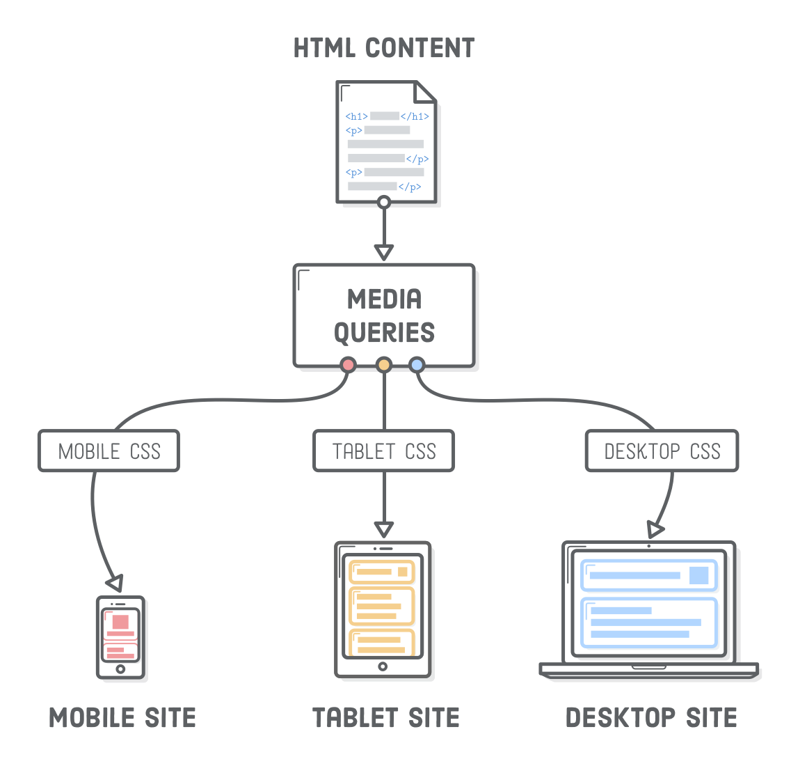
Responsive web design is an approach to building websites that adjust their layout and presentation to suit the device and screen size being used. Rather than creating a separate website for every type of device, developers use flexible layouts and design rules that let one site work across a range of screens.
A responsive page might show several columns on a desktop, for example, then stack those columns vertically on a phone. Text, images, menus, and other elements can also resize or rearrange as the available space changes.
Core Principles of Responsive Design
Flexible layouts
Fixed-width layouts can overflow or leave awkward gaps on screens that differ from the size they were designed for. Responsive layouts use flexible measurements, such as percentages or CSS grid and flexbox, so elements can expand or contract within their containers.
.content {


  width: min(100% - 2rem, 70rem);


  margin-inline: auto;


}
This example lets content use most of the available width on a small screen while limiting its maximum width on a larger one.
Flexible images and media
Images and videos should fit their containers without stretching beyond them. A common CSS rule is:
img,


video {


  max-width: 100%;


  height: auto;


}
This helps media scale down on narrow screens while preserving its proportions. For more control, developers can use the HTML picture element or responsive image attributes to serve different image sizes to different devices.
CSS media queries
Media queries apply styles when certain conditions are met, such as a minimum screen width. They can be used to change column layouts, spacing, type sizes, or navigation behavior.
.card-list {


  display: grid;


  grid-template-columns: 1fr;


  gap: 1rem;


}


@media (min-width: 48rem) {


  .card-list {


    grid-template-columns: repeat(2, 1fr);


  }


}


@media (min-width: 72rem) {


  .card-list {


    grid-template-columns: repeat(3, 1fr);


  }


}
In this example, the cards appear in one column on smaller screens, two columns on medium screens, and three columns on wider screens. Breakpoints should be chosen based on where the layout needs to change—not just to match a specific phone or tablet model.
Why a Mobile-First Approach Helps
Many responsive websites are designed with a mobile-first approach. This means starting with the smallest practical screen and adding layout enhancements as more space becomes available. It encourages teams to prioritize essential content and functionality, which can make the experience simpler on every device.
Mobile-first does not mean designing only for phones. The site should still make full use of larger screens, with thoughtful changes to layout and presentation as the viewport grows.
Responsive Design Is More Than Screen Size
A responsive website should work well for people, not just fit inside a screen. Consider how visitors interact with the page and whether the content remains readable and accessible.
- Readable text: Use comfortable type sizes and line lengths, and avoid requiring visitors to zoom to read ordinary content.
- Usable controls: Make buttons and links easy to tap, with enough space between interactive elements.
- Clear navigation: Menus should be easy to find and operate with touch, a keyboard, or a mouse.
- Accessible content: Use semantic HTML, descriptive link text, visible focus styles, and sufficient color contrast.
- Good performance: Optimize images and limit unnecessary scripts so pages load reliably on slower connections.
How to Test a Responsive Website
Browser developer tools can simulate different screen sizes, making them useful during development. However, simulation should not be the only test. Check the site on real devices when possible, and test a range of viewport widths—not just common phone and desktop sizes.
As you test, look for horizontal scrolling, clipped content, overlapping elements, hard-to-use controls, and text that becomes difficult to read. Also try rotating a phone, increasing text size, navigating with a keyboard, and using the page with touch input.
Common Responsive Design Mistakes
- Designing for specific devices instead of content: Layouts should adapt naturally rather than depend on exact device dimensions.
- Hiding important information on small screens: Simplifying a layout should not make essential content or actions inaccessible.
- Using too many breakpoints: Add breakpoints where the design needs them, and keep the CSS manageable.
- Ignoring performance: A layout may look responsive but still feel slow if it loads oversized images or unnecessary code.
- Testing only in a browser simulator: Real devices can reveal issues with touch, performance, and browser behavior.
Conclusion
Responsive web design helps a website adapt to different screens while keeping its content accessible and easy to use. Flexible layouts, scalable media, and well-chosen media queries provide the technical foundation. Careful attention to readability, navigation, accessibility, and performance makes the experience work for a wider range of people and devices.
7 Key FAQs About Mastering Responsive Web Design
- What is responsive web design?
- How does responsive web design work?
- Why is responsive web design important?
- What is the difference between responsive and adaptive web design?
- What are the main principles of responsive web design?
- How can I test whether a website is responsive?
- Does responsive web design improve SEO?
What is responsive web design?
Responsive web design is an approach to building websites that automatically adapt their layout and content to different screen sizes and devices, including phones, tablets, and desktop computers. It uses flexible layouts, scalable images, and CSS media queries to keep pages readable, accessible, and easy to navigate without requiring a separate website for each device.
How does responsive web design work?
Responsive web design works by using flexible layouts, images, and CSS media queries to adjust a website to the screen size and capabilities of the device. Instead of building separate versions for phones, tablets, and computers, a site can rearrange its content, resize elements, and adapt navigation as the available space changes. The viewport setting helps browsers display the page at the device’s actual width, while responsive images and layouts keep content readable and prevent unnecessary horizontal scrolling.
Why is responsive web design important?
Responsive web design is important because people access websites on a wide range of devices, from smartphones to large desktop monitors. A responsive site adjusts its layout and content to fit each screen, making pages easier to read, navigate, and use without unnecessary zooming or scrolling. It can also improve accessibility, support search visibility, and provide a more consistent experience for visitors—helping businesses reach and serve more people.
What is the difference between responsive and adaptive web design?
Responsive web design uses flexible layouts that continuously adjust to the available screen space, typically with fluid grids, flexible images, and CSS media queries. Adaptive web design, by contrast, uses a set of predefined layouts designed for particular screen sizes or device categories, then displays the layout that best matches the visitor’s screen. Both approaches aim to provide a good experience across devices, but responsive designs adjust more fluidly, while adaptive designs switch between distinct layouts.
What are the main principles of responsive web design?
The main principles of responsive web design are flexible layouts, adaptable images and media, and CSS media queries that adjust styles to different screen sizes. Together, these techniques let content rearrange and resize instead of forcing visitors to zoom or scroll sideways. A mobile-first approach, readable text, accessible navigation, and easy-to-use controls also help ensure the site works well across devices and for a wide range of users.
How can I test whether a website is responsive?
You can test whether a website is responsive by resizing your browser window and checking that the layout, text, images, and navigation adjust smoothly without horizontal scrolling or overlapping content. Use your browser’s developer tools to preview common screen sizes, then, when possible, check the site on real phones and tablets in both portrait and landscape orientations. Also test that links and buttons are easy to use, text remains readable, and all important content is accessible at every size.
Does responsive web design improve SEO?
Yes. Responsive web design can support SEO by providing a consistent, mobile-friendly experience and making it easier for search engines to crawl and index one URL for each page. It can also improve usability on phones and tablets, which may help visitors stay engaged. Responsive design alone does not guarantee higher rankings, however; useful content, fast loading, accessibility, and other SEO factors still matter.