
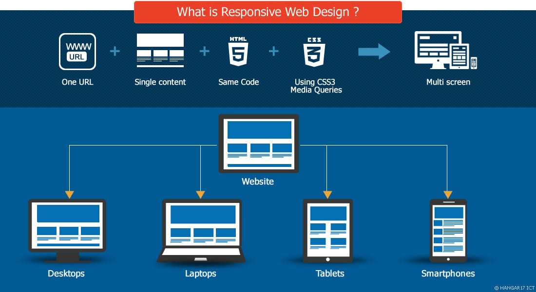
Responsive web design has become a crucial aspect of creating websites in today’s digital landscape. With the increasing variety of devices that people use to access the internet, it is essential for websites to adapt and display properly on screens of all sizes. Implementing responsive web design allows a website to adjust its layout and content based on the screen size and orientation, providing users with an optimal viewing experience.
One of the key components of responsive web design is using media queries in CSS to apply different styles based on the device’s screen size. By defining breakpoints where the layout changes, designers can create fluid and flexible designs that look great on desktops, laptops, tablets, and smartphones. This ensures that users can easily navigate and interact with the website regardless of the device they are using.
Another important aspect of responsive web design is using flexible grid layouts. Grid systems allow designers to create a structure that automatically adjusts based on the screen size, ensuring that content remains organized and visually appealing across different devices. By using relative units like percentages instead of fixed pixel values, designers can create layouts that scale smoothly and maintain consistency across various screen sizes.
In addition to media queries and flexible grids, optimizing images for different screen resolutions is also crucial for responsive web design. Using high-resolution images for Retina displays while providing smaller file sizes for faster loading times on mobile devices helps ensure a seamless user experience across all devices.
Overall, implementing responsive web design is essential for creating modern websites that cater to a diverse range of users and devices. By utilizing techniques like media queries, flexible grids, and optimized images, designers can build websites that are visually appealing, user-friendly, and accessible on any device.
Top 6 FAQs About Implementing Responsive Web Design
- What is responsive web design?
- Why is responsive web design important?
- How do media queries work in responsive web design?
- What are the benefits of using flexible grids in responsive web design?
- How can I optimize images for responsive web design?
- What are some common challenges when implementing responsive web design?
What is responsive web design?
Responsive web design is a design approach that aims to create websites that can adapt and respond to different screen sizes and devices. In other words, a responsively designed website will automatically adjust its layout, content, and functionality based on the device being used to view it. This ensures that users have a consistent and optimal experience, whether they are accessing the website on a desktop computer, laptop, tablet, or smartphone. By implementing responsive web design techniques such as media queries, flexible grids, and optimized images, designers can create websites that are visually appealing and easy to use across a wide range of devices.
Why is responsive web design important?
Responsive web design is crucial in today’s digital age because it ensures that websites can adapt and display correctly on various devices, such as desktops, laptops, tablets, and smartphones. With the increasing use of mobile devices for browsing the internet, having a responsive website is essential to provide users with a seamless and consistent experience across different screen sizes and orientations. By implementing responsive web design, businesses can reach a wider audience, improve user engagement, and enhance their overall online presence. Additionally, responsive design is favored by search engines like Google, as it helps improve a website’s visibility and ranking in search results. Overall, the importance of responsive web design lies in its ability to create user-friendly websites that deliver optimal performance and usability on any device.
How do media queries work in responsive web design?
Media queries play a crucial role in responsive web design by allowing designers to apply different styles based on the characteristics of the user’s device, such as screen size, resolution, and orientation. By using media queries in CSS, designers can define specific breakpoints where the layout and styling of a website change to accommodate different screen sizes. This enables websites to adapt dynamically to various devices, ensuring that content remains readable and visually appealing across desktops, laptops, tablets, and smartphones. Media queries provide a flexible and efficient way to create responsive designs that enhance the user experience by optimizing the layout and presentation of content based on the device being used.
What are the benefits of using flexible grids in responsive web design?
Using flexible grids in responsive web design offers several benefits that contribute to a better user experience. One key advantage is that flexible grids allow for fluid layout adjustments based on screen size, ensuring that content remains visually appealing and well-organized on devices of all sizes. By using relative units like percentages instead of fixed pixel values, designers can create layouts that scale smoothly and maintain consistency across different screen resolutions. This adaptability not only enhances the aesthetic appeal of the website but also improves usability by providing a seamless browsing experience for users on desktops, laptops, tablets, and smartphones. Additionally, flexible grids help optimize load times and performance by allowing content to adapt dynamically to varying screen sizes without compromising design integrity.
How can I optimize images for responsive web design?
Optimizing images for responsive web design is a crucial step in ensuring that websites load quickly and look great on all devices. One effective technique is to use CSS to set the maximum width of images to 100% so that they scale proportionally based on the size of the viewport. This helps prevent images from overflowing their containers or appearing pixelated on high-resolution screens. Additionally, using image formats like WebP or SVG can help reduce file sizes without compromising quality, improving loading times on mobile devices. By implementing these strategies, designers can create visually appealing websites that provide a seamless user experience across various screen sizes and resolutions.
What are some common challenges when implementing responsive web design?
When it comes to implementing responsive web design, there are several common challenges that designers often face. One of the main challenges is ensuring consistent user experience across different devices and screen sizes. Designers must carefully consider how elements like navigation menus, images, and text will adapt to various screen resolutions while maintaining usability and readability. Another challenge is optimizing performance, as responsive websites can sometimes be slower to load on mobile devices due to larger file sizes or unnecessary content. Additionally, testing across multiple devices and browsers to ensure compatibility and responsiveness can be time-consuming but is essential for a successful implementation of responsive web design. By addressing these challenges proactively and staying updated on best practices, designers can create websites that provide a seamless experience for users across all devices.