
Flutter Web Responsive Design: A Practical Guide
Responsive design helps a website adapt to different screen sizes, input methods, and browsing contexts. With Flutter, developers can build web experiences from a shared codebase while tailoring layouts for phones, tablets, laptops, and large desktop displays.
Flutter’s widget system makes it possible to create flexible interfaces, but a web app does not become responsive automatically. Good results come from choosing appropriate breakpoints, using available space thoughtfully, and testing layouts across a range of devices.
What Responsive Design Means in Flutter
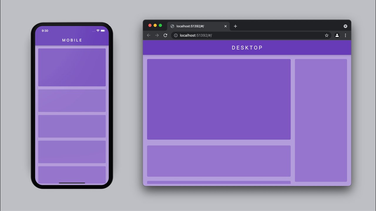
Responsive design is about more than shrinking a desktop layout to fit a phone. A well-designed interface adjusts its structure and behavior to suit the available space. For example, a navigation bar might become a drawer on a narrow screen, a multi-column page might switch to one column, and large margins might become compact padding.
In Flutter, layouts are built from widgets that receive constraints from their parents. Understanding those constraints is central to responsive design. Rather than relying on fixed pixel dimensions, use flexible widgets and adapt the layout when the available width changes.
Start With Flexible Layout Widgets
Flutter provides several widgets that help interfaces adapt naturally:
RowandColumnarrange content horizontally or vertically.ExpandedandFlexiblelet children share available space.Wrapmoves items onto additional lines when they no longer fit.LayoutBuilderbuilds a layout using the constraints available from its parent.ConstrainedBoxandLimitedBoxhelp set sensible size limits.AspectRatiopreserves a consistent width-to-height relationship.
For example, a row of cards may work well on a wide screen but overflow on a phone. A Wrap can move the cards onto additional lines, while a LayoutBuilder can switch to a different arrangement entirely.
Use Breakpoints Based on Content
Breakpoints are widths at which the interface changes its layout. They should be chosen according to the needs of the content, not simply by targeting a list of popular devices. If a navigation menu becomes crowded at a certain width, that is a useful point to change the navigation pattern.
Here is a simple example using LayoutBuilder:
LayoutBuilder(


  builder: (context, constraints) {


    if (constraints.maxWidth < 600) {


      return const MobileLayout();


    } else if (constraints.maxWidth < 1000) {


      return const TabletLayout();


    } else {


      return const DesktopLayout();


    }


  },


)
The values in this example are starting points, not universal rules. Check how the actual content behaves at different widths and adjust the breakpoints accordingly.
Think Beyond Width
Screen width is an important factor, but responsive web design should account for other differences as well. Desktop users commonly navigate with a mouse and keyboard, while mobile users rely on touch. Make buttons and other interactive elements comfortable to tap, provide visible focus states for keyboard navigation, and avoid interactions that depend only on hover.
Text also needs room to breathe. Avoid fixed-height containers that can clip content when users increase browser zoom or use larger text settings. Let important areas grow vertically, and make sure headings, forms, and buttons remain usable when the page is enlarged.
Manage Content Width and Spacing
A page can technically fill the screen and still be difficult to read. On wide displays, long lines of text become tiring, so consider limiting the width of reading areas. At the same time, avoid overly narrow content on phones, where every bit of available space matters.
Use consistent spacing rules and adapt them when the layout changes. A desktop page may use generous horizontal padding, while a compact layout needs smaller margins. Keep spacing values organized so that the interface feels consistent across screens.
Make Navigation Adapt to the Screen
Navigation is often one of the first parts of a layout to need adjustment. A horizontal menu may fit on desktop but feel cramped on a phone. Common approaches include using a drawer or compact menu on smaller screens and a full navigation bar on larger ones.
Whichever pattern you choose, make the current location clear and ensure that all destinations remain reachable. A responsive menu should work with touch, mouse, and keyboard input.
Test in Realistic Conditions
Test responsive layouts at more than a few preset device sizes. Resize the browser gradually, check narrow and unusually wide windows, and try longer text or larger browser zoom. This helps reveal problems such as clipped labels, unexpected overflow, awkward gaps, and controls that are difficult to use.
Flutter’s widget tests can verify layout behavior, while browser-based testing helps assess the complete web experience. Also check loading behavior, scrolling, keyboard interaction, and any browser-specific requirements relevant to your project.
Common Responsive Design Mistakes
- Using fixed dimensions everywhere: Fixed widths and heights can cause overflow or cut off content on smaller screens.
- Designing only for named devices: A layout should work across a range of widths, not just a few device presets.
- Scaling everything down: Smaller content is not always a usable mobile layout. Some elements need to move, stack, or change form.
- Ignoring text growth: Fixed-height containers can fail when text wraps or browser zoom is increased.
- Testing only with a mouse: Touch and keyboard users may encounter different usability issues.
Build for the Content, Then Refine
A reliable Flutter web layout begins with a clear understanding of the content and the space it needs. Use flexible widgets for everyday sizing, introduce layout changes where the content calls for them, and keep accessibility in mind throughout development.
Responsive design is an ongoing process. By testing across different viewport sizes and input methods, developers can create Flutter web experiences that feel intentional on mobile, tablet, and desktop screens—not merely resized to fit.
Top 8 FAQs About Responsive Design in Flutter Web Development
- Is Flutter better than HTML?
- How do I make my Flutter website responsive?
- What is responsive and adaptive in Flutter?
- Is Flutter web stable now?
- What is responsive design in Flutter?
- Can Flutter be used for web dev?
- Can Flutter be used for web development?
- How to make Flutter web responsive?
Is Flutter better than HTML?
Flutter isn’t necessarily better than HTML; the right choice depends on your project. Flutter lets teams build rich, interactive web apps with Dart and share much of the code with mobile apps, while HTML, CSS, and JavaScript are the foundations of the web and offer broad browser support, mature tooling, and strong flexibility for content-focused, SEO-sensitive sites. For responsive design, both approaches can create layouts that work across screen sizes, but they use different tools and workflows. Choose Flutter when code sharing and a consistent app-like experience are priorities; choose standard web technologies when traditional web conventions, lightweight pages, or direct control over markup are more important.
How do I make my Flutter website responsive?
To make a Flutter website responsive, build layouts that adapt to the available space instead of relying on fixed widths and heights. Use flexible widgets such as Expanded, Flexible, and Wrap, and use LayoutBuilder or MediaQuery to adjust the layout at appropriate breakpoints—for example, changing a desktop navigation bar into a mobile menu. Test at a range of browser widths, check for overflow, and make sure text, buttons, and navigation remain usable with touch, mouse, keyboard, and browser zoom.
What is responsive and adaptive in Flutter?
In Flutter, responsive design adjusts a layout to fit the available screen space, often by resizing, spacing, or rearranging widgets as the viewport changes. Adaptive design goes a step further by tailoring the interface to the user’s platform or context—for example, using platform-appropriate controls or navigation patterns. The terms are related, and a Flutter app may use both: responsive layouts to work across different screen sizes and adaptive choices to feel natural on each device.
Is Flutter web stable now?
Yes, Flutter web is considered stable and is suitable for many production websites and web applications. It supports responsive layouts, modern browsers, and deployment through standard web hosting, though performance and loading behavior can vary depending on the app’s size and complexity. Before choosing Flutter for a web project, evaluate factors such as accessibility, search engine visibility, initial load time, and whether the experience needs to feel like a traditional content-focused website. Always test the app in the browsers and on the devices your audience uses most.
What is responsive design in Flutter?
Responsive design in Flutter is the practice of adapting an app’s layout and interactions to different screen sizes, orientations, and input methods, such as touch, mouse, and keyboard. Rather than simply shrinking a desktop page to fit a phone, Flutter developers use flexible widgets, available layout constraints, and breakpoints to rearrange content—for example, turning multiple columns into a single column on smaller screens—so the experience remains clear and usable across devices.
Can Flutter be used for web dev?
Yes, Flutter can be used for web development. It lets you build interactive websites and web applications with Dart and a shared codebase for platforms such as mobile, desktop, and the web. Flutter works well for app-like experiences, but it may not be the best fit for every website—especially content-heavy sites that depend on traditional web pages, search engine optimization, or minimal load times. The right choice depends on your project’s goals, performance needs, and audience.
Can Flutter be used for web development?
Yes, Flutter can be used for web development. It lets developers build interactive web applications using Dart and a shared codebase that can also target platforms such as iOS, Android, and desktop. Flutter is especially useful for app-like experiences, dashboards, and tools with rich interfaces. For content-heavy websites that depend on search visibility, fast initial loading, or conventional web behavior, compare Flutter with web-focused frameworks before choosing a technology.
How to make Flutter web responsive?
To make a Flutter web app responsive, build layouts that adapt to the available space instead of relying on fixed widths and heights. Use widgets such as LayoutBuilder or MediaQuery to check the viewport size, then adjust the layout at content-appropriate breakpoints—for example, switching from a multi-column desktop layout to a single-column mobile layout. Widgets such as Expanded, Flexible, and Wrap help content resize or rearrange naturally. Test the app at different browser widths, with touch and keyboard input, and at increased zoom to catch overflow and usability issues.