
Responsive Web Design: A Guide to the Concept and Its Wikipedia Overview
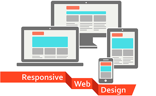
Responsive web design is an approach to building websites that adapt to the screen size and capabilities of the device being used. A responsive site can rearrange its layout, resize images, and adjust text so that it remains usable on phones, tablets, laptops, and desktop computers.
People searching for “responsive web design Wikipedia” may be looking for a concise definition or an overview of the subject. Wikipedia’s article on responsive web design covers the concept’s history, common techniques, and role in modern web development. The explanation below provides a practical introduction to the same topic.
What Is Responsive Web Design?
Responsive web design (RWD) allows a website to respond to the available space rather than relying on a separate fixed layout for every device. For example, a three-column page on a wide desktop screen might display as two columns on a tablet and one column on a phone.
The term “responsive web design” was popularized by web designer Ethan Marcotte in a 2010 article. The approach grew in importance as people began accessing websites on a wider range of devices and screen sizes.
Core Techniques
Fluid Grids
Fluid grids use flexible measurements, such as percentages or relative CSS units, instead of setting every element to a fixed width. This helps page sections expand or contract with the viewport.
Flexible Images and Media
Images and other media should fit within their containing elements instead of overflowing them. A common CSS rule is max-width: 100%, which lets an image shrink when necessary while preserving its proportions.
CSS Media Queries
Media queries apply different CSS rules depending on conditions such as viewport width, orientation, or user preferences. A designer might use a media query to change a navigation menu from a horizontal row to a compact mobile layout.
@media (max-width: 600px) {


  .columns {


    display: block;


  }


}
Responsive Design and Mobile-First Design
Responsive design is not the same as mobile-first design, though the two approaches are often used together. Responsive design describes a site’s ability to adapt across screen sizes. Mobile-first design is a workflow that begins with the smallest screen and adds layout features as more space becomes available.
Starting with a simple mobile layout can help teams prioritize essential content and functionality. The design can then be expanded for larger screens without assuming that every visitor has a desktop computer.
Why Responsive Web Design Matters
- Improved usability: Visitors can read and navigate a site without excessive zooming or horizontal scrolling.
- Consistent content: A single site can serve users on many types of devices.
- Easier maintenance: One adaptable site is often simpler to update than separate desktop and mobile versions.
- Better accessibility: A flexible layout can support text resizing and different viewing preferences when designed carefully.
- Search visibility: Search engines can more easily discover and index content when it is available through a consistent website structure.
Responsive Design Is More Than Screen Size
A responsive website should do more than shrink its desktop layout. Developers also need to consider touch targets, readable font sizes, keyboard navigation, contrast, loading speed, and the order in which content appears. A layout that technically fits a small screen may still be difficult to use.
Performance is especially important on mobile connections. Optimized images, efficient code, and limited use of unnecessary scripts can help pages load more quickly. Accessibility should also be considered throughout the design process, rather than added as a final adjustment.
How to Learn More
Wikipedia can be a useful starting point for learning about responsive web design, its terminology, and its history. For practical implementation, readers can also consult documentation for HTML and CSS, including resources on CSS Grid, Flexbox, media queries, and accessible design. Comparing several reliable sources can provide a fuller understanding than relying on any single overview.
Summary
Responsive web design is a foundational approach to creating websites that work across a variety of screen sizes and devices. It commonly combines fluid layouts, flexible media, and CSS media queries. Whether learning from Wikipedia or building a site from scratch, the central goal is the same: make content and functionality clear, accessible, and easy to use wherever the website is viewed.
Responsive Web Design FAQs: Core Principles, Key Components, Benefits, and Implementation
- What are the three pillars of responsive web design?
- What are the 3 basic things required for responsive web design?
- What are the top 10 reasons for Responsive web design?
- What are the core principles of responsive web design?
- What is responsive web design and how is it achieved?
What are the three pillars of responsive web design?
The three pillars of responsive web design are fluid grids, flexible images and media, and CSS media queries. Fluid grids let page layouts adjust to different screen widths, while flexible images and media resize to fit their containers without distorting or overflowing. CSS media queries apply specific styles based on conditions such as viewport size, allowing a site to shift its layout and presentation across phones, tablets, and desktops. Together, these techniques help create a consistent, usable experience on a range of devices.
What are the 3 basic things required for responsive web design?
The three basic elements of responsive web design are fluid grids, flexible images, and CSS media queries. Fluid grids use relative sizing so page layouts adjust to available screen space, while flexible images resize within their containers to avoid overflowing. Media queries apply different styles at specific viewport sizes or under other conditions, helping a site remain readable and usable across phones, tablets, and desktop screens.
What are the top 10 reasons for Responsive web design?
The top 10 reasons to use responsive web design are to improve the experience on phones, tablets, and desktops; make content easier to read and navigate; avoid horizontal scrolling and awkward zooming; reach more people across different devices; keep a consistent look and feel; simplify site updates by maintaining one adaptable website; support search engine discoverability; improve accessibility when layouts are built with inclusive practices; help visitors complete tasks and take action; and prepare the site to work with new screen sizes and devices.
What are the core principles of responsive web design?
The core principles of responsive web design are fluid layouts, flexible images and media, and CSS media queries. Fluid layouts use relative measurements so page elements can adjust to the available screen space, while flexible media resize to fit their containers without distortion or overflow. Media queries apply different styles based on factors such as viewport width, allowing a site to reorganize content and navigation for phones, tablets, and larger screens. Together, these techniques help create websites that are usable across devices without requiring a separate layout for each one.
What is responsive web design and how is it achieved?
Responsive web design is an approach to building websites that adapt their layout and content to different screen sizes and devices, from phones to desktop computers. It is achieved by using flexible grids and images, CSS media queries, and responsive units so that elements resize, rearrange, or change appearance as the available space changes. The goal is to keep a website easy to read and use without unnecessary zooming or horizontal scrolling.