
Adaptive Web Development: Building Websites for Different Devices and Needs
People access websites on a wide range of devices, from smartphones and tablets to laptops, desktop computers, and even smart displays. Adaptive web development helps a website deliver a useful experience across these different environments by adjusting its layout, content, and functionality to suit the user’s context.
Rather than designing for a single screen size, an adaptive approach considers the ways people browse and the capabilities of the devices they use. The goal is not simply to make a page fit on a screen. It is to make the site easy to use, quick to load, and accessible wherever it is viewed.
What Is Adaptive Web Development?
Adaptive web development is the practice of creating websites that respond to different user contexts. These can include screen size, input method, connection speed, device capabilities, and accessibility preferences.
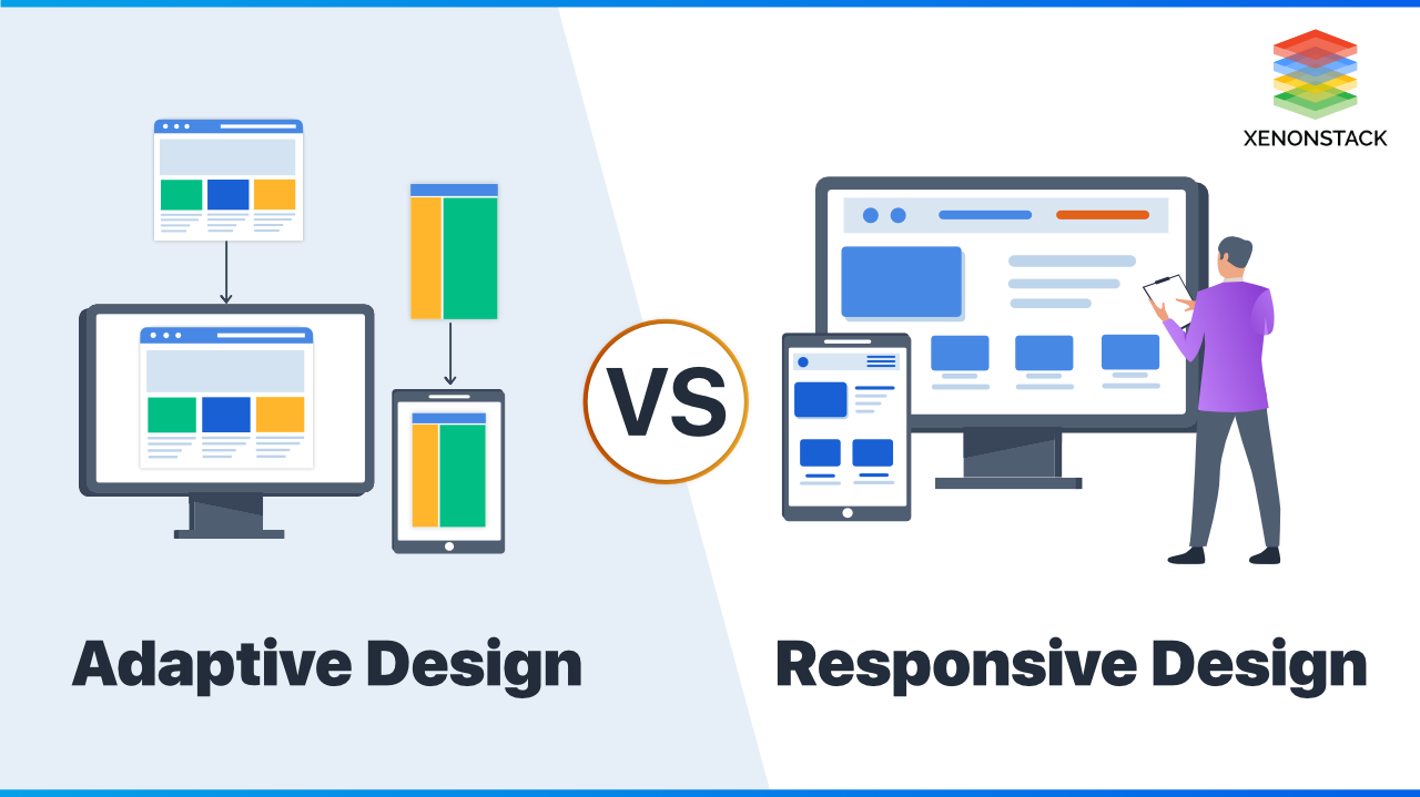
The term is often used alongside responsive web design. Responsive design typically uses flexible layouts and CSS media queries to adapt continuously to available screen space. Adaptive design may instead use a set of predefined layouts or experiences for particular screen ranges or conditions. In practice, many modern websites combine both approaches: flexible page layouts with targeted adjustments for specific devices and situations.
Why Adaptive Experiences Matter
A website that works well on a large monitor may be difficult to use on a phone. Text can become too small, menus may be hard to reach, and important actions can be buried below unnecessary content. A carefully adapted experience helps reduce these problems.
- Improved usability: Content and controls are easier to understand and interact with on different devices.
- Better accessibility: Thoughtful layouts, readable text, and keyboard-friendly controls can support a wider range of users.
- Stronger performance: Serving appropriate images and limiting unnecessary features can help pages load faster, especially on slower connections.
- More consistent experiences: Visitors can move between devices without having to relearn how the site works.
- Greater reach: A well-adapted site can serve people using a variety of devices, browsers, and input methods.
Core Principles of Adaptive Web Development
Start with the User’s Goals
Before choosing layouts or breakpoints, identify what visitors need to accomplish. A customer visiting a store may want to find a product, check availability, or complete a purchase. A reader may need clear navigation and comfortable text. Understanding these priorities helps teams decide what should be prominent and what can be simplified on smaller screens.
Design for Content, Not Just Devices
It can be tempting to create designs for a short list of popular phones and computers. But new devices appear regularly, and screen sizes vary even within the same category. Instead, let the content guide layout decisions. Add breakpoints when the design needs them—for example, when a navigation bar becomes crowded—not simply because a particular device is common.
Use Flexible Layouts
Modern CSS tools such as Flexbox, Grid, and fluid sizing can help content adapt naturally to available space. Flexible layouts reduce the need to maintain a separate design for every screen width. They also make it easier to accommodate changes in content, browser settings, and zoom levels.
Make Touch and Keyboard Use Comfortable
On touchscreens, buttons and links should be easy to tap without accidentally activating nearby controls. At the same time, interactive elements should work with a keyboard and provide clear focus indicators. Supporting different input methods is an important part of creating an adaptable experience.
Prioritize Performance
Large images, heavy scripts, and unnecessary animations can slow a website down. Use appropriately sized image assets, modern formats where supported, and lazy loading for offscreen content. Review third-party scripts and remove features that do not support a clear user need.
A Practical Development Process
- Research the audience: Learn about visitors’ needs, common tasks, assistive technologies, and likely browsing conditions.
- Plan the content: Organize information by importance so essential details remain easy to find on every screen.
- Build a solid foundation: Use semantic HTML, accessible controls, and a layout that can grow or shrink naturally.
- Add targeted adaptations: Apply CSS breakpoints and device-specific enhancements only where they improve the experience.
- Optimize assets: Deliver images, fonts, and scripts efficiently, and avoid loading resources that visitors do not need.
- Test in real conditions: Check different screen sizes, browsers, input methods, network speeds, and accessibility settings.
- Measure and improve: Use user feedback and performance data to find friction and refine the site over time.
Common Challenges to Avoid
One common mistake is treating mobile visitors as if they need a stripped-down version of the website. Simplifying a layout can be useful, but hiding essential information or functionality may leave people unable to complete important tasks. Prioritize content carefully, and make sure core features remain available.
Another challenge is relying on device detection as the main way to choose a layout. Device detection can be unreliable and may fail to account for browser resizing, unusual screen dimensions, or new hardware. Feature detection and flexible CSS are generally more durable ways to respond to a user’s environment.
Teams should also avoid testing only on a developer’s own phone or computer. A site can behave differently across browsers, assistive technologies, and operating systems. Testing with real devices and a range of users can uncover issues that a simulator may miss.
Adaptive Development and Accessibility
Adaptability and accessibility are closely connected. A site should remain usable when someone increases text size, navigates with a keyboard, uses a screen reader, or switches to a high-contrast display. Semantic markup, meaningful labels, sufficient color contrast, and predictable navigation help make the experience more flexible for everyone.
Accessibility should be considered throughout development rather than added as a final check. Testing with accessibility tools and, where possible, people who use assistive technologies can reveal practical barriers early.
Conclusion
Adaptive web development is about creating experiences that work well across changing devices, conditions, and user needs. The strongest approach combines flexible layouts with thoughtful, targeted adjustments. By focusing on real user goals, accessibility, performance, and continuous testing, teams can build websites that are easier to use today and better prepared for the devices of tomorrow.
9 Essential Tips for Adaptive Web Development: Creating Responsive and User-Friendly Websites
- Design for common screen sizes and device capabilities.
- Use flexible grids and layouts.
- Set breakpoints where content needs them.
- Optimize images for different screen densities.
- Support touch, mouse, and keyboard input.
- Keep navigation usable on small screens.
- Test on real devices and browsers.
- Respect accessibility and reduced-motion settings.
- Measure performance on slower connections.
Design for common screen sizes and device capabilities.
When developing an adaptive website, account for the screen sizes and device capabilities your audience commonly uses, including phones, tablets, and desktop computers. Consider how layouts, navigation, images, and interactive features behave at different widths, and make sure controls work well with touch, mouse, and keyboard input. Use real audience data to guide your priorities, but keep designs flexible so the site remains usable on less common devices and future screen sizes.
Use flexible grids and layouts.
Use flexible grids and layouts so your website can adapt smoothly to different screen sizes instead of relying on fixed dimensions. CSS Grid, Flexbox, and relative units such as percentages, `rem`, and `vw` help content resize and rearrange as space changes. This keeps text readable, images within their containers, and navigation easy to use on phones, tablets, and desktop screens. Test the layout at a range of widths to catch awkward spacing or overflow early.
Set breakpoints where content needs them.
Set breakpoints where your content needs them, not just at the widths of popular devices. As a layout changes, watch for points where text becomes cramped, navigation gets crowded, or columns stop working well; then add a breakpoint to adjust the design. This content-first approach keeps your site readable and usable across a wider range of screen sizes, including devices you may not have anticipated.
Optimize images for different screen densities.
Optimize images for different screen densities so they look sharp without slowing down your website. Provide appropriately sized versions for standard- and high-resolution displays, and use responsive image techniques such as the srcset and sizes attributes to let the browser choose the best option for each screen. Compress image files and use modern formats when supported to reduce download times while preserving visual quality.
Support touch, mouse, and keyboard input.
Support touch, mouse, and keyboard input so visitors can interact with your website in the way that works best for them. Make buttons and links easy to tap, ensure hover effects aren’t required to reveal important information, and provide a visible focus indicator for keyboard users. Use semantic HTML and test key tasks with each input method to catch controls that are difficult to reach, operate, or understand.
Keep navigation usable on small screens.
Keep navigation usable on small screens by making menus easy to find, open, and operate with a thumb, keyboard, or screen reader. Use clear labels, comfortable tap targets, and a simple structure, and avoid hiding essential pages behind confusing icons or deep menu layers. Test the navigation at different screen sizes and zoom levels to make sure visitors can reach key content without excessive scrolling or accidental taps.
Test on real devices and browsers.
Test your website on real devices and browsers to see how it performs beyond a development environment. Screen sizes, touch controls, fonts, and browser behavior can vary, and emulators may not reveal every issue. Check key pages and tasks on a mix of phones, tablets, and computers, using popular browsers and different input methods. This helps uncover problems with navigation, readability, loading speed, and interactive elements before they affect your visitors.
Respect accessibility and reduced-motion settings.
Respect accessibility preferences by making your site usable with keyboards, screen readers, clear color contrast, and scalable text. Also honor users’ reduced-motion settings: avoid unnecessary animations, or use CSS media queries such as prefers-reduced-motion to reduce or disable motion effects when requested. These considerations make the experience more comfortable and inclusive for people with different abilities and preferences.
Measure performance on slower connections.
Measure your website’s performance on slower connections to understand what visitors experience when bandwidth is limited. Test page load times, image behavior, and interactive features using network-throttling tools, then reduce large files, optimize images, and defer nonessential scripts where possible. A faster, more reliable experience helps visitors reach important content and complete tasks without unnecessary delays.