
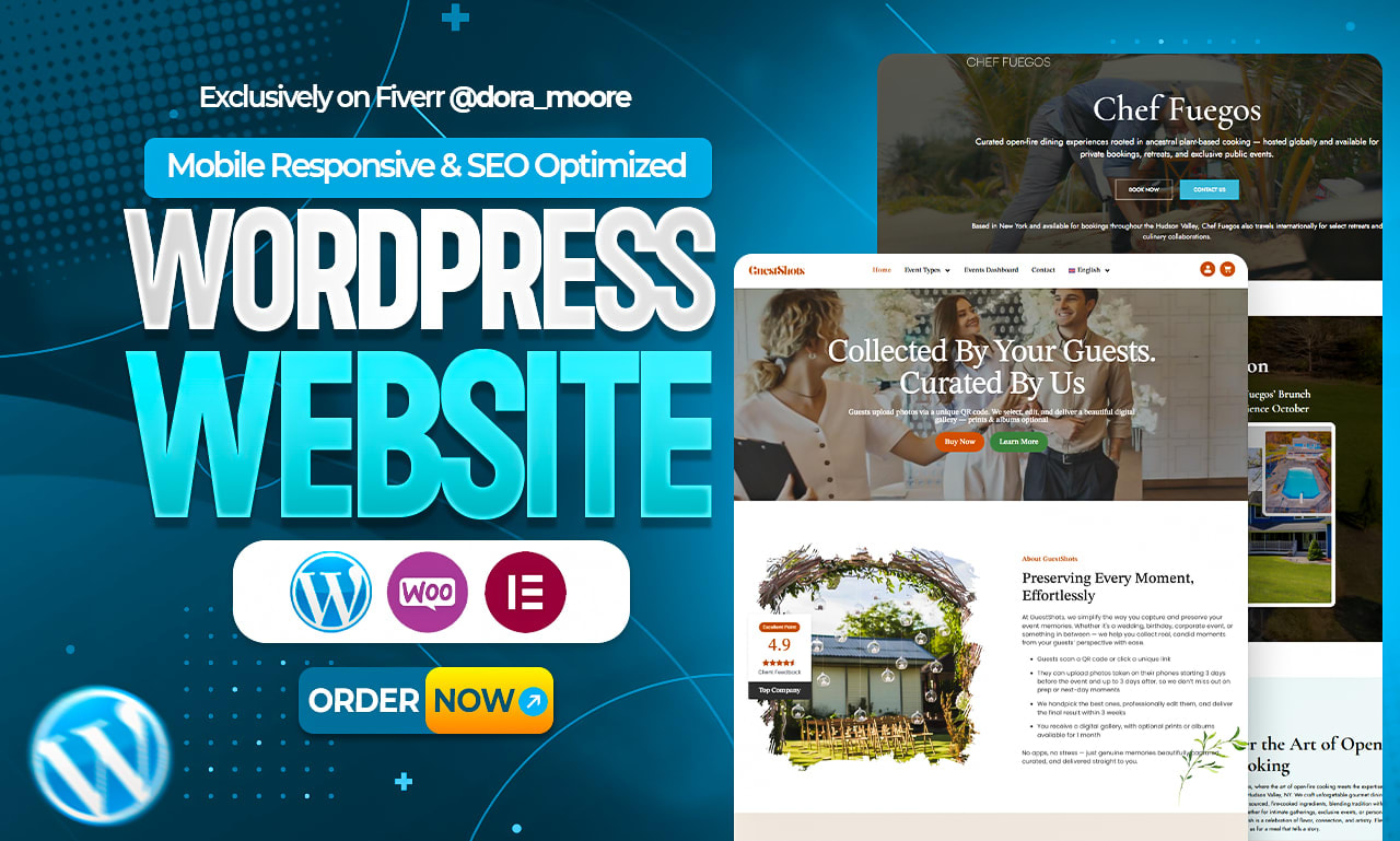
Responsive WordPress Web Design: A Practical Guide
People visit websites on phones, tablets, laptops, and large desktop monitors. A responsive WordPress website adapts to those different screens so visitors can read, navigate, and interact without unnecessary zooming or horizontal scrolling. It can also make a site easier to maintain, since one adaptable website can serve users across a range of devices.
Responsive design is more than making a desktop layout shrink to fit a phone. It involves flexible layouts, readable typography, touch-friendly controls, well-sized images, and thoughtful choices about what matters most on each screen.
What Does Responsive Web Design Mean?
A responsive website adjusts its layout and presentation to suit the available screen space. For example, a row of three content cards might appear side by side on a desktop, then stack vertically on a phone. Navigation may shift from a full menu to a compact menu button, while images resize to fit their containers.
Responsive design is different from building a separate mobile website. In WordPress, a responsive theme or page layout typically uses the same content and site address across devices, with styling that adapts to the visitor’s screen.
Start with a Responsive WordPress Theme
The theme is a key part of a WordPress site’s design. Many modern themes are built to be responsive, but the label alone does not guarantee a good experience. Check the theme’s demo at different screen sizes and look closely at:
- Whether text remains easy to read on a phone
- Whether navigation is clear and usable with a touch screen
- Whether images and embedded media fit the screen
- Whether buttons and links have enough space around them
- Whether layouts remain usable at intermediate tablet sizes
Choose a theme that suits the site’s purpose and content. A design that works well for a magazine may not be the best fit for a service business or an online store. Avoid choosing a theme based only on its desktop appearance.
Use Flexible Layouts and Thoughtful Breakpoints
Responsive layouts use flexible widths and spacing instead of relying on fixed dimensions designed for one screen size. In a page builder or block editor, look for settings that let columns stack on smaller screens, adjust spacing, and control how content is displayed at different breakpoints.
A breakpoint is a screen width at which a layout changes. Good breakpoints are based on when the content needs to change—not on a particular phone model. Test the actual page as it narrows, and adjust the layout when elements become crowded, difficult to read, or awkward to use.
Make Text and Navigation Easy to Use
Small text and crowded menus can make a responsive site frustrating even when its layout technically fits the screen. Use a comfortable text size, clear headings, and enough line spacing to support reading on smaller displays. Keep paragraphs focused and break up long pages with useful headings.
Mobile navigation should be easy to find and operate. Menu buttons need to be large enough to tap, and important links should not be packed too closely together. Make sure visitors can identify the current page and reach essential information without having to guess where it is hidden.
Optimize Images and Media
Large images can slow down a website, especially for visitors using mobile connections. Upload images at dimensions appropriate for their use, compress them before or during upload, and avoid using unnecessarily large files. WordPress can generate multiple image sizes, but the theme and plugins also affect how images are displayed.
Check image crops on narrow screens. A photo that looks balanced on a desktop may cut off an important subject on a phone. For videos and maps, use responsive embeds or blocks that resize within the content area. Avoid elements that force the page wider than the screen.
Consider Accessibility
Responsive design and accessibility work together. Visitors may use a phone with a screen reader, enlarge text, navigate with a keyboard, or rely on other assistive technology. Use meaningful heading order, descriptive link text, sufficient color contrast, and alternative text for informative images.
Do not communicate important information through color alone. Check that forms have clear labels and that interactive controls can be reached and operated using different input methods. These practices help make the site more usable for a wider range of people.
Keep Performance in Mind
A responsive design should not come at the cost of a slow site. Too many plugins, oversized images, complex animations, and poorly optimized scripts can affect loading time on any device. Use only the plugins the site needs, keep WordPress and its components updated, and test performance after significant design changes.
Performance depends on more than the theme. Hosting, caching, image optimization, and third-party services can all play a role. If a page feels slow, review it as a visitor would on a phone—not only on a fast desktop connection.
Test the Site on Different Screens
WordPress’s theme preview and browser developer tools can help you inspect layouts at different widths. They are useful, but they should not replace testing on real devices when possible. Check key pages on phones and tablets, including:
- The home page and main navigation
- Service, product, or category pages
- Forms, search, and checkout flows
- Blog posts with images, tables, or embedded media
- Footer links and other secondary navigation
Look for horizontal scrolling, overlapping content, tiny tap targets, hard-to-read text, and layouts that make important actions difficult to find. Test both portrait and landscape orientations where relevant.
Common Responsive Design Mistakes
- Designing only for desktop: A layout may look polished on a large monitor but become cramped on a phone.
- Hiding too much content: Removing useful information from mobile layouts can make the site harder to use.
- Using fixed-width elements: Large tables, images, or page sections can cause unwanted horizontal scrolling.
- Relying on appearance alone: A site can look responsive while still having inaccessible menus or unusable forms.
- Skipping ongoing checks: Theme, plugin, and content updates can affect the layout over time.
Conclusion
Responsive WordPress web design helps visitors use a site comfortably across phones, tablets, and desktop screens. A suitable theme provides a strong starting point, but good results also depend on flexible layouts, readable content, optimized media, accessibility, and testing.
Review the site from the visitor’s perspective on different devices. Fix the places where reading, navigation, or completing a task becomes difficult. Small improvements to spacing, images, menus, and forms can make a meaningful difference to the overall experience.
8 Essential Tips for Creating a Responsive WordPress Website
- Choose a mobile-friendly WordPress theme.
- Use a responsive page builder layout.
- Set images to scale within their containers.
- Keep menus simple on small screens.
- Use readable fonts and comfortable spacing.
- Test pages on phones, tablets, and desktops.
- Optimize images to improve mobile load times.
- Preview changes before publishing.
Choose a mobile-friendly WordPress theme.
Choose a mobile-friendly WordPress theme to give your site a strong foundation for responsive design. Look for a theme that adapts its layout to different screen sizes, keeps text easy to read, and makes menus and buttons simple to use on touch screens. Preview the theme on phones, tablets, and desktops before committing, and test key pages to make sure images, forms, and navigation work well on each device.
Use a responsive page builder layout.
Use a responsive page builder layout to make your WordPress pages adapt smoothly to phones, tablets, and desktops. Choose a builder that lets you adjust columns, spacing, font sizes, and element visibility for different screen sizes, then preview each layout as you work. Keep important content and actions easy to find on smaller screens, and avoid hiding information visitors need. After publishing, test key pages on real devices to catch cramped sections, tiny buttons, or unwanted horizontal scrolling.
Set images to scale within their containers.
Set images to scale within their containers so they fit neatly on screens of different sizes without stretching, cropping unexpectedly, or creating horizontal scrolling. In WordPress, choose responsive image settings in your theme or page builder, and use image styles that preserve the original aspect ratio. Then preview pages on phones, tablets, and desktops to make sure images remain clear and fit the layout.
Keep menus simple on small screens.
Keep menus simple on small screens by showing only the most important links and organizing related pages into clear, easy-to-understand groups. A compact menu helps visitors find what they need without scrolling through a long list or tapping crowded links. Use a clearly labeled menu button, make each item large enough to tap comfortably, and keep essential actions—such as contacting you or shopping—easy to find.
Use readable fonts and comfortable spacing.
Choose fonts that are easy to read on small screens, and use text sizes large enough that visitors don’t need to zoom. Keep line spacing comfortable and leave enough space between paragraphs, headings, links, and buttons so content doesn’t feel crowded. Clear typography and generous spacing make a WordPress site easier to scan and navigate on phones, tablets, and desktop screens.
Test pages on phones, tablets, and desktops.
Test your WordPress pages on phones, tablets, and desktop computers to make sure they work well at different screen sizes. Check that text is easy to read, images fit properly, menus and buttons are simple to use, and no content requires horizontal scrolling. Pay special attention to important pages, such as contact forms, product pages, and checkout screens, where a layout issue could prevent visitors from completing a task.
Optimize images to improve mobile load times.
Optimizing images is one of the simplest ways to improve load times on mobile devices. Compress image files before uploading them to WordPress, choose dimensions that fit how each image will appear, and use modern formats such as WebP when supported. Avoid serving oversized images when smaller versions will do, and check that images resize properly on narrow screens. Faster-loading pages use less mobile data and make it easier for visitors to browse your site.
Preview changes before publishing.
Preview changes on multiple screen sizes before publishing to make sure your WordPress site looks and works as intended on phones, tablets, and desktop computers. Check that text is readable, images fit properly, menus and buttons are easy to use, and no content causes horizontal scrolling. A quick review in the WordPress preview, browser tools, and—when possible—real devices can catch layout problems before visitors see them.