
W3C and Responsive Web Design: Building Websites for Every Screen
People visit websites on phones, tablets, laptops, desktop computers, and devices with many different screen sizes. Responsive web design helps a website adapt to those conditions so that its content remains usable and easy to read. The World Wide Web Consortium (W3C) supports this work by developing open web standards for technologies such as HTML and CSS.
What Is Responsive Web Design?
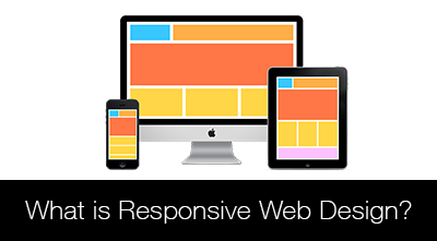
Responsive web design is an approach to building websites that adjust to the device and browser displaying them. Instead of creating a separate site for every screen size, developers use flexible layouts, adaptable media, and CSS rules to create one experience that responds to available space.
A responsive page might show a multi-column layout on a wide screen and rearrange the same content into a single column on a phone. Navigation, images, spacing, and text can all adapt as needed.
How W3C Standards Support Responsive Design
W3C does not define a single standard called “responsive web design.” Rather, responsive sites are built with web technologies that W3C develops and maintains, including HTML and CSS. These standards give browsers a common foundation for interpreting page structure, styling, and layout.
Several techniques are especially useful:
- CSS media queries: Apply styles according to conditions such as viewport width, screen orientation, or user preferences.
- Flexible layouts: CSS Grid, Flexbox, and relative units help content adjust instead of relying on fixed pixel dimensions.
- Responsive images: HTML and CSS features can help display images at suitable sizes and resolutions.
- Semantic HTML: Meaningful elements make page structure clearer to browsers, assistive technologies, and developers.
- Accessibility guidance: W3C’s Web Content Accessibility Guidelines (WCAG) help teams make content more perceivable, operable, understandable, and robust.
Start With the Viewport
For many mobile browsers, the viewport meta element tells the browser to use the device’s actual width when laying out the page. Without it, a phone may render a desktop-sized layout and scale it down, making text and controls difficult to use.
<meta name="viewport" content="width=device-width, initial-scale=1">This element belongs inside the document’s <head>. It does not make a site responsive on its own, but it is an important part of a mobile-friendly foundation.
Use Flexible Layouts and Content-Driven Breakpoints
Responsive layouts work best when they can grow and shrink naturally. For example, CSS Grid can create columns that fit the available space:
.card-grid {


  display: grid;


  grid-template-columns: repeat(auto-fit, minmax(16rem, 1fr));


  gap: 1rem;


}
When media queries are needed, choose breakpoints based on the content rather than targeting specific device models. A breakpoint should be added when the layout becomes cramped, text lines grow too long, or navigation stops working comfortably.
@media (max-width: 40rem) {


  .site-nav {


    flex-direction: column;


  }


}
Make Images and Text Adapt
Images should not overflow their containers. A common CSS rule allows them to scale down while preserving their proportions:
img {


  max-width: 100%;


  height: auto;


}
Text also needs room to adapt. Use readable font sizes, sufficient line spacing, and layouts that do not force users to zoom or scroll horizontally to read ordinary content. Avoid setting fixed heights on areas that contain text, since text may wrap onto more lines on smaller screens or when users enlarge it.
Responsive Design and Accessibility
A responsive page should work for more than different screen sizes. It should also support different ways of interacting with the web. Make sure controls can be used with a keyboard, links and buttons have clear labels, and focus indicators remain visible. Do not rely on color alone to convey important information.
Respecting user preferences can improve comfort, too. For example, CSS can reduce animation for people who request less motion:
@media (prefers-reduced-motion: reduce) {


  *,


  *::before,


  *::after {


    scroll-behavior: auto !important;


    animation-duration: 0.01ms !important;


    transition-duration: 0.01ms !important;


  }


}
Responsive design and accessibility are related, but they are not the same thing. A layout may adapt to a phone and still have inaccessible controls or unclear content. Testing against WCAG helps teams assess accessibility more systematically.
Test With Realistic Conditions
Browser developer tools can simulate different viewport sizes, but testing should go beyond a few preset dimensions. Check pages at narrow and wide widths, zoom in, navigate with a keyboard, and try common touch interactions. If possible, test on actual devices and browsers as well.
Look for problems such as clipped content, tiny tap targets, overlapping elements, unreadable text, and horizontal scrolling. Also test forms, menus, tables, and other components that may behave differently on small screens.
Build for the Open Web
W3C standards help make the web more consistent and interoperable, while responsive design techniques help websites serve people across a broad range of devices. By using semantic HTML, modern CSS, adaptable media, and accessibility guidance, developers can create experiences that are flexible without sacrificing usability.
The best responsive website is not simply one that fits a phone screen. It is one that keeps its content clear, its controls usable, and its experience dependable wherever and however someone visits.
8 Essential Tips for W3C-Compliant Responsive Web Design
- Use semantic HTML that works across devices.
- Add the viewport meta tag for mobile browsers.
- Use fluid layouts instead of fixed-width pages.
- Apply CSS media queries at content-driven breakpoints.
- Make images scale within their containers.
- Keep text readable without horizontal scrolling.
- Support keyboard navigation and accessible contrast.
- Validate your HTML and CSS with W3C tools.
Use semantic HTML that works across devices.
Use semantic HTML to give your content clear meaning and structure, whether it’s viewed on a phone, tablet, or desktop. Elements such as <nav>, <main>, <article>, and properly ordered headings help browsers and assistive technologies interpret your page consistently. Pair semantic markup with flexible CSS, and your content can adapt to different screen sizes without relying on device-specific HTML or confusing workarounds.
Add the viewport meta tag for mobile browsers.
Add the viewport meta tag to help mobile browsers display your page at the device’s actual width instead of shrinking a desktop-sized layout to fit the screen. Place <meta name="viewport" content="width=device-width, initial-scale=1"> inside the document’s <head>. This gives responsive CSS a reliable starting point, making text, images, and layouts easier to view and use on phones.
Use fluid layouts instead of fixed-width pages.
Use fluid layouts instead of fixed-width pages so your content can adapt to the space available on different screens. Set widths with flexible units such as percentages, fractions, or relative CSS units rather than hard-coded pixel values. This helps columns, images, and other elements resize naturally on phones, tablets, and desktop displays, reducing the chance of cramped content or horizontal scrolling. Use CSS Grid or Flexbox to create flexible layouts, and test them at different viewport sizes to make sure the page remains easy to read and use.
Apply CSS media queries at content-driven breakpoints.
Apply CSS media queries at content-driven breakpoints rather than choosing widths to match specific phones or tablets. Start with a flexible layout, then adjust it when the content no longer fits comfortably—for example, when navigation feels crowded, columns become too narrow, or text is difficult to read. This approach helps a website adapt smoothly across a wide range of screen sizes and devices.
Make images scale within their containers.
Make images scale within their containers so they fit different screen sizes without stretching or causing horizontal scrolling. A simple CSS rule such as img { max-width: 100%; height: auto; } lets an image shrink when its container gets narrower while preserving its original proportions. This helps keep pages readable and usable on phones, tablets, and larger screens.
Keep text readable without horizontal scrolling.
Keep text readable without horizontal scrolling by designing page layouts that adapt to the available screen width. Use flexible containers, responsive font sizes, and appropriate line spacing instead of fixed-width elements that force users to scroll sideways or zoom in to read. Test your pages on narrow screens and at increased zoom, and check that text, navigation, and other content remain visible and usable.
Support keyboard navigation and accessible contrast.
Support keyboard navigation by making sure visitors can reach and use every link, button, form field, and menu without a mouse. Keep the keyboard focus indicator clearly visible so users can tell which element is selected. Choose text and background colors with sufficient contrast to make content easier to read, including on small screens and in different lighting conditions. These practices help make responsive websites more usable for people with disabilities and improve the experience for everyone.
Validate your HTML and CSS with W3C tools.
Validate your HTML and CSS with W3C tools to catch errors that can cause responsive layouts to behave inconsistently across browsers and devices. The W3C Markup Validation Service can flag issues in your page structure, while the CSS Validation Service can identify invalid styles and syntax problems. Validation won’t guarantee that a design is accessible or works perfectly at every screen size, so also test your site at different viewport widths and with real browsers—but it’s a useful step toward a more reliable, standards-based experience.