
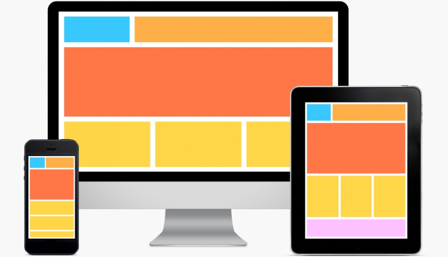
In today’s digital age, having a responsive website is crucial for reaching a wider audience and providing an optimal user experience across various devices. Responsive web design ensures that your site looks great and functions well on desktops, laptops, tablets, and smartphones. Fortunately, creating a responsive website doesn’t have to be complicated. With the right tools and techniques, you can easily achieve a responsive design that adapts to different screen sizes.
One of the simplest ways to make your website responsive is by using CSS media queries. Media queries allow you to apply specific styles based on the device’s screen size, orientation, and resolution. By defining different CSS rules for different screen sizes, you can ensure that your website looks good on any device.
Another key aspect of responsive web design is using flexible layouts and images. Instead of setting fixed widths for elements on your website, use relative units like percentages or ems. This allows your content to adapt fluidly to different screen sizes without breaking the layout. Similarly, use max-width properties for images to prevent them from overflowing their containers on smaller screens.
It’s also important to consider touch-friendly navigation for mobile users. Make sure that buttons and links are large enough to tap easily with a finger, and avoid using hover effects that don’t work on touchscreens. Additionally, prioritize content hierarchy by placing important information at the top of the page for better mobile usability.
In conclusion, creating an easy responsive web design involves using CSS media queries, flexible layouts, touch-friendly navigation, and prioritizing content hierarchy. By following these principles and best practices, you can ensure that your website looks great and functions well across all devices.Responsive web design is essential in today’s digital landscape where users access websites on a variety of devices. By implementing these tips and techniques into your web design process, you can create a seamless user experience that adapts to different screen sizes effortlessly.
9 Essential FAQs About Easy Responsive Web Design
- What is responsive web design?
- Why is responsive web design important?
- How does responsive web design work?
- What are CSS media queries and how are they used in responsive web design?
- What are the key principles of easy responsive web design?
- How can I make my website mobile-friendly?
- What tools or frameworks can help with creating a responsive website?
- What are some common challenges faced in implementing responsive web design?
- How can I test if my website is truly responsive?
What is responsive web design?
Responsive web design refers to the practice of creating websites that automatically adapt and adjust their layout and content based on the device and screen size being used to view them. In essence, a responsive website ensures that users have a consistent and optimal experience regardless of whether they are accessing the site on a desktop computer, laptop, tablet, or smartphone. By utilizing techniques such as flexible grids, CSS media queries, and fluid images, responsive web design allows for seamless navigation and readability across various devices. This approach not only improves user experience but also helps websites rank better in search engine results, as search engines like Google prioritize mobile-friendly sites.
Why is responsive web design important?
Responsive web design is crucial in today’s digital era because it ensures that your website is accessible and user-friendly across a wide range of devices. With the increasing use of smartphones and tablets to browse the internet, having a responsive design allows your site to adapt seamlessly to different screen sizes and resolutions. This not only enhances the user experience by providing easy navigation and readability but also improves search engine rankings as search engines like Google prioritize mobile-friendly websites. By investing in responsive web design, you can reach a larger audience, increase engagement, and ultimately drive more traffic to your site.
How does responsive web design work?
Responsive web design works by using a combination of flexible grids, media queries, and fluid layouts to create a website that can adapt to various screen sizes and devices. The key concept behind responsive design is to build a single website that can respond to the user’s behavior and environment based on screen size, platform, and orientation. When a user accesses a responsive website on a mobile device or desktop computer, the layout and content dynamically adjust to provide an optimal viewing experience. Media queries allow designers to apply specific styles based on the device’s characteristics, ensuring that the website looks great and functions well across all devices. By incorporating these techniques, responsive web design enables websites to be user-friendly and visually appealing on any screen size or device.
What are CSS media queries and how are they used in responsive web design?
CSS media queries are a fundamental aspect of responsive web design. They allow developers to apply specific CSS styles based on the characteristics of the device viewing the website, such as screen size, orientation, and resolution. By using media queries, designers can create a fluid and adaptable layout that adjusts seamlessly to different screen sizes. Media queries enable the design to respond dynamically to changes in the viewing environment, ensuring that the website looks great and functions well on desktops, laptops, tablets, and smartphones. In essence, CSS media queries play a crucial role in making websites responsive by tailoring the presentation of content to suit various devices and screen dimensions.
What are the key principles of easy responsive web design?
The key principles of easy responsive web design revolve around using CSS media queries to adapt styles based on screen size, employing flexible layouts and images to ensure content adjusts fluidly, implementing touch-friendly navigation for mobile users, and prioritizing content hierarchy for better usability. By following these principles, web designers can create websites that look great and function well across various devices, providing a seamless user experience for all visitors.
How can I make my website mobile-friendly?
Making your website mobile-friendly is essential for reaching a wider audience and providing a positive user experience on smartphones and tablets. To achieve this, you can start by implementing responsive web design techniques, such as using CSS media queries to adjust styles based on screen size, creating flexible layouts that adapt to different devices, and optimizing images for fast loading times. Additionally, prioritize mobile usability by making navigation elements easy to tap with a finger, ensuring that text is legible without zooming, and minimizing the use of large files or plugins that can slow down page loading on mobile devices. By following these best practices and focusing on creating a seamless experience for mobile users, you can make your website more accessible and engaging across all devices.
What tools or frameworks can help with creating a responsive website?
When it comes to creating a responsive website, there are several tools and frameworks available to help streamline the process. Popular tools like Bootstrap, Foundation, and Bulma offer pre-built CSS and JavaScript components that are designed to be responsive out of the box. These frameworks provide a solid foundation for building responsive layouts, navigation menus, forms, and other elements without having to start from scratch. Additionally, CSS preprocessors like SASS and LESS can help you write cleaner and more organized stylesheets for your responsive design. With the right tools and frameworks at your disposal, creating a responsive website becomes more efficient and manageable, allowing you to focus on delivering a seamless user experience across all devices.
What are some common challenges faced in implementing responsive web design?
Implementing responsive web design comes with its own set of challenges that web developers often face. One common challenge is ensuring consistent user experience across different devices and screen sizes. Design elements may not always translate well from desktop to mobile, leading to layout issues or content readability problems. Another challenge is optimizing performance, as responsive websites can sometimes be slower to load due to the need for loading multiple versions of assets based on device size. Additionally, testing and debugging responsive designs across various browsers and devices can be time-consuming and complex. Overcoming these challenges requires careful planning, testing, and a deep understanding of responsive design principles to create a seamless and user-friendly experience for all visitors.
How can I test if my website is truly responsive?
Testing if your website is truly responsive is a crucial step in ensuring a seamless user experience across various devices. One effective way to test the responsiveness of your website is by using browser developer tools, such as the inspect element feature. These tools allow you to simulate different screen sizes and resolutions, giving you a preview of how your site will appear on various devices. Additionally, you can use online responsive design testing tools that provide a more comprehensive analysis of your website’s responsiveness across different devices and screen sizes. By utilizing these testing methods, you can identify any issues and make necessary adjustments to ensure that your website looks and functions perfectly on all devices.