
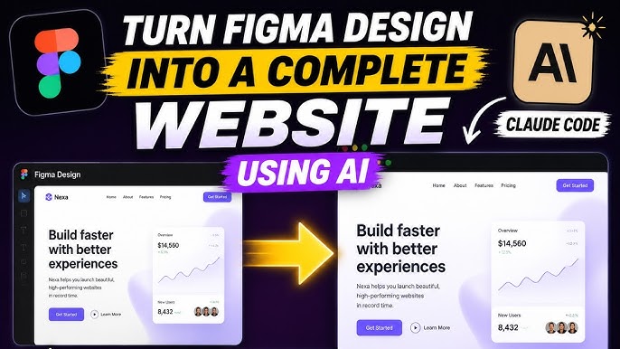
In today’s digital age, having a responsive website is essential to ensure a seamless user experience across various devices. If you have a design mockup created in Figma and want to bring it to life as a fully functional website, you’re in the right place. In this article, we’ll guide you through the process of building a responsive website from a Figma design.
Step 1: Export Assets from Figma
The first step is to export assets from your Figma design. This includes images, icons, fonts, and any other elements you may have used in your design. Export these assets in the appropriate formats for web use (e.g., PNG, SVG).
Step 2: Set Up Your HTML Structure
Create an HTML file and set up the basic structure of your website using HTML tags such as ,
, and . Link your CSS file within the tag using the tag.Step 3: Style Your Website with CSS
Use CSS to style your website according to the design mockup. You can use CSS properties like color, font-size, margin, padding, and more to achieve the desired look and layout. Make sure to use media queries to make your website responsive across different screen sizes.
Step 4: Add Interactivity with JavaScript
If your design includes interactive elements such as sliders, dropdown menus, or animations, you can use JavaScript to add functionality to your website. Link your JavaScript file at the bottom of your HTML file before the closing tag.
Step 5: Test Your Website
Before launching your website, it’s crucial to test it across various devices and screen sizes to ensure that it displays correctly and functions as intended. Use browser developer tools or online testing tools to simulate different viewports.
By following these steps, you can bring your Figma design to life as a fully responsive website. Remember that responsiveness is key in today’s mobile-first world, so make sure your website looks great and functions flawlessly on all devices. Happy coding!
5 Key Benefits of Building a Responsive Website from a Figma Design
- Ensures a seamless user experience across devices of all sizes.
- Allows for better reach and engagement with mobile users.
- Improves search engine optimization (SEO) by providing a mobile-friendly website.
- Enhances brand credibility and professionalism.
- Adapts to future device innovations, ensuring long-term usability.
Challenges of Building a Responsive Website from Figma Designs: 7 Key Cons
- 1. Time-consuming process to ensure design fidelity across different screen sizes.
- 2. Potential for discrepancies between the Figma design and the final website due to human error.
- 3. Difficulty in maintaining consistency in layout and styling elements on a responsive design.
- 4. Limited flexibility in making on-the-fly design changes compared to traditional web development methods.
- 5. Increased complexity in debugging and troubleshooting responsive issues on various devices.
- 6. Risk of performance issues with heavy image assets or complex animations on a responsive website.
- 7. Dependency on third-party plugins or tools for certain responsive design features, adding potential security risks.
Ensures a seamless user experience across devices of all sizes.
Building a responsive website from a Figma design ensures a seamless user experience across devices of all sizes. By implementing responsive design principles, the website adapts and adjusts its layout and content to fit the screen size of the device being used, whether it’s a desktop computer, tablet, or smartphone. This flexibility not only enhances user satisfaction by providing a consistent experience regardless of the device but also helps improve accessibility and usability, ultimately leading to higher engagement and conversion rates.
Allows for better reach and engagement with mobile users.
Building a responsive website from a Figma design allows for better reach and engagement with mobile users. With the increasing use of smartphones and tablets, having a website that adapts seamlessly to different screen sizes and devices is crucial to reaching a wider audience. A responsive design ensures that mobile users have a positive browsing experience, leading to higher engagement and increased time spent on the site. By catering to the needs of mobile users, businesses can enhance their online presence and connect more effectively with their target audience on the go.
Improves search engine optimization (SEO) by providing a mobile-friendly website.
One significant advantage of building a responsive website from a Figma design is that it improves search engine optimization (SEO) by providing a mobile-friendly website. Search engines like Google prioritize mobile-friendly websites in their search results, as more and more users are accessing the internet on mobile devices. By ensuring that your website is responsive and adapts to different screen sizes, you enhance the user experience on mobile, which can lead to higher rankings in search engine results pages. This, in turn, increases visibility and organic traffic to your website, ultimately benefiting your overall SEO efforts.
Enhances brand credibility and professionalism.
Building a responsive website from a Figma design enhances brand credibility and professionalism by ensuring that your website looks polished and functions seamlessly across all devices. A responsive design demonstrates that your brand is modern, adaptive, and committed to providing a positive user experience. When visitors can easily navigate your website on their smartphones, tablets, or desktops without any issues, it conveys a sense of reliability and professionalism, ultimately building trust with your audience. By investing in a responsive website, you showcase your brand as forward-thinking and customer-oriented, setting a strong foundation for establishing credibility in the competitive online landscape.
Adapts to future device innovations, ensuring long-term usability.
One significant advantage of building a responsive website from a Figma design is that it adapts to future device innovations, ensuring long-term usability. By creating a website that can seamlessly adjust its layout and design based on the screen size and capabilities of new devices, you are future-proofing your online presence. This flexibility allows your website to remain user-friendly and accessible to a wide range of users, regardless of the devices they use to access it. Embracing responsiveness not only enhances the user experience today but also guarantees that your website will continue to be relevant and functional as technology evolves in the future.
1. Time-consuming process to ensure design fidelity across different screen sizes.
One significant drawback of building a responsive website from a Figma design is the time-consuming process required to ensure design fidelity across different screen sizes. As web developers strive to maintain the visual integrity of the original design on various devices, they must invest additional time in tweaking and adjusting layout elements, styles, and content to accommodate different screen resolutions. This meticulous process of testing and fine-tuning can prolong the development timeline, potentially delaying the website launch.
2. Potential for discrepancies between the Figma design and the final website due to human error.
One significant drawback of building a responsive website from a Figma design is the potential for discrepancies between the original design and the final website due to human error. Despite meticulous attention to detail during the development process, mistakes can still occur when translating the design into code. This can result in elements not aligning correctly, fonts appearing differently, or colors not matching precisely. Such discrepancies may require additional time and effort to identify and rectify, leading to delays in project completion and potentially impacting the overall user experience of the website.
3. Difficulty in maintaining consistency in layout and styling elements on a responsive design.
One significant challenge when building a responsive website from a Figma design is the difficulty in maintaining consistency in layout and styling elements across different screen sizes. Ensuring that the design looks and functions seamlessly on various devices can be a complex task, as elements may need to be rearranged or resized to accommodate different viewport sizes. This can lead to inconsistencies in the overall look and feel of the website, making it challenging to maintain a cohesive design aesthetic throughout the responsive design.
4. Limited flexibility in making on-the-fly design changes compared to traditional web development methods.
One drawback of building a responsive website from a Figma design is the limited flexibility in making on-the-fly design changes compared to traditional web development methods. Since the design is initially created in Figma and then translated into code, any spontaneous design modifications may require going back to the Figma file, making adjustments, and then updating the code accordingly. This process can be time-consuming and may disrupt the workflow, especially when quick changes are needed during development. In traditional web development methods where designs are coded directly, developers have more freedom to make immediate design tweaks without relying heavily on external design tools like Figma.
5. Increased complexity in debugging and troubleshooting responsive issues on various devices.
One significant drawback of building a responsive website from a Figma design is the increased complexity in debugging and troubleshooting responsive issues on various devices. Due to the wide range of screen sizes, resolutions, and browsers used by visitors, ensuring consistent display and functionality across all platforms can be challenging. Identifying and fixing responsive design issues may require extensive testing and debugging efforts, adding complexity to the development process and potentially delaying the launch of the website.
6. Risk of performance issues with heavy image assets or complex animations on a responsive website.
One potential drawback of building a responsive website from a Figma design is the risk of performance issues that may arise due to heavy image assets or complex animations. When designing for responsiveness, it’s important to consider the impact of large image files or intricate animations on the website’s loading speed and overall performance. These elements can slow down the website, leading to longer loading times and a poor user experience, especially on mobile devices with limited bandwidth. Careful optimization of image assets and animations is necessary to ensure that the website remains fast and responsive across all devices without sacrificing visual appeal.
7. Dependency on third-party plugins or tools for certain responsive design features, adding potential security risks.
One significant drawback of building a responsive website from a Figma design is the dependency on third-party plugins or tools for certain responsive design features. While these plugins can help streamline the development process and provide advanced functionality, they also introduce potential security risks. Relying on external tools means entrusting sensitive data to third-party providers, increasing the vulnerability of the website to security breaches or data leaks. It’s crucial to carefully vet and monitor the security practices of any plugins or tools used in the development process to mitigate these risks and safeguard the integrity of the website.