
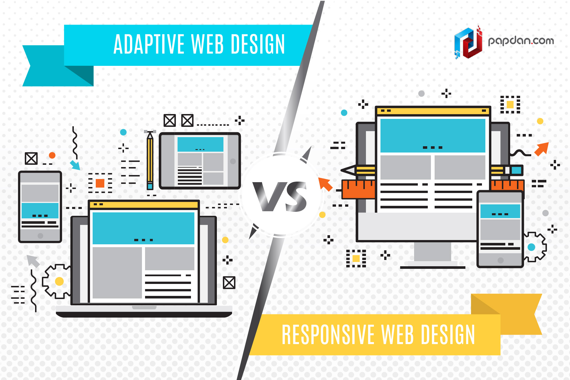
Responsive vs. Adaptive Web Design: Understanding the Differences
In today’s digital age, creating a user-friendly and visually appealing website is essential for businesses to succeed online. Two popular approaches to achieving this are responsive and adaptive web design.
Responsive Web Design
Responsive web design is a method that allows a website to adapt to different screen sizes and resolutions across various devices, such as desktops, laptops, tablets, and smartphones. This is achieved through the use of flexible grids and layouts that automatically adjust based on the screen size.
With responsive design, a single set of HTML code is used for all devices, and CSS media queries are employed to determine the layout based on the device’s screen size. This results in a seamless user experience regardless of the device being used.
Adaptive Web Design
Adaptive web design, on the other hand, involves creating multiple versions of a website specifically tailored to different device categories or screen sizes. Instead of using a single layout that adapts fluidly, adaptive design serves different layouts based on predefined breakpoints.
Each version of an adaptive website is optimized for specific screen sizes or devices, providing a more customized experience for users. While this approach offers more control over how content is displayed on various devices, it requires more upfront planning and development work compared to responsive design.
The Key Differences
- Flexibility: Responsive design offers fluidity in adapting to any screen size without the need for separate versions.
- Precision: Adaptive design provides greater control over how content is displayed on specific devices but requires more maintenance.
- Development Time: Responsive design generally requires less development time as it uses a single codebase for all devices.
- User Experience: Both approaches aim to enhance user experience by ensuring websites are accessible and easy to navigate across devices.
Ultimately, choosing between responsive and adaptive web design depends on factors such as budget, project requirements, and target audience. While responsive design is more cost-effective and easier to implement initially, adaptive design may be preferred for projects that require more customization and control over how content is presented.
6 Essential Tips for Mastering Responsive and Adaptive Web Design
- Prioritize mobile-first design to ensure a seamless experience on smaller screens.
- Use fluid grids and flexible images to allow content to adapt to various screen sizes.
- Incorporate media queries to apply different styles based on device characteristics like width and resolution.
- Optimize touch targets for easy navigation on touchscreens, considering the size of human fingers.
- Ensure fast loading times by optimizing images, minimizing HTTP requests, and utilizing caching techniques.
- Test your design across multiple devices and browsers to ensure consistent functionality and aesthetics.
Prioritize mobile-first design to ensure a seamless experience on smaller screens.
When implementing responsive adaptive web design, it is crucial to prioritize a mobile-first approach to guarantee a seamless user experience on smaller screens. By designing with mobile devices in mind first, you can ensure that your website functions optimally on smartphones and tablets, which are increasingly used for browsing. This strategy allows you to focus on essential content and features, optimizing them for smaller screens before scaling up to larger devices. Prioritizing mobile-first design not only enhances usability but also improves performance and accessibility across a wide range of devices, ultimately leading to a more satisfying user experience.
Use fluid grids and flexible images to allow content to adapt to various screen sizes.
In responsive and adaptive web design, utilizing fluid grids and flexible images is crucial to ensure that website content can seamlessly adjust to different screen sizes. By incorporating fluid grids that can expand or contract based on the device’s dimensions, and using flexible images that scale proportionally, designers can create a visually consistent and user-friendly experience across a range of devices. This approach helps maintain the integrity of the layout and ensures that users can access content easily regardless of the screen size they are viewing it on.
Incorporate media queries to apply different styles based on device characteristics like width and resolution.
In responsive and adaptive web design, incorporating media queries is a crucial tip to enhance the user experience across various devices. By utilizing media queries, developers can apply specific styles based on device characteristics such as width and resolution. This allows for a more tailored and optimized layout that adapts seamlessly to different screen sizes, ensuring that the website looks and functions well on desktops, laptops, tablets, and smartphones. Media queries play a key role in creating a responsive and adaptive design that prioritizes usability and accessibility for all users.
Optimize touch targets for easy navigation on touchscreens, considering the size of human fingers.
When implementing responsive or adaptive web design, it is crucial to optimize touch targets to ensure easy navigation on touchscreens, especially considering the size of human fingers. Designing larger touch targets that are easily clickable can significantly enhance the user experience on mobile devices. By making buttons, links, and interactive elements more prominent and spaced out appropriately, users can navigate the website with ease and accuracy, reducing the chances of accidental clicks or frustration. Prioritizing touch-friendly design elements is key to creating a user-friendly interface that caters to the needs of mobile users.
Ensure fast loading times by optimizing images, minimizing HTTP requests, and utilizing caching techniques.
To enhance the performance of a website built with responsive or adaptive design, it is crucial to prioritize fast loading times. This can be achieved by optimizing images to reduce file sizes, minimizing HTTP requests by combining scripts and stylesheets, and implementing caching techniques to store static resources locally on users’ devices. By focusing on these optimization strategies, web developers can create a smoother and more efficient user experience across various devices, ultimately improving the overall usability and engagement of the website.
Test your design across multiple devices and browsers to ensure consistent functionality and aesthetics.
To ensure a seamless user experience, it is crucial to test your responsive or adaptive web design across various devices and browsers. By conducting thorough testing, you can verify that your website maintains consistent functionality and aesthetics regardless of the device or browser being used. This proactive approach helps identify any potential issues early on and allows for necessary adjustments to be made to deliver a cohesive and user-friendly experience across all platforms.