
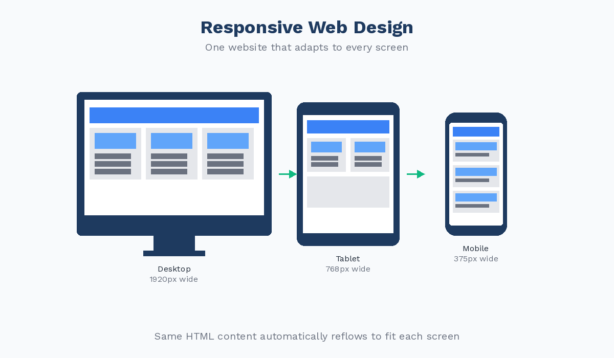
Responsive web design is a crucial aspect of modern website development. With the increasing use of mobile devices to access the internet, it is more important than ever to ensure that websites are optimized for various screen sizes and devices.
One of the key principles of responsive web design is creating websites that can adapt and respond to different screen sizes, resolutions, and orientations. This means that a website should look good and function well whether it is viewed on a desktop computer, a tablet, or a smartphone.
By using flexible grids, images, and CSS media queries, web designers can create layouts that automatically adjust to fit the screen size of the device being used. This not only improves the user experience but also helps with search engine optimization since responsive websites tend to rank higher in search engine results pages.
Another benefit of responsive web design is that it eliminates the need for separate mobile websites or apps. Instead of maintaining multiple versions of a website for different devices, developers can create one responsive design that works across all platforms.
In today’s fast-paced digital world, having a responsive website is no longer optional – it’s essential. Users expect websites to load quickly and look great on any device they are using. By embracing responsive web design principles, businesses can ensure that their online presence remains competitive and accessible to all users, regardless of how they access the internet.
Understanding Responsive Web Design: Key Concepts and Examples
- What is a responsive website example?
- What are the core concepts of responsive web design?
- What is responsive web design in Bootstrap?
- How to implement responsive web design?
- What is UX responsive design?
- What is a responsive website design?
- What are examples of responsive design?
What is a responsive website example?
A common example of a responsive website is the official website of Starbucks. When you visit the Starbucks website on a desktop computer, you’ll see a full-screen layout with high-resolution images and detailed information. However, if you switch to viewing the website on a mobile device like a smartphone or tablet, you’ll notice that the layout adjusts seamlessly to fit the smaller screen size. The content is rearranged, images are resized appropriately, and menus are simplified for easier navigation. This dynamic adaptation is a prime example of responsive web design in action, showcasing how a single website can provide an optimal user experience across various devices.
What are the core concepts of responsive web design?
The core concepts of responsive web design revolve around creating websites that can adapt and respond to different screen sizes and devices. Key principles include using flexible grids to layout content, employing CSS media queries to apply styles based on screen size, and optimizing images for various resolutions. By focusing on these core concepts, web designers can ensure that websites look great and function well across a wide range of devices, providing users with a seamless and consistent experience regardless of how they access the site.
What is responsive web design in Bootstrap?
Responsive web design in Bootstrap refers to the use of the Bootstrap framework to create websites that automatically adjust and adapt to different screen sizes and devices. Bootstrap is a popular front-end framework that provides a set of pre-designed components, such as grids, typography, forms, buttons, and navigation bars, that can be easily customized and integrated into web projects. By utilizing the responsive grid system in Bootstrap, developers can build websites that are mobile-friendly and responsive by default. This means that the layout of the website will automatically adjust based on the screen size of the device, ensuring a consistent user experience across desktops, tablets, and smartphones. Overall, responsive web design in Bootstrap simplifies the process of creating websites that look great and function well on any device.
How to implement responsive web design?
Implementing responsive web design involves several key steps to ensure that a website is optimized for various screen sizes and devices. First, web designers need to create a flexible grid layout that can adapt to different screen widths. This grid system helps to organize content and maintain consistency across devices. Next, images and media should be set to resize proportionally based on the screen size using CSS media queries. It is also important to use fluid typography that adjusts in size based on the viewport width. Testing the responsive design on different devices and browsers is crucial to identify any issues and make necessary adjustments for optimal performance. By following these steps and best practices, web developers can successfully implement responsive web design to create a seamless user experience across all devices.
What is UX responsive design?
UX responsive design refers to the practice of creating user experiences that are optimized for various devices and screen sizes through responsive web design techniques. It focuses on ensuring that users have a seamless and intuitive experience when interacting with a website across different platforms. UX responsive design involves designing layouts, navigation, and content in a way that adapts to the user’s device, providing a consistent and user-friendly experience regardless of how they access the website. By prioritizing user experience in responsive design, designers can create websites that are not only visually appealing but also functional and easy to use on any device.
What is a responsive website design?
A responsive website design is a design approach that ensures a website can adapt and adjust its layout and content to display optimally on various devices and screen sizes. This means that a responsive website will look great and function seamlessly whether it is viewed on a desktop computer, laptop, tablet, or smartphone. By utilizing flexible grids, images, and CSS media queries, responsive web design allows websites to automatically adjust their appearance based on the device being used. This results in an improved user experience, better accessibility, and higher search engine rankings. In essence, a responsive website design is essential for ensuring that websites are user-friendly and visually appealing across all devices in today’s digital landscape.
What are examples of responsive design?
Examples of responsive design can be found all around the web, showcasing how websites adapt to different screen sizes and devices. Popular examples include media outlets like BBC News and The New York Times, e-commerce sites such as Amazon and eBay, as well as tech giants like Apple and Google. These websites seamlessly adjust their layouts, images, and content to provide an optimal viewing experience on desktops, laptops, tablets, and smartphones. By incorporating responsive design principles, these websites ensure that users can access their content easily and enjoy a consistent user experience across various devices.