
The Importance of Responsive Design in Figma
Responsive design is a crucial aspect of modern web and app development. With the increasing variety of devices and screen sizes used to access websites and applications, it’s essential to ensure that your designs look great and function well across all platforms. Figma, a popular design tool among designers and developers, offers powerful features to help create responsive designs efficiently.
One of the key benefits of using Figma for responsive design is its ability to create designs that adapt seamlessly to different screen sizes. By utilizing Figma’s constraints feature, designers can define how elements should behave when the screen size changes. This allows for the creation of flexible layouts that adjust dynamically based on the device being used.
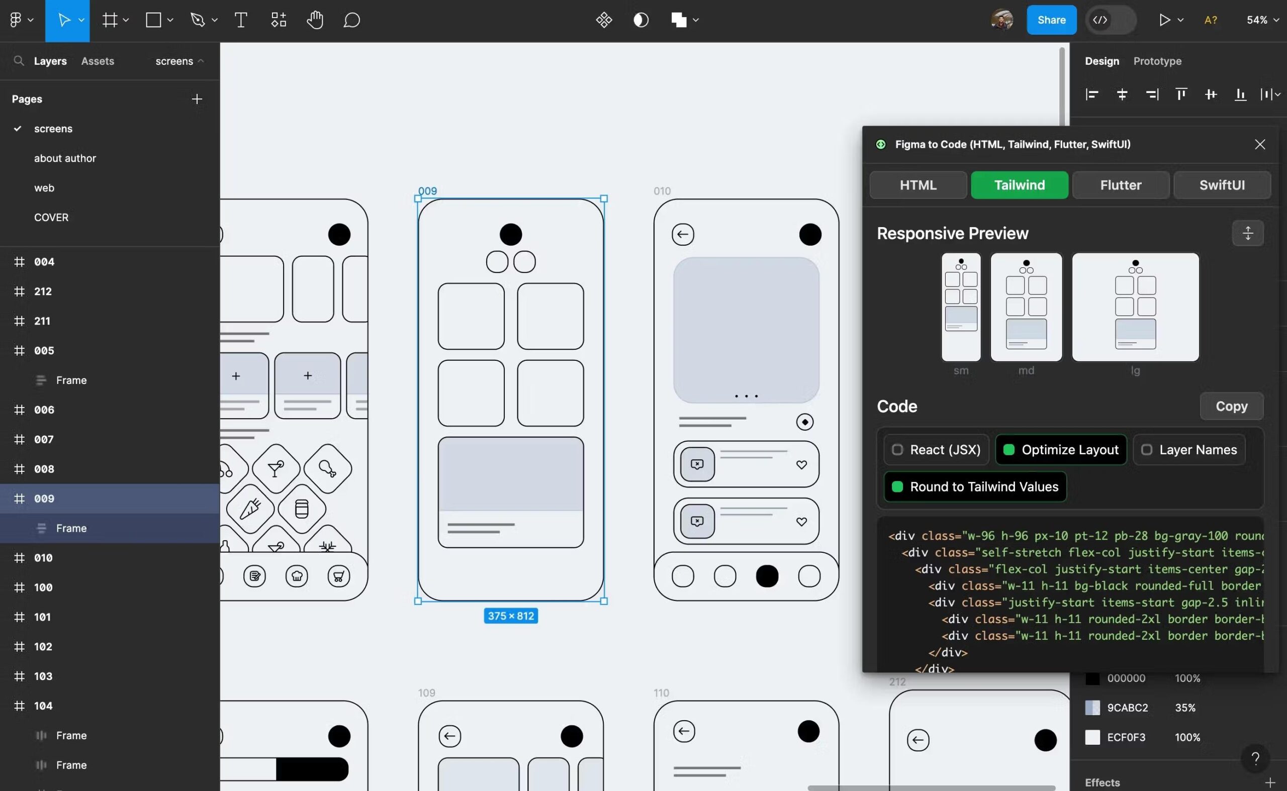
Another advantage of using Figma for responsive design is its preview functionality. Designers can easily preview how their designs will look on various devices by simply resizing the artboard within Figma. This real-time feedback enables designers to make adjustments quickly and ensure that their designs are optimized for all screen sizes.
Figma also offers components and variants that streamline the process of creating responsive designs. By creating reusable components with different states or variants for various screen sizes, designers can maintain consistency across their designs while still allowing for flexibility in layout and content placement.
In conclusion, responsive design is essential in today’s digital landscape, and Figma provides powerful tools to help designers create adaptive and user-friendly designs. By leveraging features such as constraints, preview functionality, components, and variants, designers can ensure that their designs are optimized for a wide range of devices and screen sizes.
Top 5 Benefits of Using Figma for Responsive Design
- Efficient creation of designs that adapt to different screen sizes.
- Real-time preview functionality for quick assessment of design responsiveness.
- Streamlined process with components and variants for maintaining consistency.
- Enhanced user experience by ensuring optimal display on various devices.
- Saves time and effort by simplifying the creation of responsive layouts.
Challenges of Using Figma for Responsive Design: 7 Key Drawbacks
- Learning curve for beginners due to the complexity of responsive design principles.
- Constraints in Figma may require additional time and effort to set up correctly for complex layouts.
- Limited customization options for responsive design compared to other specialized tools.
- Difficulties in maintaining consistency across different screen sizes and breakpoints.
- Potential performance issues with complex responsive designs in Figma.
- Collaboration challenges when working on responsive designs with a team using Figma.
- Responsive design features in Figma may not be as advanced or intuitive as dedicated prototyping tools.
Efficient creation of designs that adapt to different screen sizes.
One of the key advantages of using Figma for responsive design is the efficient creation of designs that seamlessly adapt to various screen sizes. With Figma’s constraints feature, designers can easily define how elements should behave when the screen size changes, allowing for flexible layouts that automatically adjust based on the device being used. This streamlines the design process, enabling designers to create responsive designs more quickly and effectively, ensuring a consistent and user-friendly experience across different devices and screen resolutions.
Real-time preview functionality for quick assessment of design responsiveness.
One of the standout advantages of utilizing responsive design in Figma is the real-time preview functionality it offers. This feature allows designers to instantly assess how their designs will appear and behave across various devices by simply resizing the artboard within the tool. The ability to receive immediate feedback on design responsiveness enables designers to make quick adjustments and optimizations, ensuring that their designs are visually appealing and functional on different screen sizes. This real-time preview functionality in Figma streamlines the design process and empowers designers to create adaptive layouts efficiently.
Streamlined process with components and variants for maintaining consistency.
One of the standout advantages of using responsive design in Figma is the streamlined process it offers through components and variants. By creating reusable components with different states or variants tailored for various screen sizes, designers can maintain consistency across their designs effortlessly. This approach not only saves time but also ensures that the design remains cohesive and visually appealing across different devices. With Figma’s components and variants, designers can easily make updates or modifications to elements that automatically reflect across all instances, making it a powerful tool for maintaining design consistency throughout the responsive design process.
Enhanced user experience by ensuring optimal display on various devices.
Responsive design in Figma enhances the user experience by ensuring optimal display on various devices. By utilizing features like constraints and preview functionality, designers can create layouts that adapt seamlessly to different screen sizes, providing users with a consistent and visually appealing experience across desktops, tablets, and mobile devices. This attention to responsive design not only improves usability but also helps to increase engagement and satisfaction among users, ultimately leading to a more successful and user-friendly product.
Saves time and effort by simplifying the creation of responsive layouts.
Responsive design in Figma offers a significant advantage by saving time and effort through simplifying the creation of responsive layouts. With features like constraints and layout grids, designers can easily define how elements should behave across different screen sizes, eliminating the need for manual adjustments. This streamlines the design process, allowing designers to focus more on creativity and less on tedious resizing tasks. By efficiently creating responsive layouts in Figma, designers can deliver consistent and user-friendly designs across various devices without sacrificing quality or wasting unnecessary time and effort.
Learning curve for beginners due to the complexity of responsive design principles.
One potential drawback of using responsive design in Figma is the steep learning curve it presents for beginners, primarily due to the complexity of responsive design principles. Understanding how to create layouts that adapt to different screen sizes and resolutions can be challenging for those new to design or unfamiliar with responsive design concepts. The need to grasp concepts like constraints, breakpoints, and fluid layouts may require additional time and effort for beginners to master, potentially slowing down their design process initially. However, with practice and dedication, beginners can overcome this hurdle and harness the power of responsive design in Figma to create versatile and user-friendly designs.
Constraints in Figma may require additional time and effort to set up correctly for complex layouts.
One potential drawback of using constraints in Figma for responsive design is that they may pose a challenge when dealing with complex layouts, requiring additional time and effort to set up correctly. Designers working on intricate designs with multiple elements and varying screen sizes may find it challenging to define constraints that ensure all components behave as intended across different devices. This complexity can lead to a more time-consuming design process as designers fine-tune and adjust constraints to achieve the desired responsive layout.
Limited customization options for responsive design compared to other specialized tools.
One drawback of using Figma for responsive design is the limited customization options available compared to other specialized tools. While Figma offers powerful features for creating responsive designs, such as constraints and layout grids, it may not provide the same level of control and fine-tuning that some designers require for complex responsive layouts. Designers who need highly customized responsive designs with intricate interactions and animations may find that other tools designed specifically for responsive design offer more advanced capabilities and flexibility in achieving their desired outcomes.
Difficulties in maintaining consistency across different screen sizes and breakpoints.
One challenge that designers may encounter when working on responsive design in Figma is the difficulty in maintaining consistency across different screen sizes and breakpoints. As designs need to adapt to various devices, it can be challenging to ensure that the layout, typography, and visual elements remain consistent and cohesive across all screen sizes. Designers may need to invest extra time and effort in testing and refining their designs to address any inconsistencies that arise when transitioning between different breakpoints. This can lead to potential discrepancies in the user experience and visual aesthetics if not carefully managed throughout the design process.
Potential performance issues with complex responsive designs in Figma.
One potential con of responsive design in Figma is the risk of encountering performance issues, especially when working on complex responsive designs. As the number of elements and interactions increases in a design, it can put a strain on Figma’s processing capabilities, leading to slower performance and rendering times. Designers may experience lag or delays when making changes to intricate responsive layouts, impacting their workflow efficiency. It is important for designers to be mindful of the complexity of their designs and optimize them accordingly to mitigate potential performance issues while working on responsive projects in Figma.
Collaboration challenges when working on responsive designs with a team using Figma.
One significant con of working on responsive designs with a team using Figma is the collaboration challenges that can arise. When multiple team members are involved in creating responsive designs, coordinating efforts and ensuring consistency across different screen sizes can be complex. Without proper communication and coordination, there is a risk of inconsistencies in design elements and layouts, leading to a disjointed user experience. Additionally, managing feedback and revisions from team members on responsive designs within Figma can be challenging, especially when multiple iterations are required to achieve the desired responsiveness across various devices. These collaboration challenges can slow down the design process and hinder the efficiency of the team’s workflow when working on responsive designs in Figma.
Responsive design features in Figma may not be as advanced or intuitive as dedicated prototyping tools.
One potential drawback of using responsive design features in Figma is that they may not be as advanced or intuitive as those found in dedicated prototyping tools. While Figma offers powerful tools for creating responsive designs, designers may find limitations when compared to specialized prototyping software. These tools often provide more advanced features and functionalities specifically tailored for creating interactive prototypes with complex responsive behaviors. Designers may need to explore additional plugins or workarounds to achieve certain responsive design requirements that are more seamlessly integrated in dedicated prototyping tools.