
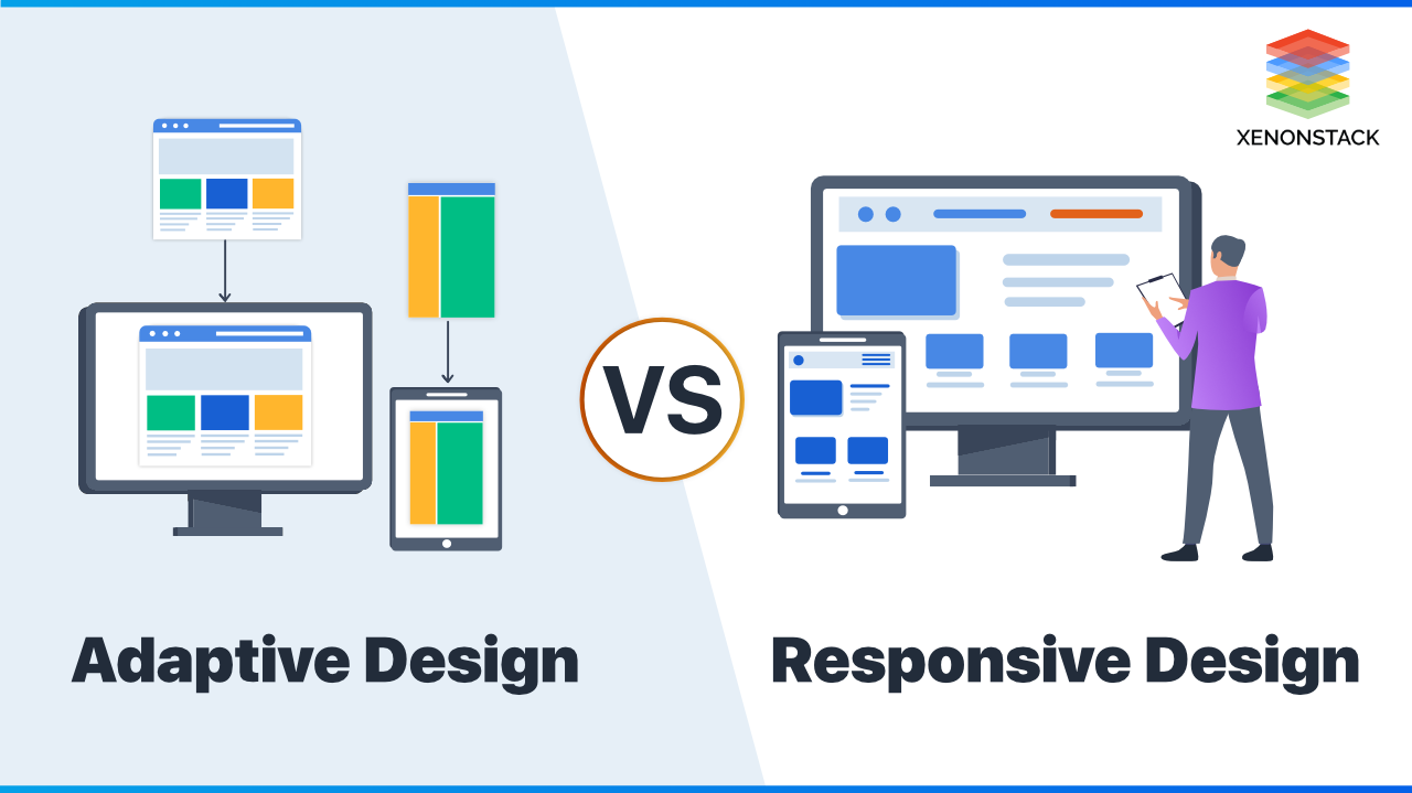
Responsive Web App Design: Building Better Experiences on Every Screen
People use web apps on phones, tablets, laptops, and desktop computers—often switching between devices throughout the day. Responsive web app design helps an application adapt to those different screens and ways of interacting. The goal is not simply to make a desktop interface smaller. It is to create a clear, usable experience wherever and however someone accesses the app.
What Is Responsive Web App Design?
Responsive web app design is an approach to designing and developing web applications that adjust their layout and behavior to suit the user’s device, screen size, and input method. A responsive app may rearrange content, resize components, simplify navigation, or offer different interaction patterns on smaller screens.
Responsive design differs from building a separate mobile website for every device. Instead, one application uses flexible layouts and adaptable components to serve a range of screen sizes. The experience should remain consistent in purpose and quality, even when its presentation changes.
Why Responsiveness Matters
- More accessible use: People can use the app on the device that is most convenient to them.
- Improved usability: Well-designed layouts reduce unnecessary scrolling, zooming, and navigation.
- Greater consistency: Users can move between devices without having to learn a completely different interface.
- Fewer maintenance challenges: A flexible design system can be easier to update than multiple unrelated versions of an app.
- Better support for changing screens: The app can accommodate new devices and browser window sizes more effectively.
Start With the User’s Tasks
Responsive design works best when it begins with what users need to accomplish. A dashboard, for example, may need to show several data panels on a large screen, while a phone layout may prioritize the most important figures and make the rest available through expandable sections.
List the key tasks users perform, then consider how each task should work on different devices. Ask questions such as:
- What information must be visible immediately?
- Which actions are used most often?
- Can a complex task be divided into clear steps?
- What content can be hidden, condensed, or moved without making the app harder to use?
Use Flexible Layouts
Responsive interfaces rely on layouts that can grow, shrink, and reorganize. Instead of assuming that every user has a particular screen width, use flexible grids, relative sizing, and sensible limits on content width.
On a wide display, an app might place navigation beside the main content. On a phone, that same navigation could become a menu button or a compact tab bar. Cards that appear in several columns on desktop may stack vertically on a smaller screen.
Changes should be purposeful. Compressing every element into a narrow column can technically fit the screen, but it may leave users with tiny controls, crowded text, and too many steps.
Design Navigation for Different Contexts
Navigation is one of the most noticeable parts of a responsive app. A persistent sidebar may work well on a desktop, while a mobile screen may require a menu, bottom navigation, or a shorter set of primary options.
Keep the most important destinations easy to find. Use familiar labels, make the current location clear, and avoid placing essential actions behind layers of menus. If navigation changes across screen sizes, preserve a consistent structure so users can still understand where they are.
Make Controls Comfortable to Use
Mobile users may tap with a thumb instead of clicking with a mouse. Buttons, links, form fields, and other interactive elements should be easy to identify and operate. Give controls enough space to reduce accidental taps, and avoid relying on hover effects to reveal essential information.
Consider the full range of input methods. A responsive web app should work with touch, a keyboard, and a mouse. Visible focus states, logical tab order, and clear control labels improve usability for keyboard users and people who use assistive technology.
Make Content Easy to Read
Text should remain readable at different screen sizes and zoom levels. Use a clear type hierarchy, comfortable line spacing, and line lengths that are not excessively wide. Avoid fixed text sizes or layouts that break when someone enlarges the page.
Content also needs responsive handling. Tables may need horizontal scrolling, a simplified mobile presentation, or a different way to compare information. Images should scale without distortion, and important details should not disappear simply because a screen is narrow.
Think Beyond Screen Width
Responsive design is about more than fitting a layout into a viewport. Performance, accessibility, browser behavior, and network conditions all affect the experience. Large images and unnecessary scripts can make an app feel slow, particularly on mobile connections. Load only what is needed and provide useful feedback when an action takes time.
Accessibility should be part of the design process from the start. Use semantic HTML, maintain sufficient color contrast, label form fields, and ensure that dynamic content can be understood by assistive technologies. A layout that adapts visually should also remain usable with different ways of navigating and perceiving content.
Test on Real Devices and at Different Sizes
Browser resizing tools are useful, but they should not be the only form of testing. Check the app on actual phones and tablets when possible. Test different orientations, zoom levels, browsers, and input methods. Pay particular attention to forms, menus, dialogs, data-heavy screens, and any task users must complete successfully.
Testing should include both common and unusual viewport sizes. Breakpoints should be chosen based on where the content needs to change—not simply to match a list of popular devices. If a layout becomes crowded or difficult to use, that is a signal to adjust the design.
Common Mistakes to Avoid
- Designing only for desktop: Adding a mobile layout at the end can lead to awkward compromises.
- Hiding too much content: Removing important information may make the app harder to use on smaller screens.
- Using tiny controls: Compact interfaces should still be comfortable to operate.
- Relying on hover: Touchscreens do not use hover in the same way as a mouse.
- Testing only one device: A layout can behave differently across browsers, screen sizes, and input methods.
- Ignoring performance: A responsive layout can still feel poor if it loads slowly or responds inconsistently.
A Practical Approach
- Identify the main users and tasks the app needs to support.
- Prioritize content and actions for each task.
- Create flexible layouts and reusable components.
- Plan how navigation and controls will work on touch and keyboard devices.
- Build accessibility and performance considerations into the design.
- Test the complete experience across screen sizes and real devices.
- Refine the interface based on observed problems and user feedback.
Conclusion
Responsive web app design is about making an application useful and comfortable across a variety of screens and contexts. By focusing on user tasks, flexible layouts, clear navigation, accessible controls, and thorough testing, teams can create experiences that adapt without losing their clarity or purpose. The strongest responsive apps do more than fit the screen: they help people get things done wherever they are.
Responsive Web App Design: 9 Frequently Asked Questions
- What screen size is best for responsive web design?
- What is the difference between PWA and responsive website?
- What is responsive design in web design?
- What are the three basic things required for responsive web design?
- Is responsive web design still a thing?
- Is responsive design UX or UI?
- How do I create a responsive website design?
- What are the 3 basic things required for responsive web design?
- Should web apps be responsive?
What screen size is best for responsive web design?
There’s no single screen size that’s best for responsive web design. Instead, design for the range of screens your audience uses, and set breakpoints where the content or layout needs to change—not just for specific device models. Start with a flexible layout, test it at common phone, tablet, and desktop widths, and adjust wherever text, navigation, or controls become difficult to use.
What is the difference between PWA and responsive website?
A responsive website adapts its layout and content to different screen sizes, so it’s easy to use on phones, tablets, and computers through a web browser. A Progressive Web App (PWA) is a website built with additional app-like capabilities: depending on the browser and device, it may be installable, work offline or with a weak connection, and send push notifications. A PWA should also be responsive, but responsiveness alone does not make a website a PWA.
What is responsive design in web design?
Responsive design in web design is an approach that lets a website or web app adapt its layout and content to different screen sizes and devices, from phones to desktop computers. It uses flexible layouts, images, and interface elements so pages remain readable and easy to use without requiring users to zoom, scroll sideways, or navigate a separate mobile site.
What are the three basic things required for responsive web design?
The three basic requirements for responsive web design are a fluid grid, flexible images and media, and CSS media queries. A fluid grid uses relative units, such as percentages, so page layouts adjust to different screen widths. Flexible images and media scale within their containers to prevent overflow or distortion. Media queries let CSS apply different styles at chosen breakpoints, helping layouts, text, and navigation adapt to the available space. Together, these techniques create a website that remains usable across phones, tablets, and desktop screens.
Is responsive web design still a thing?
Yes, responsive web design is still very much a thing—and it’s essential for modern web apps. People access websites on a wide range of devices and screen sizes, so layouts need to adapt to provide a clear, usable experience on phones, tablets, laptops, and desktops. Responsive design has evolved beyond simply rearranging columns; it also considers touch and keyboard interactions, accessibility, performance, and the needs of users in different contexts.
Is responsive design UX or UI?
Responsive design is both a UI and UX concern. It is part of UI because it determines how an app’s layout, controls, and content look and behave across screen sizes. It is also part of UX because those design choices affect how easily people can navigate the app, understand information, and complete tasks on different devices. In short, responsive design shapes the interface and the overall experience.
How do I create a responsive website design?
To create a responsive website design, start by planning for mobile screens as well as larger displays, then use flexible layouts, relative sizing, and CSS media queries to adapt the content to different viewport sizes. Make navigation, images, forms, and buttons easy to use on touchscreens, and keep text readable without requiring users to zoom. Test the site at a range of screen widths and on real devices, checking that content remains accessible, loads efficiently, and works with both touch and keyboard input.
What are the 3 basic things required for responsive web design?
The three basic requirements for responsive web design are a flexible grid-based layout, flexible images and media, and CSS media queries. A flexible layout adjusts to the available screen space instead of relying on fixed dimensions, while flexible images scale within their containers so they don’t overflow or appear distorted. Media queries let designers apply different styles at specific screen sizes, helping the interface adapt its layout, typography, and navigation for phones, tablets, and desktops.
Should web apps be responsive?
Yes, most web apps should be responsive so people can use them comfortably on phones, tablets, laptops, and desktop computers. A responsive design adapts layouts, navigation, and controls to different screen sizes and input methods, helping users complete tasks without excessive zooming or scrolling. The exact experience may vary by device, but core features should remain accessible, readable, and easy to use.