
Web Layouts: A Guide to Creating Engaging and Functional Websites
When it comes to designing a website, the layout plays a crucial role in determining the overall user experience. A well-thought-out web layout not only enhances the visual appeal of a site but also ensures easy navigation and accessibility for visitors. In this article, we will explore the key elements of web layouts and provide tips for creating engaging and functional websites.
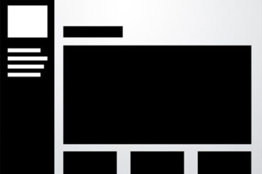
Grid Layouts:
One of the fundamental principles of web design is the use of grid layouts. Grids help designers organize content on a webpage in a structured manner, making it easier for users to scan and navigate through the site. By dividing the page into columns and rows, designers can create a balanced and harmonious layout that guides users’ eyes smoothly across the screen.
Responsive Design:
With the increasing use of mobile devices, responsive design has become essential for modern websites. Responsive layouts adapt to different screen sizes and resolutions, ensuring that your site looks great on all devices, from smartphones to desktop computers. Using CSS media queries, designers can create flexible layouts that adjust dynamically based on the user’s device.
Whitespace:
Whitespace, also known as negative space, is an essential design element that helps create breathing room between different sections of a webpage. By strategically incorporating whitespace into your layout, you can improve readability, highlight important content, and create a sense of balance and harmony. Remember, less is often more when it comes to whitespace – don’t overcrowd your layout with unnecessary elements.
Typography:
The choice of typography can significantly impact the overall look and feel of a website. When selecting fonts for your web layout, consider factors such as readability, hierarchy, and brand consistency. Use different font sizes, styles, and weights to create contrast and emphasize key information. Remember to optimize typography for legibility across various devices and screen sizes.
Visual Hierarchy:
Creating a clear visual hierarchy is essential for guiding users’ attention and helping them navigate through your website effectively. Use color contrast, font size variations, whitespace, and placement to establish a logical flow of information on the page. Important elements such as headings, calls-to-action buttons, and navigation menus should stand out prominently to draw users’ focus.
In conclusion
Designing an effective web layout requires careful consideration of various elements such as grids, responsive design principles,
whitespace usage typography choices visual hierarchy.
By following these tips guidelines
you can create engaging functional websites that deliver exceptional user experiences across all devices.
Remember
experimentation iteration are key refining perfecting your web layouts over time.
Whether you’re designing a new website or revamping an existing one,
paying attention to these fundamental principles will help you create visually appealing user-friendly websites that leave a lasting impression on your visitors.
6 Key Benefits of Effective Web Layouts for an Engaging User Experience
- Enhance visual appeal of the website
- Improve user experience and navigation
- Organize content in a structured manner
- Facilitate readability and information accessibility
- Support responsive design for multi-device compatibility
- Create a clear visual hierarchy for effective communication
Challenges of Web Layouts: Slow Load Times, User Confusion, Inconsistency, and Lack of Originality
- Complex layouts can lead to slower loading times, especially on devices with limited processing power or slow internet connections.
- Poorly designed layouts can result in a cluttered and confusing user experience, making it difficult for visitors to find the information they are looking for.
- Inconsistent layouts across different pages of a website can create confusion and disrupt the overall visual cohesiveness of the site.
- Over-reliance on pre-designed templates for web layouts can limit creativity and make websites look generic or unoriginal.
Enhance visual appeal of the website
One of the key benefits of well-designed web layouts is their ability to enhance the visual appeal of a website. By carefully organizing content, images, and other elements on the page, designers can create visually stunning and engaging websites that capture users’ attention. A visually appealing layout not only makes a strong first impression but also helps establish a brand’s identity and credibility. Through thoughtful use of colors, typography, whitespace, and imagery, designers can create a cohesive and aesthetically pleasing design that reflects the brand’s personality and values. Ultimately, an attractive web layout can draw users in, encourage them to explore further, and leave a memorable impression that keeps them coming back for more.
Improve user experience and navigation
One of the key benefits of well-designed web layouts is their ability to significantly enhance user experience and navigation. By organizing content in a clear and structured manner, users can easily find the information they are looking for without feeling overwhelmed or lost. Intuitive navigation menus, strategically placed calls-to-action buttons, and logical content flow all contribute to a seamless browsing experience that keeps visitors engaged and encourages them to explore more of the website. A user-friendly layout not only improves usability but also helps build trust with users, leading to higher engagement and conversion rates.
Organize content in a structured manner
One of the key benefits of web layouts is their ability to organize content in a structured and systematic manner. By utilizing grids, columns, and rows, designers can arrange text, images, and other elements in a way that is visually appealing and easy to navigate. This structured approach not only enhances the overall aesthetic of a website but also improves user experience by guiding visitors through the content in a logical and intuitive fashion. With a well-organized web layout, users can quickly find the information they need, leading to increased engagement and satisfaction with the site.
Facilitate readability and information accessibility
One significant advantage of well-designed web layouts is their ability to facilitate readability and information accessibility for users. By structuring content in a clear and organized manner, a thoughtfully crafted layout enhances the user experience by making it easier for visitors to consume information quickly and efficiently. Through strategic use of typography, whitespace, and visual hierarchy, web layouts guide users’ eyes smoothly across the page, highlighting important content and ensuring that key information is easily accessible. This not only improves user engagement but also helps visitors find the information they need without feeling overwhelmed or confused. Ultimately, a user-friendly layout that prioritizes readability and accessibility contributes to a positive overall impression of the website and encourages users to stay longer and explore further.
Support responsive design for multi-device compatibility
One of the key advantages of web layouts is their ability to support responsive design, ensuring multi-device compatibility. By using responsive layouts, designers can create websites that adapt seamlessly to different screen sizes and resolutions, providing a consistent user experience across devices such as smartphones, tablets, and desktop computers. This flexibility not only improves accessibility for users but also enhances the overall usability and functionality of the website, ultimately leading to higher engagement and satisfaction among visitors.
Create a clear visual hierarchy for effective communication
One of the key benefits of web layouts is their ability to create a clear visual hierarchy for effective communication. By strategically organizing content, using contrasting colors and font sizes, and incorporating whitespace, web designers can guide users’ attention and prioritize information on a webpage. A well-defined visual hierarchy helps users quickly understand the structure of the content, navigate through the site with ease, and focus on key messages or calls-to-action. This results in improved user engagement, better usability, and enhanced overall user experience on the website.
Complex layouts can lead to slower loading times, especially on devices with limited processing power or slow internet connections.
One significant drawback of complex web layouts is their potential to slow down loading times, particularly on devices with limited processing power or slow internet connections. When a website contains intricate design elements, multiple images, and intricate CSS styling, it can increase the amount of data that needs to be downloaded, resulting in longer loading times for users. This can lead to a frustrating experience for visitors who may abandon the site if it takes too long to load. Therefore, it’s essential for designers to strike a balance between creativity and performance optimization to ensure that websites load quickly and efficiently across all devices and connection speeds.
Poorly designed layouts can result in a cluttered and confusing user experience, making it difficult for visitors to find the information they are looking for.
One significant con of web layouts is that poorly designed layouts can result in a cluttered and confusing user experience. When a website is overcrowded with elements, lacks clear organization, or has inconsistent navigation, visitors may struggle to find the information they are looking for. This can lead to frustration, increased bounce rates, and ultimately a negative impression of the website. It’s essential for designers to prioritize simplicity, clarity, and user-friendliness in their layouts to ensure a seamless and intuitive browsing experience for visitors.
Inconsistent layouts across different pages of a website can create confusion and disrupt the overall visual cohesiveness of the site.
One significant drawback of web layouts is the potential for inconsistent designs across different pages of a website. When each page has its own layout, color scheme, and navigation structure, it can lead to confusion among users and disrupt the overall visual cohesiveness of the site. Visitors may struggle to find familiar elements or navigate seamlessly between pages, resulting in a disjointed user experience. Consistency in web layouts is crucial for establishing a sense of unity and guiding users through the site intuitively.
Over-reliance on pre-designed templates for web layouts can limit creativity and make websites look generic or unoriginal.
One significant drawback of web layouts is the tendency to rely heavily on pre-designed templates, which can stifle creativity and result in websites that appear generic or unoriginal. While templates offer convenience and time-saving benefits, they often restrict designers’ ability to create unique and innovative layouts tailored to specific needs. Overusing templates can lead to a lack of originality and a cookie-cutter appearance, making it challenging for websites to stand out in a crowded online landscape. Designers should strive to strike a balance between utilizing templates for efficiency and incorporating custom elements to infuse personality and creativity into their web layouts, ensuring a more distinctive and engaging user experience.