
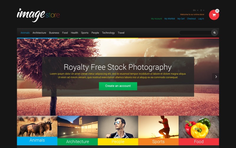
The Importance of Magento Responsive Web Design
In today’s digital age, having a responsive web design is crucial for the success of any online business. When it comes to e-commerce platforms like Magento, ensuring that your website is responsive can have a significant impact on user experience and ultimately, your bottom line.
Magento is a popular choice for businesses looking to set up an online store due to its robust features and flexibility. However, without a responsive design, your Magento website may not perform as well on mobile devices, leading to a loss of potential customers.
A responsive web design ensures that your Magento website adapts to different screen sizes and devices, providing users with an optimal viewing experience. Whether a customer is accessing your site from a desktop computer, tablet, or smartphone, they should be able to navigate your store easily and make purchases without any issues.
By implementing a responsive design for your Magento website, you can improve user engagement, increase conversion rates, and boost overall customer satisfaction. In addition, search engines like Google prioritize mobile-friendly websites in their rankings, which can help improve your site’s visibility and attract more organic traffic.
Overall, investing in a responsive web design for your Magento store is essential for staying competitive in today’s online marketplace. It not only enhances the user experience but also contributes to the success and growth of your e-commerce business.
6 Essential Tips for Optimizing Magento Websites for Responsive Design
- Ensure your Magento website is mobile-friendly by using a responsive design.
- Optimize images and content for fast loading on mobile devices.
- Test your website on different screen sizes to ensure it looks good across all devices.
- Use a clean and simple design to improve user experience on mobile.
- Implement touch-friendly elements like larger buttons for easy navigation on touchscreen devices.
- Consider implementing lazy loading to improve page speed on mobile.
Ensure your Magento website is mobile-friendly by using a responsive design.
To optimize the user experience and reach a wider audience, it is crucial to ensure that your Magento website is mobile-friendly by implementing a responsive design. By utilizing responsive design techniques, you can create a seamless browsing experience for visitors across various devices, including smartphones and tablets. This approach not only enhances usability but also improves search engine rankings and ultimately drives more traffic and conversions to your Magento store.
Optimize images and content for fast loading on mobile devices.
To ensure optimal performance of your Magento website on mobile devices, it is essential to optimize images and content for fast loading. By reducing image file sizes without compromising quality and minimizing unnecessary content, you can improve the loading speed of your site on smartphones and tablets. This not only enhances user experience but also contributes to lower bounce rates and higher conversion rates, as mobile users are more likely to engage with a fast-loading website. Prioritizing image and content optimization is a key strategy in achieving a responsive web design that caters to the needs of mobile users effectively.
Test your website on different screen sizes to ensure it looks good across all devices.
To ensure a seamless user experience across all devices, it is essential to test your Magento website on various screen sizes. By testing your website on different devices, such as desktops, laptops, tablets, and smartphones, you can identify any design or layout issues that may arise. This proactive approach allows you to make necessary adjustments to ensure that your website looks good and functions well on all screen sizes, ultimately enhancing user satisfaction and increasing the likelihood of conversions.
Use a clean and simple design to improve user experience on mobile.
When focusing on Magento responsive web design, utilizing a clean and simple design can significantly enhance the user experience on mobile devices. By keeping the design clutter-free and easy to navigate, users can quickly find what they are looking for without feeling overwhelmed. A clean and simple layout not only improves usability but also ensures faster loading times, which is crucial for mobile users who expect seamless browsing experiences. Prioritizing simplicity in design can lead to higher engagement, increased conversions, and overall customer satisfaction on your Magento website across various devices.
Implement touch-friendly elements like larger buttons for easy navigation on touchscreen devices.
When focusing on Magento responsive web design, it is crucial to implement touch-friendly elements such as larger buttons to enhance navigation on touchscreen devices. By incorporating larger buttons that are easy to tap, users on smartphones and tablets can navigate the website with ease and efficiency. This simple adjustment not only improves user experience but also ensures that visitors can interact seamlessly with the Magento store, ultimately leading to higher engagement and conversion rates.
Consider implementing lazy loading to improve page speed on mobile.
Consider implementing lazy loading on your Magento website to enhance page speed, especially on mobile devices. Lazy loading is a technique that defers the loading of non-essential resources, such as images and videos, until they are needed. By incorporating lazy loading into your responsive design strategy, you can significantly improve the performance of your site on mobile devices, leading to faster load times and a smoother user experience. This optimization not only benefits your customers by reducing waiting times but also helps boost your site’s search engine ranking and overall usability.