
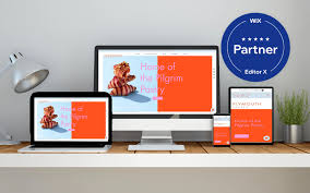
Wix Responsive Design: Why It Matters for Your Website
In today’s digital age, having a website that is accessible on all devices is more important than ever. With the increasing use of smartphones and tablets, it’s crucial to ensure that your website is responsive and can adapt to different screen sizes. This is where Wix’s responsive design comes into play.
What is Wix Responsive Design?
Wix is a popular website builder that allows users to create their own websites without any coding knowledge. One of the key features of Wix is its responsive design capabilities. This means that the website you create on Wix will automatically adjust to fit the screen size of any device it’s being viewed on, whether it’s a desktop computer, tablet or smartphone.
Why Does Responsive Design Matter?
There are several reasons why responsive design is important for your website:
- Improved User Experience: When a user visits your website on their mobile device, they expect it to be just as easy to navigate and use as it would be on a desktop computer. If your website isn’t optimized for mobile devices, users may become frustrated with the experience and leave your site.
- Increased Traffic: Google has stated that mobile-friendly websites will rank higher in search results than those that aren’t optimized for mobile devices. This means that if your website isn’t responsive, you could be missing out on potential traffic from mobile users.
- Cost-Effective: Instead of creating multiple versions of your website for different devices, responsive design allows you to create one site that adapts to all screen sizes. This can save time and money in the long run.
How Does Wix Ensure Responsive Design?
Wix uses a grid-based layout system which allows elements on the page to automatically adjust based on screen size. This ensures that text and images are not cut off or distorted when viewed on smaller screens.
In addition, Wix offers a range of templates specifically designed for mobile devices. These templates are optimized for touchscreens and include features such as larger buttons and simplified navigation menus.
Conclusion
In today’s digital landscape, having a website that is responsive and accessible on all devices is crucial. Wix’s responsive design capabilities ensure that your website will look great and function properly on any screen size. By using Wix, you can create a professional-looking website that is user-friendly and optimized for all devices.
7 Tips for Optimizing Your Wix Site for Responsive Design
- Utilize the Wix Mobile Editor to customize your mobile site design and layout.
- Use the Wix ADI feature to ensure that your website is automatically optimized for all devices.
- Make sure that buttons, links, and other interactive elements are large enough to be easily tapped on mobile devices.
- Simplify your navigation menu by using drop-down menus or hamburger menus on mobile devices.
- Test out different font sizes and styles to make sure they look great on all screen sizes and resolutions.
- Leverage the “Hide On Mobile” feature to hide certain elements of your page when viewed from a mobile device if needed.
- Take advantage of the Wix App Market for adding extra features such as live chat or analytics tracking specifically designed for mobile users
Utilize the Wix Mobile Editor to customize your mobile site design and layout.
Utilizing the Wix Mobile Editor for Responsive Design
When it comes to creating a responsive website, it’s important to ensure that your mobile site design and layout is just as appealing and user-friendly as your desktop version. This is where the Wix Mobile Editor comes in handy.
The Wix Mobile Editor allows you to customize your mobile site design and layout, ensuring that your website looks great and functions properly on all devices. With this tool, you can easily add or remove elements, adjust font sizes and colors, and rearrange the layout of your mobile site.
One of the key benefits of using the Wix Mobile Editor is that it allows you to preview your changes in real-time. This means that you can see exactly how your mobile site will look before publishing it live.
To utilize the Wix Mobile Editor, simply log into your Wix account and select “Mobile View” from the top menu. From here, you can make any necessary changes to your mobile site design and layout.
In addition to customizing your mobile site design, it’s important to ensure that your website is optimized for speed on mobile devices. This means minimizing large images or videos that could slow down load times.
In conclusion, utilizing the Wix Mobile Editor is a key step in creating a responsive website that looks great and functions properly on all devices. By customizing your mobile site design and layout, you can ensure that users have a positive experience when visiting your website on their smartphones or tablets.
Use the Wix ADI feature to ensure that your website is automatically optimized for all devices.
Wix ADI: The Easiest Way to Ensure Your Website is Responsive
Creating a responsive website can be challenging, especially if you’re not familiar with coding or web design. Fortunately, Wix offers a solution that makes it easy for anyone to create a website that is optimized for all devices: the Wix ADI feature.
What is Wix ADI?
Wix ADI (Artificial Design Intelligence) is a tool that helps users create a website quickly and easily. It uses advanced algorithms to analyze your content and create a custom website design based on your preferences.
Why Use Wix ADI for Responsive Design?
One of the key benefits of using Wix ADI is that it automatically optimizes your website for all devices. This means that you don’t have to worry about tweaking the design or layout to ensure that it looks great on mobile devices or tablets.
With Wix ADI, you can rest assured that your website will be responsive and user-friendly, no matter what device your visitors are using. This can help improve user experience and increase engagement on your site.
How Does Wix ADI Work?
To use Wix ADI, simply answer a few questions about your business and preferences. The tool will then generate a custom website design based on your answers.
Once the initial design is created, you can customize it further by adding text, images, and other elements. The tool will continue to adjust the layout and design as you make changes, ensuring that everything looks great on all devices.
Conclusion
Creating a responsive website doesn’t have to be difficult or time-consuming. With the Wix ADI feature, anyone can create a professional-looking website that is optimized for all devices in just minutes. By using this tool, you can ensure that your website looks great and functions properly on desktop computers, tablets, and smartphones alike.
Make sure that buttons, links, and other interactive elements are large enough to be easily tapped on mobile devices.
Wix Responsive Design Tip: Make Sure Your Interactive Elements are Mobile-Friendly
When designing a website on Wix, it’s important to keep in mind that more and more users are accessing the web through mobile devices. This means that your website needs to be optimized for mobile use, including ensuring that interactive elements like buttons and links are easy to tap on smaller screens.
Here’s why this tip is important:
Mobile users interact with websites differently than desktop users. They use their fingers to navigate, scroll, and click. This means that interactive elements need to be large enough for them to easily tap with their fingers.
If buttons or links are too small, users may accidentally click on the wrong element or become frustrated trying to tap on the correct one. This can lead to a poor user experience and potentially cause visitors to leave your site.
To ensure that your interactive elements are mobile-friendly, make sure they are large enough for fingers to easily tap on without accidentally clicking on other elements nearby. Wix offers a range of design tools and templates specifically designed for mobile devices, so take advantage of these features when creating your website.
In conclusion, making sure your interactive elements are mobile-friendly is crucial in creating a positive user experience for visitors accessing your site through mobile devices. By keeping this tip in mind when designing your Wix website, you can ensure that all visitors have an enjoyable and frustration-free experience on your site.
Simplify your navigation menu by using drop-down menus or hamburger menus on mobile devices.
Wix Responsive Design Tip: Simplify Your Navigation Menu
When it comes to creating a responsive website on Wix, simplifying your navigation menu is key to ensuring a positive user experience on mobile devices. With limited screen space, it’s important to make it easy for users to find what they’re looking for without having to scroll endlessly.
One effective way to simplify your navigation menu is by using drop-down menus or hamburger menus on mobile devices. Drop-down menus allow you to group related pages or subcategories together, making it easier for users to navigate your site. Hamburger menus, which are represented by three horizontal lines, are also an effective way to simplify your navigation menu and save valuable screen space.
When designing your drop-down or hamburger menu, keep in mind the following tips:
- Keep It Simple: Don’t overload your menu with too many options. Stick to the most important pages and categories.
- Use Clear Labels: Make sure the labels for each page or category are clear and concise so users know exactly what they’re clicking on.
- Test It Out: Make sure your drop-down or hamburger menu works properly on all devices and browsers.
By simplifying your navigation menu with drop-down or hamburger menus on mobile devices, you can create a more user-friendly experience for visitors to your Wix website.
Test out different font sizes and styles to make sure they look great on all screen sizes and resolutions.
Wix Responsive Design: Tip for Choosing Fonts
When it comes to designing a website on Wix, choosing the right font is important. However, it’s not just about finding a font that looks great – you also need to ensure that it’s readable on all screen sizes and resolutions. Here’s a tip to help you choose the right fonts for your responsive design:
Test out different font sizes and styles to make sure they look great on all screen sizes and resolutions.
Different devices have different screen sizes and resolutions, which can affect the way fonts appear. A font that looks great on a desktop computer may be too small or difficult to read on a smartphone or tablet. That’s why it’s important to test out different font sizes and styles to ensure they look great on all devices.
When choosing fonts for your website, consider using web-safe fonts that are designed specifically for online use. These fonts are optimized for readability on screens and are less likely to cause compatibility issues across different devices.
In addition, consider using sans-serif fonts as they tend to be more legible at smaller sizes than serif fonts. It’s also important to avoid using too many different fonts as this can make your website look cluttered and unprofessional.
By testing out different font sizes and styles, you can ensure that your website is readable and visually appealing across all devices. With Wix’s responsive design capabilities, you can create a professional-looking website that is optimized for all screen sizes and resolutions.
Leverage the “Hide On Mobile” feature to hide certain elements of your page when viewed from a mobile device if needed.
Wix Responsive Design: Using the “Hide On Mobile” Feature
Creating a website that looks great on all devices can be a challenge, but with Wix’s responsive design capabilities, it’s easier than ever. One useful feature that can help improve the mobile experience of your website is the “Hide On Mobile” feature.
What is the “Hide On Mobile” feature?
The “Hide On Mobile” feature allows you to hide certain elements of your page when viewed from a mobile device. This can be useful if you have content that doesn’t translate well to smaller screens or if you want to simplify the mobile version of your site.
How to use the “Hide On Mobile” feature in Wix
Using the “Hide On Mobile” feature in Wix is easy. Here’s how:
Select the element you want to hide (such as an image or text box).
Click on the Settings icon in the top toolbar.
Under “Mobile,” toggle on the “Hide on Mobile” option.
Preview your site on a mobile device to ensure that the element is hidden.
Benefits of using the “Hide On Mobile” feature
There are several benefits to using this feature:
Improved User Experience: By hiding certain elements on mobile devices, you can create a cleaner and more streamlined experience for users.
Faster Load Times: Removing unnecessary elements from your mobile site can help reduce load times and improve page speed, which is important for both user experience and search engine optimization.
Customization: The ability to hide specific elements on mobile devices gives you more control over how your website looks and functions across different devices.
Conclusion
Wix’s responsive design capabilities make it easy to create a website that looks great on all devices, including desktops, tablets, and smartphones. The “Hide On Mobile” feature is just one tool in your arsenal for creating a user-friendly and optimized mobile experience. By using this feature, you can simplify your mobile site and improve load times, ultimately enhancing the overall user experience.
Take advantage of the Wix App Market for adding extra features such as live chat or analytics tracking specifically designed for mobile users
Wix is a popular website builder that offers responsive design capabilities to ensure your website looks great and functions properly on all devices. However, there are additional features you can add to your website to enhance the user experience, especially for mobile users. This is where the Wix App Market comes in.
The Wix App Market offers a wide range of apps specifically designed for Wix websites. These apps can help you add extra features such as live chat or analytics tracking to your site. By taking advantage of these apps, you can improve the overall functionality and user experience of your website.
One key benefit of using apps from the Wix App Market is that they are designed with mobile users in mind. For example, adding a live chat app can allow mobile users to easily connect with your business without having to navigate through multiple pages or fill out lengthy contact forms.
Similarly, adding an analytics tracking app can help you better understand how mobile users interact with your website. This information can then be used to optimize your site for mobile devices and improve the overall user experience.
In conclusion, while Wix’s responsive design capabilities are essential for ensuring your website looks great on all devices, adding extra features from the Wix App Market can take your site to the next level. By focusing on mobile-specific apps such as live chat or analytics tracking, you can enhance the user experience for mobile users and grow your business online.