
Title: Unveiling the Best Designed Websites of 2020
Introduction:
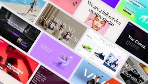
In the digital age, a well-designed website is crucial for capturing and retaining the attention of online visitors. As we bid farewell to 2020, let’s take a moment to appreciate some of the most visually stunning and creatively designed websites that emerged during this challenging year. From sleek minimalism to bold and vibrant aesthetics, these websites showcase exceptional design elements that push boundaries and inspire.
Apple (www.apple.com):
Known for its clean and minimalist approach, Apple’s website continues to set the standard for elegant design. With its seamless navigation, crisp visuals, and intuitive user interface, Apple’s website embodies simplicity at its finest. The use of ample white space allows their products to take center stage, while subtle animations add a touch of interactivity.
Stripe (www.stripe.com):
Stripe’s website exemplifies modern design with its sleek layout and thoughtful use of color gradients. The combination of vibrant hues creates an engaging visual experience while maintaining a professional look. Additionally, their use of concise copy and clear call-to-action buttons ensures that users can easily understand their services.
Dropbox (www.dropbox.com):
Dropbox’s website stands out for its innovative use of illustrations that bring their brand to life. The hand-drawn aesthetic adds a personal touch while maintaining a sense of professionalism. The site effectively communicates Dropbox’s features through interactive elements and well-crafted storytelling.
Framer (www.framer.com):
Framer’s website showcases the power of dynamic visuals in web design. By incorporating captivating animations throughout their site, Framer demonstrates how motion can enhance user engagement. Their use of bold typography and carefully curated color palette further reinforces their brand identity as a cutting-edge design tool.
Spotify Design (www.design.spotify.com):
Spotify Design’s website captures attention with its vibrant color scheme and playful illustrations. It successfully blends creativity and usability, providing an enjoyable browsing experience. The site also features insightful articles and resources, making it a valuable hub for design inspiration.
Conclusion:
The year 2020 brought forth a plethora of beautifully designed websites that reflect the ever-evolving landscape of digital aesthetics. From the minimalistic elegance of Apple to the vibrant creativity of Spotify Design, these websites demonstrate the power of thoughtful design in captivating online audiences.
As we move into the future, it is clear that web design will continue to evolve, embracing new technologies and pushing boundaries. By drawing inspiration from these remarkable websites, designers and businesses alike can strive to create visually stunning online experiences that leave a lasting impression on visitors.
5 Frequently Asked Questions About Best Designed Websites in 2020
- What are the best designed websites of 2020?
- How do I create a great website design?
- What factors make a website design successful?
- What are the latest trends in website design?
- How can I make sure my website is optimized for mobile devices?
What are the best designed websites of 2020?
Determining the “best” designed websites is subjective and can vary based on individual preferences and industry trends. However, here are a few websites from 2020 that received recognition for their exceptional design:
- Airbnb (www.airbnb.com): Airbnb’s website underwent a major redesign in 2020, focusing on simplicity and user-friendliness. The site features beautiful imagery, intuitive navigation, and a clean layout that effortlessly guides users through the booking process.
- Stripe (www.stripe.com): Stripe’s website showcases a modern and visually appealing design. With its use of vibrant color gradients, concise copy, and clear call-to-action buttons, Stripe effectively communicates its services while maintaining an engaging user experience.
- Slack (www.slack.com): Slack’s website combines simplicity with playful illustrations to create an inviting and user-friendly interface. The site effectively communicates the features and benefits of the platform while incorporating interactive elements that make it enjoyable to explore.
- Trello (www.trello.com): Trello’s website stands out for its clean design and intuitive layout. The use of bold colors, minimalistic icons, and clear typography creates a visually pleasing experience that aligns with Trello’s brand identity as a productivity tool.
- Epicurrence (www.epicurrence.com): Epicurrence is an event-based website that showcases an innovative design approach. With its unique scrolling effects, vibrant colors, and captivating animations, this website creates an immersive experience that stands out from traditional event websites.
- Nike Better World (www.nikebetterworld.com): Nike Better World is an interactive microsite that promotes sustainability through engaging visuals and storytelling elements. The site effectively communicates Nike’s commitment to environmental responsibility while providing an immersive browsing experience.
Remember that design trends evolve rapidly, so it’s always worth exploring recent web design award winners or seeking inspiration from design communities to stay up-to-date with the latest trends in web design excellence.
How do I create a great website design?
Creating a great website design requires careful planning, attention to detail, and a deep understanding of your target audience. Here are some key steps to guide you in creating an exceptional website design:
- Define your goals: Start by clearly defining the purpose and goals of your website. Understand what you want to achieve, whether it’s driving sales, generating leads, or providing information.
- Research your target audience: Conduct thorough research to understand your target audience’s preferences, demographics, and behaviors. This will help you tailor your design to their needs and expectations.
- Plan your site structure: Organize your content in a logical and intuitive manner. Create a clear navigation structure that allows visitors to find information easily. Consider using wireframes or sitemaps to visualize the layout before diving into the design process.
- Prioritize user experience (UX): Focus on creating a seamless user experience that is intuitive and user-friendly. Ensure that visitors can navigate through your site effortlessly, find what they need quickly, and accomplish their goals efficiently.
- Optimize for mobile devices: With the increasing use of smartphones and tablets, it is crucial to create a responsive design that adapts seamlessly across different screen sizes. Mobile optimization is essential for providing a positive user experience.
- Choose an appropriate color scheme: Select colors that align with your brand identity while considering their psychological impact on users. Use color combinations that enhance readability and create visual harmony throughout the site.
- Pay attention to typography: Select fonts that are easy to read on various devices and sizes. Use different font weights and sizes strategically to emphasize important content elements while maintaining consistency across the site.
- Utilize whitespace effectively: Incorporate ample whitespace (empty space) around elements on your website to improve readability, create visual balance, and draw attention to key content areas.
- Use high-quality visuals: Invest in high-resolution images, illustrations, or videos that complement your content and enhance the overall visual appeal. Ensure that visuals are optimized for fast loading times without compromising quality.
- Test and iterate: Continuously test your website design across different browsers, devices, and user scenarios. Gather feedback from users and make necessary improvements based on their insights.
Remember, great website design goes beyond aesthetics. It should align with your brand, provide a seamless user experience, and effectively communicate your message to your target audience. By following these steps and staying updated with current design trends, you can create a website that stands out and leaves a lasting impression on visitors.
What factors make a website design successful?
A successful website design is a culmination of several key factors that work together harmoniously to create an engaging and user-friendly experience. Here are some important factors that contribute to the success of a website design:
- User Experience (UX): A well-designed website prioritizes the needs and expectations of its target audience. It should be intuitive, easy to navigate, and provide a seamless browsing experience. User-centric design focuses on clear information architecture, logical navigation menus, and easily accessible content.
- Visual Appeal: Visual elements play a crucial role in capturing users’ attention and conveying the brand’s identity. Aesthetically pleasing color schemes, high-quality images, appropriate typography, and consistent branding contribute to an attractive and visually cohesive design.
- Responsiveness: With the increasing use of mobile devices, responsive design is essential for ensuring that websites adapt seamlessly to different screen sizes and resolutions. Mobile-friendly designs enhance user experience by providing optimal viewing and interaction across various devices.
- Loading Speed: Slow-loading websites can lead to frustration and high bounce rates. Optimizing images, minimizing code, leveraging caching techniques, and utilizing content delivery networks (CDNs) are some strategies employed to improve loading times.
- Clear Call-to-Action (CTA): Effective websites guide users towards their intended actions through clear CTAs strategically placed throughout the site. Well-designed CTAs with compelling copy encourage users to engage further or convert into customers.
- Accessibility: A successful website design should be accessible to all users, including those with disabilities or impairments. Adhering to web accessibility guidelines ensures that everyone can access content using assistive technologies.
- Content Strategy: Engaging content is vital for keeping visitors interested and encouraging them to explore further. Well-structured content with relevant headings, concise paragraphs, bullet points, and visual aids improves readability.
- Search Engine Optimization (SEO): Implementing SEO best practices helps improve a website’s visibility in search engine results. Optimizing page titles, meta descriptions, headings, and incorporating relevant keywords can enhance organic traffic.
- Consistency: Consistency in design elements such as colors, typography, and layout throughout the website creates a cohesive and professional appearance. It helps users navigate easily and reinforces brand recognition.
- Analytics and Testing: Regularly analyzing user behavior using tools like Google Analytics helps identify areas for improvement. A/B testing allows designers to experiment with different layouts, designs, or functionalities to optimize user experience.
By considering these factors and tailoring them to their specific target audience and industry, website designers can create successful designs that captivate users, drive engagement, and achieve their intended goals.
What are the latest trends in website design?
Website design trends are constantly evolving as designers experiment with new techniques and technologies. Here are some of the latest trends in website design:
- Dark Mode: Dark mode has gained popularity due to its sleek and modern appearance. It reduces eye strain, improves readability, and adds a touch of elegance to websites.
- Minimalism: Minimalistic design continues to be a prominent trend, focusing on simplicity and clean aesthetics. It emphasizes ample white space, crisp typography, and minimal use of colors and graphics.
- Microinteractions: Microinteractions are small animations or visual cues that provide feedback or enhance user engagement. They add a delightful element to user interactions and make the website feel more dynamic.
- Bold Typography: Large, bold typography is being used to create impactful headlines and draw attention to key elements on the page. Custom fonts and creative typography choices help establish brand identity.
- Asymmetrical Layouts: Breaking away from traditional grid-based layouts, asymmetrical layouts offer a sense of uniqueness and creativity. They can create visual interest by using overlapping elements or irregular shapes.
- 3D Elements: Three-dimensional elements add depth and realism to websites, creating an immersive experience for users. These elements can be used sparingly for subtle effects or prominently for interactive experiences.
- Neumorphism: Neumorphism is a design style that combines skeuomorphism (realistic textures) with minimalism (flat design). It creates soft shadows and highlights on user interface elements, giving them a tactile feel.
- Gradients: Gradients have made a comeback in web design, adding depth and visual interest to backgrounds, buttons, and other elements. Vibrant color combinations or subtle gradients can create an engaging visual experience.
- Video Backgrounds: Video backgrounds have become increasingly popular as they help tell stories visually while capturing attention instantly. They can be used to showcase products/services or create atmospheric effects.
- Voice User Interface (VUI): With the rise of voice assistants and smart speakers, designing websites with voice user interfaces is gaining traction. Integrating voice commands and interactions can enhance accessibility and user experience.
Remember, while it’s important to stay aware of design trends, it’s equally crucial to ensure that they align with your website’s purpose, target audience, and brand identity.
How can I make sure my website is optimized for mobile devices?
Optimizing your website for mobile devices is essential in today’s mobile-first world. Here are some key steps to ensure that your website is mobile-friendly:
- Responsive Design: Implement a responsive design that automatically adjusts the layout and content based on the screen size of the device. This ensures that your website looks and functions well on various mobile devices, including smartphones and tablets.
- Mobile-Friendly Navigation: Simplify your navigation menu for mobile devices by using a hamburger menu or collapsible menu. This allows users to easily access different sections of your website without overwhelming them with too many options.
- Font and Button Sizes: Use legible fonts and ensure that they are large enough to be easily read on smaller screens. Similarly, make sure buttons and interactive elements are big enough to be tapped with a finger, avoiding accidental clicks.
- Optimized Images: Compress images to reduce file sizes without compromising quality. Large image files can slow down loading times, so optimizing them helps improve the overall performance of your website on mobile devices.
- Minimize Pop-ups: Avoid intrusive pop-ups that obstruct the user experience on mobile devices. If you need to use pop-ups, ensure they are easy to dismiss or display in a non-intrusive manner.
- Fast Loading Speed: Optimize your website’s loading speed by minimizing HTTP requests, leveraging browser caching, and reducing unnecessary code or scripts. Mobile users expect fast-loading websites, so prioritize performance optimization.
- Touch-Friendly Elements: Make sure all interactive elements such as buttons, links, and forms are easily clickable or tappable on touchscreens. Provide ample spacing between elements to prevent accidental taps.
- Test Across Devices: Test your website across various mobile devices and screen sizes to ensure consistent functionality and visual appeal. Emulators or responsive design testing tools can help simulate different device environments.
- Mobile SEO Optimization: Pay attention to mobile SEO practices, such as optimizing meta tags, using descriptive headings, and ensuring your website is mobile-indexed by search engines. This helps improve your website’s visibility in mobile search results.
- User Testing: Gather feedback from real users by conducting usability tests on mobile devices. This allows you to identify any issues or areas for improvement that may have been overlooked during the development process.
By following these guidelines, you can create a mobile-friendly website that provides a seamless and enjoyable experience for your mobile users. Remember to regularly monitor and update your website as new technologies and best practices emerge in the ever-evolving landscape of mobile web design.