
Best Mobile Website Design Trends in 2020
In 2020, mobile website design has become more important than ever. With the majority of internet users accessing websites on their mobile devices, it’s crucial for businesses to have a mobile-friendly website that provides a seamless user experience. Here are some of the best mobile website design trends that have emerged in 2020:
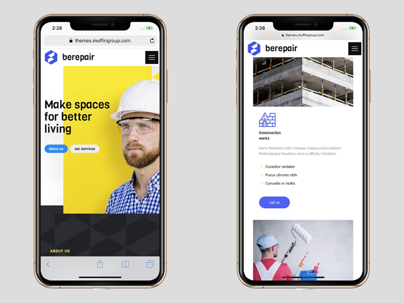
Responsive Design
Responsive design is no longer a trend but a necessity. A responsive website adapts to different screen sizes and resolutions, ensuring that your site looks great on any device, whether it’s a smartphone, tablet, or desktop computer.
Dark Mode
Dark mode has gained popularity in recent years for its sleek and modern look. Many websites now offer a dark mode option that reduces eye strain and conserves battery life on mobile devices.
Minimalist Design
Simplicity is key in mobile website design. Minimalist design focuses on clean layouts, ample white space, and easy navigation to create a clutter-free user experience.
Micro-Interactions
Micro-interactions are subtle animations or effects that engage users and enhance their experience on your website. From hover effects to loading animations, micro-interactions add personality to your site.
Thumb-Friendly Navigation
With most users navigating websites on their smartphones using their thumbs, it’s essential to have thumb-friendly navigation elements such as easy-to-reach menus and buttons for a seamless browsing experience.
Voice Search Optimization
Voice search is becoming increasingly popular with the rise of virtual assistants like Siri and Alexa. Optimizing your mobile website for voice search can improve user experience and make it easier for visitors to find what they’re looking for.
Overall, the best mobile website design trends in 2020 focus on creating user-friendly experiences that prioritize speed, accessibility, and visual appeal. By incorporating these trends into your mobile website design, you can ensure that your site stands out from the competition and provides an exceptional browsing experience for visitors.
8 Essential Tips for Designing the Best Mobile Websites in 2020
- Prioritize mobile responsiveness for seamless user experience on various devices.
- Optimize loading speed by compressing images and minimizing HTTP requests.
- Implement a clean and intuitive navigation menu for easy browsing.
- Use legible fonts and appropriate font sizes for better readability on smaller screens.
- Minimize pop-ups and interstitials to avoid disrupting the user’s journey.
- Incorporate touch-friendly elements like large buttons and clickable areas to enhance usability.
- Ensure high contrast between text and background colors for improved accessibility.
- Optimize forms for mobile input by using auto-fill, clear labels, and minimal fields.
Prioritize mobile responsiveness for seamless user experience on various devices.
In 2020, one of the key tips for achieving the best mobile website design is to prioritize mobile responsiveness. By ensuring that your website is responsive and adapts seamlessly to different screen sizes and devices, you can provide users with a consistent and user-friendly experience no matter how they access your site. Mobile responsiveness not only enhances usability but also helps improve engagement and conversion rates, making it a crucial aspect of modern website design.
Optimize loading speed by compressing images and minimizing HTTP requests.
Optimizing loading speed is crucial for a successful mobile website design in 2020. One effective tip is to compress images and minimize HTTP requests. By compressing images, you can reduce file sizes without compromising quality, ensuring faster loading times for users. Additionally, minimizing HTTP requests by combining files and resources can further improve loading speed, creating a smoother and more efficient browsing experience on mobile devices. Prioritizing these strategies can enhance user engagement and satisfaction, ultimately leading to a more successful mobile website design in 2020.
Implement a clean and intuitive navigation menu for easy browsing.
To enhance the user experience on a mobile website in 2020, it is crucial to implement a clean and intuitive navigation menu. By providing easy access to essential pages and content through a well-organized menu, users can navigate the site effortlessly and find what they are looking for quickly. A simple and intuitive navigation menu not only improves usability but also contributes to a seamless browsing experience on mobile devices, ultimately increasing user engagement and satisfaction.
Use legible fonts and appropriate font sizes for better readability on smaller screens.
To enhance the user experience on mobile devices, it is crucial to use legible fonts and appropriate font sizes in mobile website design for 2020. By choosing fonts that are easy to read and adjusting the size to ensure readability on smaller screens, you can improve the overall user experience and make it easier for visitors to consume content without straining their eyes. This simple yet effective tip can significantly enhance the usability and accessibility of your mobile website, leading to higher engagement and satisfaction among users.
Minimize pop-ups and interstitials to avoid disrupting the user’s journey.
In the realm of best mobile website design for 2020, a crucial tip is to minimize the use of pop-ups and interstitials to prevent disruptions in the user’s journey. These intrusive elements can hinder the user experience by interrupting navigation and causing frustration. By reducing the frequency of pop-ups and interstitials, website owners can create a more seamless and enjoyable browsing experience for mobile users, ultimately leading to higher engagement and satisfaction levels.
Incorporate touch-friendly elements like large buttons and clickable areas to enhance usability.
Incorporating touch-friendly elements such as large buttons and clickable areas is a crucial tip for optimizing mobile website design in 2020. By making buttons and interactive elements larger and easier to tap, you can enhance usability and provide a more intuitive browsing experience for mobile users. This design approach not only improves navigation but also reduces the risk of accidental clicks, ultimately leading to higher user engagement and satisfaction on mobile devices.
Ensure high contrast between text and background colors for improved accessibility.
Ensuring high contrast between text and background colors is a crucial tip for best mobile website design in 2020. This practice not only enhances the visual appeal of the website but also significantly improves accessibility for all users, including those with visual impairments. By choosing colors that provide a clear distinction between text and background, you can make the content easier to read and navigate on mobile devices. High contrast ensures that information is easily legible, reducing eye strain and enhancing the overall user experience for all visitors to your website.
Optimize forms for mobile input by using auto-fill, clear labels, and minimal fields.
To enhance the user experience on mobile websites in 2020, it is crucial to optimize forms for mobile input. By incorporating features such as auto-fill, clear labels, and minimal fields, you can streamline the form-filling process for users on smartphones and tablets. Auto-fill functionality saves time for users by suggesting or automatically entering information based on their previous inputs, while clear labels help users understand what each field requires. Additionally, minimizing the number of form fields reduces friction and improves the overall usability of the mobile website. By implementing these best practices, you can ensure that users have a seamless and efficient experience when interacting with forms on your mobile website.