
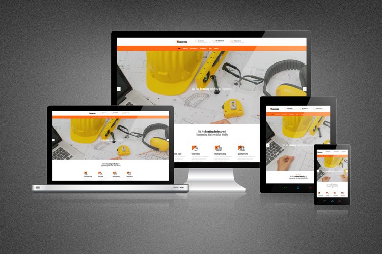
The Importance of Modern Responsive Web Design
In today’s digital age, having a responsive website is crucial for success. With the increasing use of smartphones and tablets, users are accessing websites on a variety of devices with different screen sizes. This is where modern responsive web design comes into play.
Modern responsive web design ensures that your website adapts and displays correctly on any device, providing users with a seamless experience regardless of the screen size they are using. This not only enhances user experience but also improves your website’s search engine rankings.
By implementing modern responsive web design practices, you can reach a wider audience and increase engagement on your website. Users are more likely to stay and interact with a site that is easy to navigate and visually appealing on any device.
Furthermore, modern responsive web design is essential for maintaining a consistent brand image across all platforms. A responsive website ensures that your brand message is conveyed effectively, no matter how users access your site.
In conclusion, modern responsive web design is no longer just an option – it is a necessity for any business looking to succeed online. By investing in a responsive website, you can improve user experience, boost search engine rankings, and ultimately drive more traffic and conversions to your site.
5 Essential Tips for Effective Modern Responsive Web Design
- Prioritize mobile-first design to ensure a seamless experience on smaller screens.
- Use media queries to adapt the layout and styles based on different screen sizes.
- Optimize images and videos for faster loading times on mobile devices.
- Implement flexible grids and relative units (like percentages) for better responsiveness.
- Test your website across various devices and browsers to ensure consistent performance.
Prioritize mobile-first design to ensure a seamless experience on smaller screens.
To ensure a seamless experience on smaller screens, it is crucial to prioritize mobile-first design in modern responsive web design practices. By starting with the mobile layout and then scaling up to larger screens, you can ensure that your website is optimized for mobile users and provides a user-friendly experience across all devices. This approach not only improves usability but also helps in creating a more efficient and effective design that caters to the needs of mobile users first.
Use media queries to adapt the layout and styles based on different screen sizes.
In modern responsive web design, utilizing media queries is a crucial tip to ensure your website’s layout and styles adjust seamlessly across various screen sizes. By incorporating media queries into your CSS code, you can define specific rules that target different screen widths and devices, allowing you to optimize the layout and styling of your website for each unique viewing experience. This approach not only enhances user experience by providing a consistent and visually appealing design but also contributes to better usability and accessibility on all devices.
Optimize images and videos for faster loading times on mobile devices.
Optimizing images and videos for faster loading times on mobile devices is a crucial aspect of modern responsive web design. By reducing the file size of media content without compromising quality, you can ensure that your website loads quickly and smoothly on smartphones and tablets. This not only improves user experience by minimizing wait times but also helps to retain visitors and improve overall engagement. Prioritizing image and video optimization is a key strategy in creating a responsive website that caters to the needs of mobile users, ultimately leading to higher satisfaction and better performance metrics.
Implement flexible grids and relative units (like percentages) for better responsiveness.
Implementing flexible grids and relative units, such as percentages, is a key tip in modern responsive web design. By using these techniques, web designers can create layouts that adapt fluidly to different screen sizes, ensuring a consistent and user-friendly experience across devices. Flexible grids and relative units allow for better responsiveness by enabling elements to resize proportionally based on the viewport size, making the website more visually appealing and functional for all users.
Test your website across various devices and browsers to ensure consistent performance.
To ensure a seamless user experience and consistent performance, it is crucial to test your website across various devices and browsers. By conducting thorough testing, you can identify any compatibility issues and make necessary adjustments to ensure that your website functions properly on all platforms. This proactive approach not only improves user satisfaction but also helps maintain a professional image and credibility for your website.